Housekeeping news: I went back to having an actual website in June, 2019; for a few years, I’d just used a photography hosting service, as photography was the vast majority of what I did. However, when book design again became an important-enough part of my work, I wanted to have a space to talk about it. I bought a WordPress template, added photographs, and posted it.
…But I never really liked it. From the beginning, I felt y’all deserved more: better typography, better photography, better everything. Like so many, however, one’s own stuff is always at the bottom of the to-do list. No longer.
I’d like to introduce the new version:
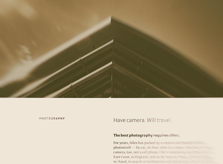
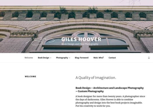
The new gileshoover.com, January, 2022
There were a few bumps getting here (naturally, I broke everything along the way; to say I don’t code is an understatement!), but with some tweaking notwithstanding, the new gileshoover.com is live. It’s got all-original photography, matched sans and serif font superfamily (Merriweather by Sorkin Type, a Google Font), much faster response time, open-source foundations, and so on.
Note that entries on Foreword are best seen individually, as you’ll see bigger photographs (or illustrations, graphics, etc.). Click on entry titles to get there.
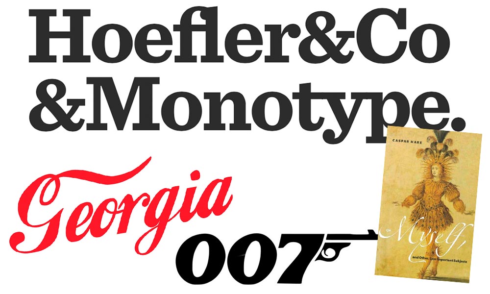
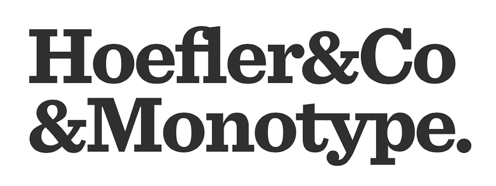
It’s been thirty-two years, four months, and fourteen days since I hung out a shingle to announce that The Hoefler Type Foundry was open for business. What started as a sole proprietorship grew into the Hoefler&Co of today, a diversified design and technology practice with an international reach, still dedicated to the invention of original, thoughtful, and hard-working typefaces.
Meanwhile, “nothing will change,” Jonathan Hoefler (previously) says, except that he’ll be stepping down. That’s kind of a big change, IMHO — but after using typography to “help elect a president,” where do you go from there? Read more here.
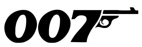
In happier news, the much-delayed new Bond movie, No Time to Die, is finally in theaters next week.
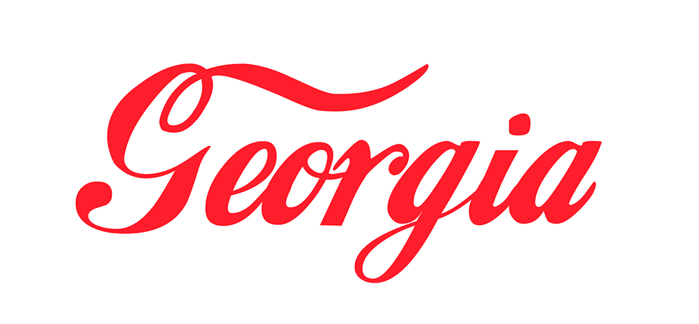
Keith Fleck has gotten a good deal of press for his Corporate States of America, but in case you haven’t seen it, it’s absolutely worth a look. Maine’s L.L. Bean, Florida’s Publix, and, of course, Georgia’s Coca-Cola are all winners. 51 bonus points!
Lastly for this month, some book design:
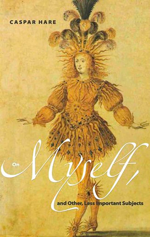
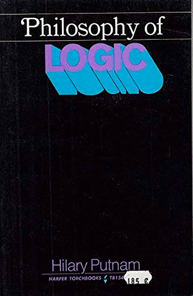
Daily Nous asks their readers to nominate the best philosophy book covers — Judging Philosophy Books By Their Covers — and there are some winners, some absolute losers, and a few funny moments, too:
“This always reminded me of a rejected Black Sabbath album cover or something,” says the poster. Nice. (And only 185 cents!)
“Since 1965, the Association of University Presses (AUPresses) Book, Jacket, and Journal Show has fulfilled its mission to “honor and instruct”: honoring the design and production teams whose work furthers a long tradition of excellence in book design […]. The Book, Jacket, and Journal Show recognizes meritorious achievement in design, production, and manufacture of books, jackets, covers, and journals by members of the university press community. It also provides an evaluation of their work and serves as a focus of discussion and a source of ideas for intelligent, creative, and resourceful bookmaking.”
Credit where credit is due: Spine, in their excellent way, has already covered this. Head on over there, knowing that I largely agree with their post in its entirety. However, there are a number of covers I like that they didn’t talk about — and they didn’t talk about interior design at all.
So, without further ado, let’s start with the covers and jackets. Interiors follow, then items that are in both categories.
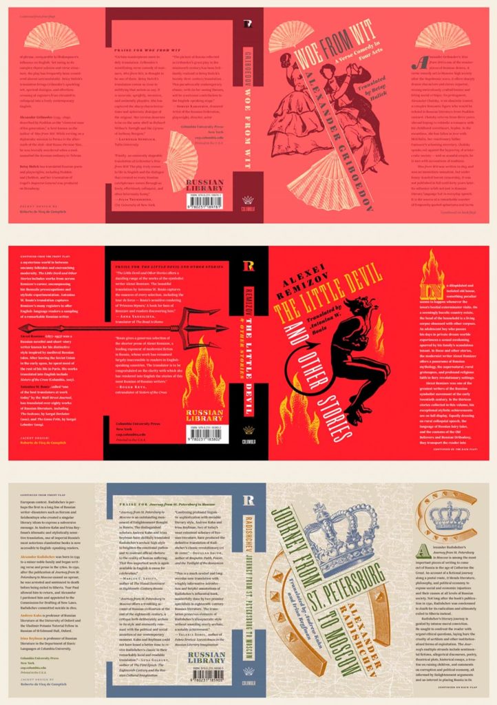
Columbia University Press with a series (in order, top to bottom): Woe from Wit, The Little Devil and Other Stories, and Journey from St. Petersburg to Moscow. Each is great on their own, but put ’em together and the series stands tall. Excellent design by Roberto de Vicq de Cumptich.
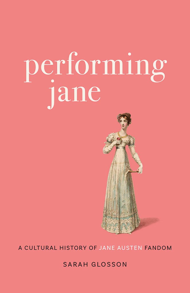
Louisiana State University brings us Performing Jane, with design by Barbara Neely Bourgoyne. Simplicity wins.
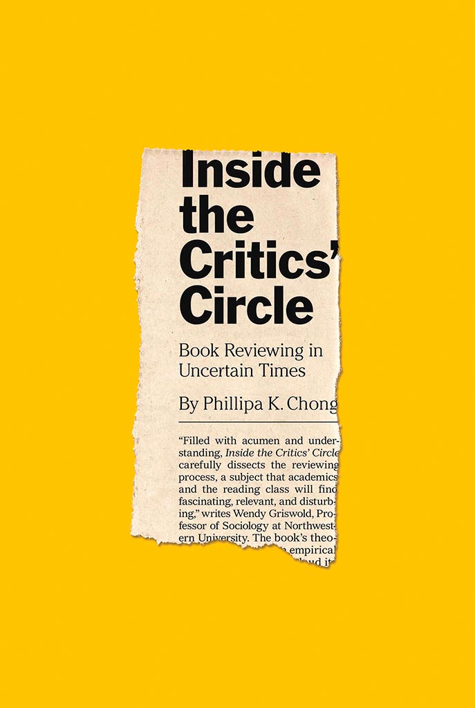
On the subject of simplicity, Inside the Critic’s Circle brings a seemingly-casual-yet-carefully-designed newspaper clipping onto a yellow background. Together, they’re attention-getting and just right. Nice. Design by Chris Ferrante for Princeton University Press.
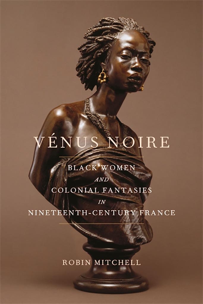
Vénus Noire is about as far from a bust as can be — except not really:
Another example of simpler-is-better, yet something so much more. Design by Kaelin Chappell Broaddus.
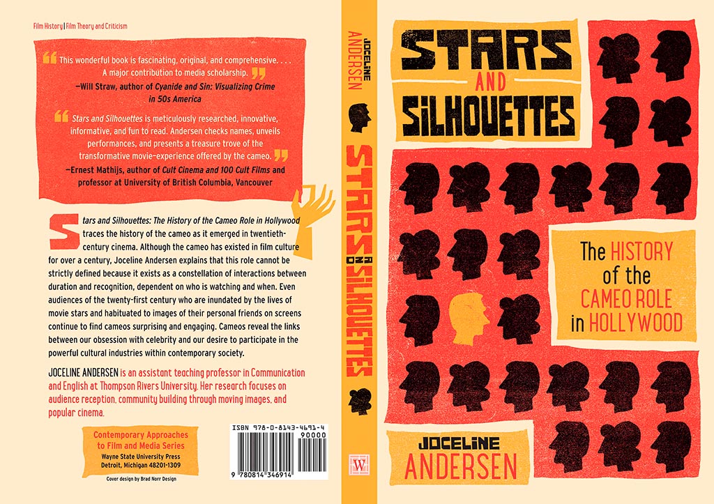
Wayne State University Press brings us Stars and Silhouettes, in all its hand-drawn glory. Love the design by Brad Norr.
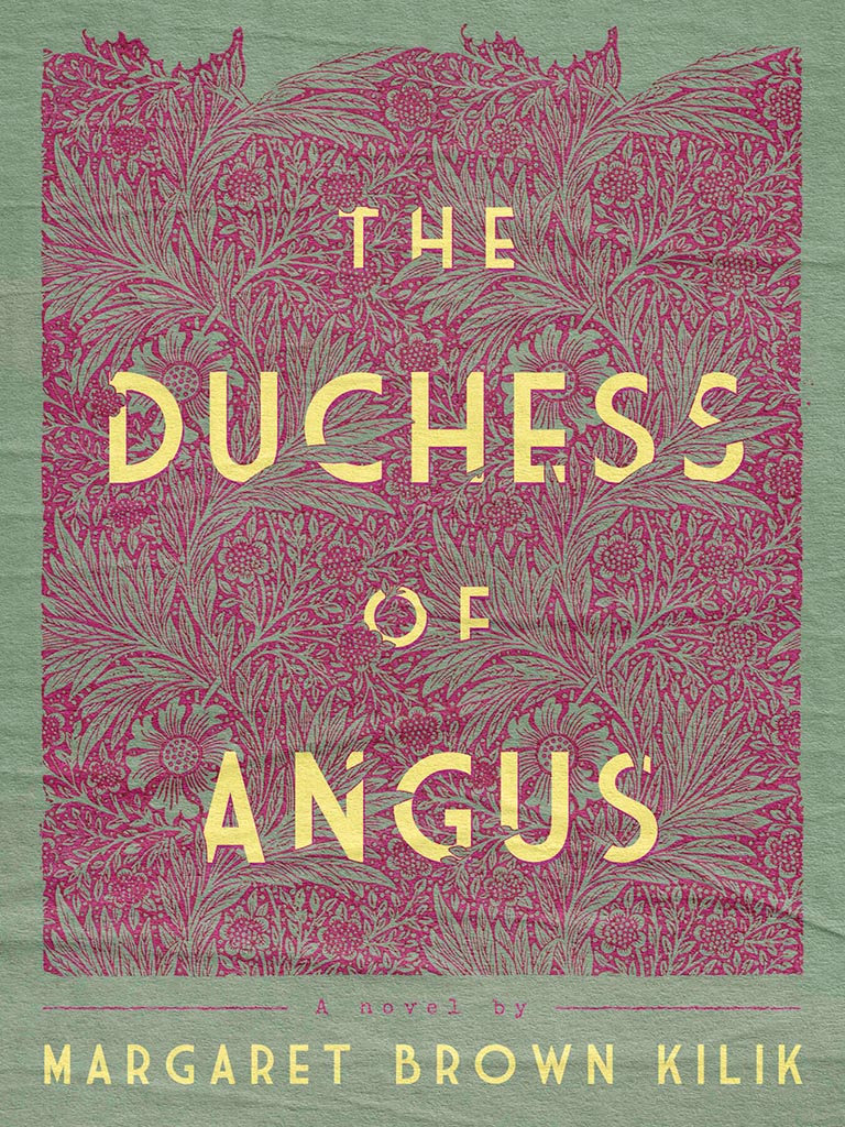
My favorite of the stand-alone cover designs, however, contains a wrinkle or two:
Lovely. The illustration and paper photograph combine into something really special. Design by Derek Thornton — whose website, by the way, has a bunch of other great stuff. Nice!
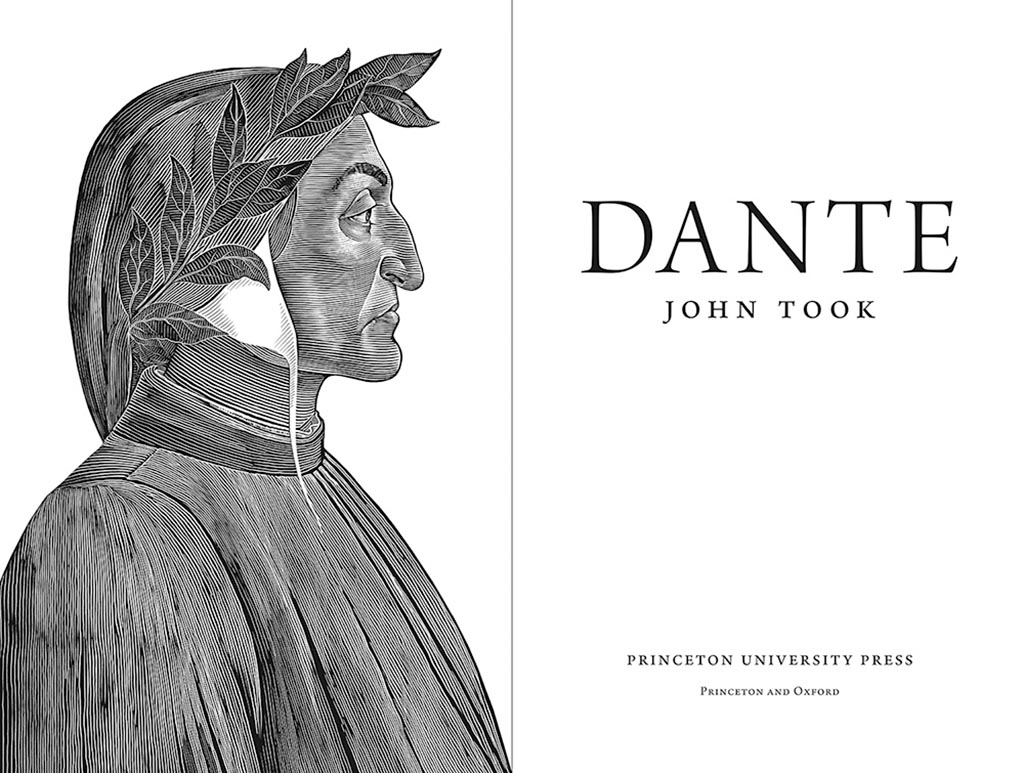
On to some interior design, with Pinceton’s Dante:
Puts “boring academic title [page]” to rest. Design by Chris Ferrante.
Next, a title on “knowing what not to know in contemporary China”, called Negative Spaces:
Design by Courtney Leigh Richardson for Duke University Press.
Next, stories from “the people of the land”:
Our Whole Gwich’in Way of Life Has Changed / Gwich’in K’yuu Gwiidandài’ Tthak Ejuk Gòonlih, with design by Alan Brownoff for the University of Alberta Press.
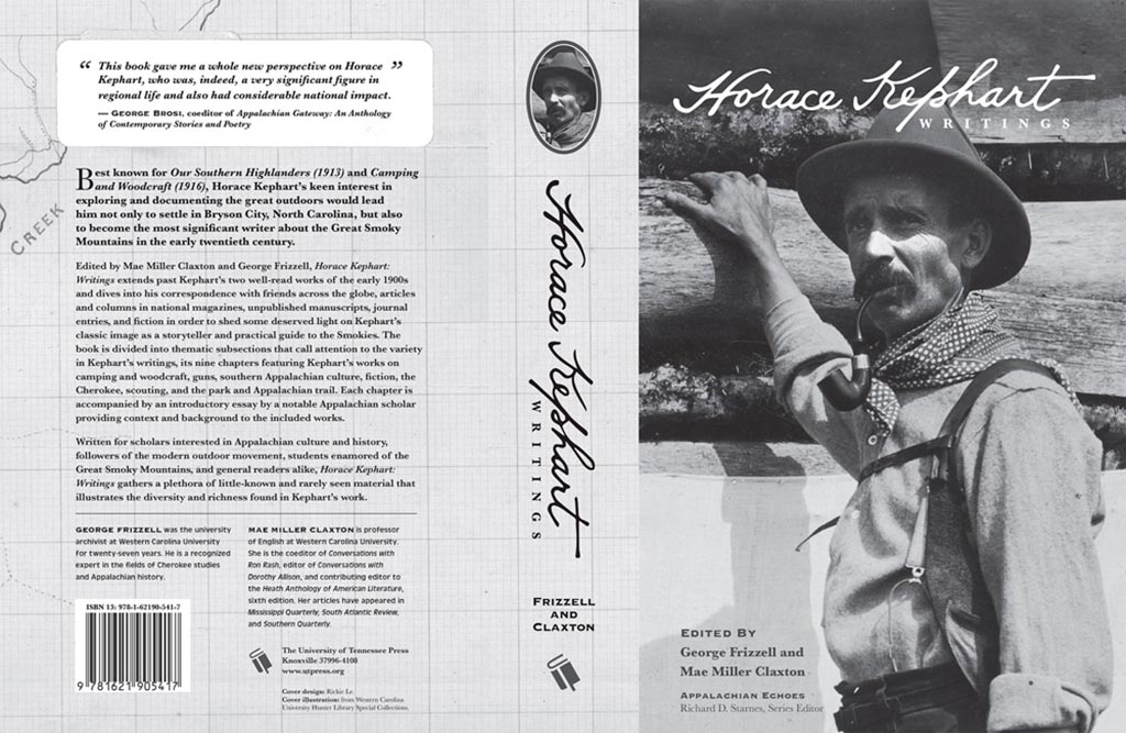
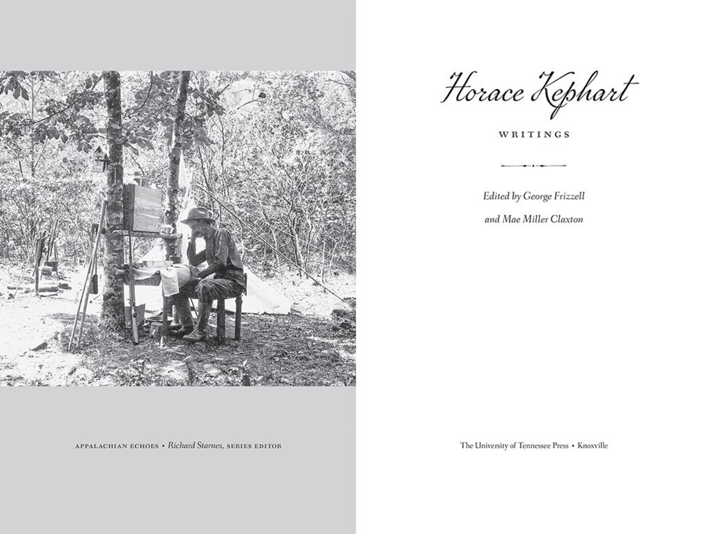
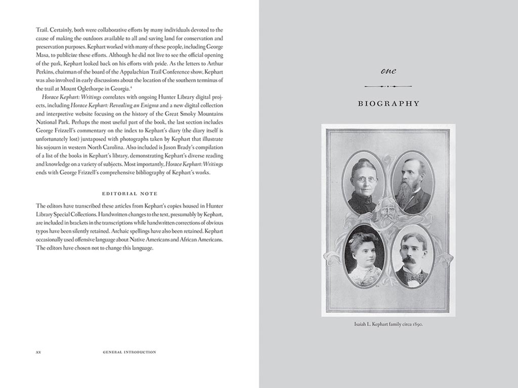
Next, a couple where both the cover and interior excel, starting with Horace Kephart from the University of Tennessee Press:
UTenn Press has a cool logo, too.
Lovely detailing in this design by Mindy Basinger Hill. Only one question here: Why doesn’t the script on the cover match that used inside? Both are nice — I prefer the one used on the cover — but either way, pick one!
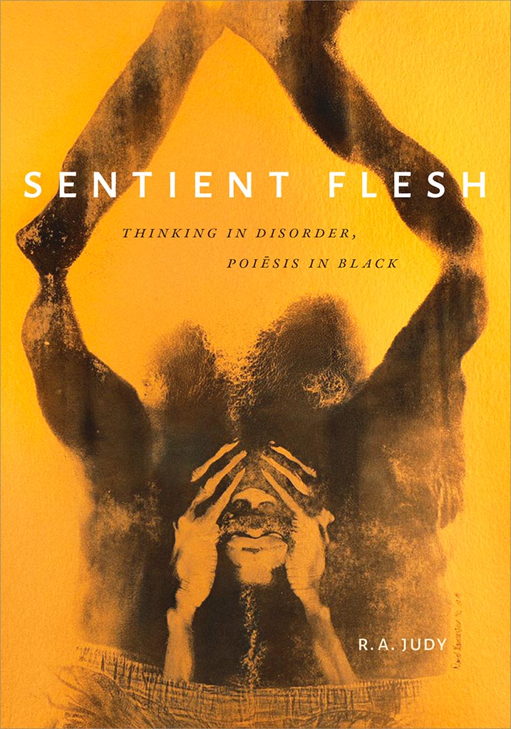
Last but certainly not least, perhaps the best designed of all the projects in the AUPresses 2021 Show, Duke’s Sentient Flesh:
Fantastic. And check the interior:
Kudos to designer Matthew Tauch for a “best in show,” at least as far as I’m concerned!
One thing I never read, if possible: ebooks. That said, in these strange times, they are what folks need — and, because these are strange times, it’s causing problems. Ars Technica has the story.
“At the Columbia Journalism Review, we capitalize Black, and not white, when referring to groups in racial, ethnic, or cultural terms. For many people, Blackreflects a shared sense of identity and community. White carries a different set of meanings; capitalizing the word in this context risks following the lead of white supremacists.”
Washington Square News discusses NYU’s attempts to — like pretty much everything else — get book design online:
The studio course focuses on book art and teaches students about the production of books, from interior and exterior design to binding techniques. Without the physical studio space and the materials it provides, digital learning has paved an unprecedented pathway for the course to continue.
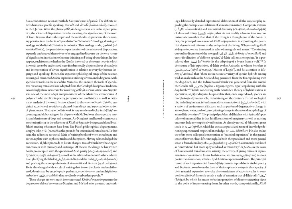
Original post, March 5th, 2020: After 23 years, BMW has updated its logo … but there’s a problem.
Let’s back up a little, as even the previous logo wasn’t perfect. Debuted in 1997, it followed the then-trendy “3D” look, complete with highlights. It was, however, clearly BMW — black background, blue-and-white roundel, chrome outline, lettering. This new one, however, loses the iconic black (for transparent) and chrome outline (for white):
BMW’s logo: 1997 (left) and 2020 (right)
It’s less representative and less clear in my opinion, but hey, I’m only a BMW owner, not any part of their marketing team.
Another problem: it debuted on the Concept i4. controversial all by itself.
Why not revert to the earlier, 1963 version? (Or update it with new type — but keep the black?) Transparency is fine in some cases, but I’m not sure that this isn’t a case of style over substance in the actual use cases (web site logo, app logo, etc. — more than just on the cars, I mean).
Update, 7/27/20: Dezeen has a roundup of the six other companies that have made their logos “flat,” proving the “3D” look mentioned above is truly out of fashion:
Audi, Citroen, VW, Nissan, Mini, and Toyota, oh boy!
Ford Almost Let a Graphic Design Legend Update Its Blue Oval Logo in 1966: Paul Rand, who designed iconic logos for IBM, Cummins, ABC and numerous other companies, designed a sleek logo for Ford that went unused.
“Opel Details All-New, Slimmer And More Modern ‘Blitz’ Logo,” at CarScoops.
Update, 12/30/20: Kia’s was previewed on a show car earlier in the year, but they’ve gone and made it official:
There were some changes along the way, if you compare what’s on the show car and what you see above — and not all for the better, as it almost gets smeared. Still, looking forward to seeing where one of the most dynamic car companies today goes with this.
Update, 1/8/21: GM. One word: GAK.
So bad I actually feel sorry for them. More here and here.
Update, 1/13/21: Brand New is actually much nicer to GM’s logo update than I expected. Diplomacy? You decide. (Brand New is a subscription now, BTW — the best $20/year available, IMHO.)
Update, 3/2/21: Peugeot has joined the fray. Not great, especially at smaller sizes, but at least not the GM train wreck — and, in many ways, better than the last couple of outline lions (this one seems to be based on the 1960 version):
Read about the lion’s history here, Peugeot’s press release “reaffirming its personality and character” here, or one of the regular site’s notes, including a potential move upmarket here or here.
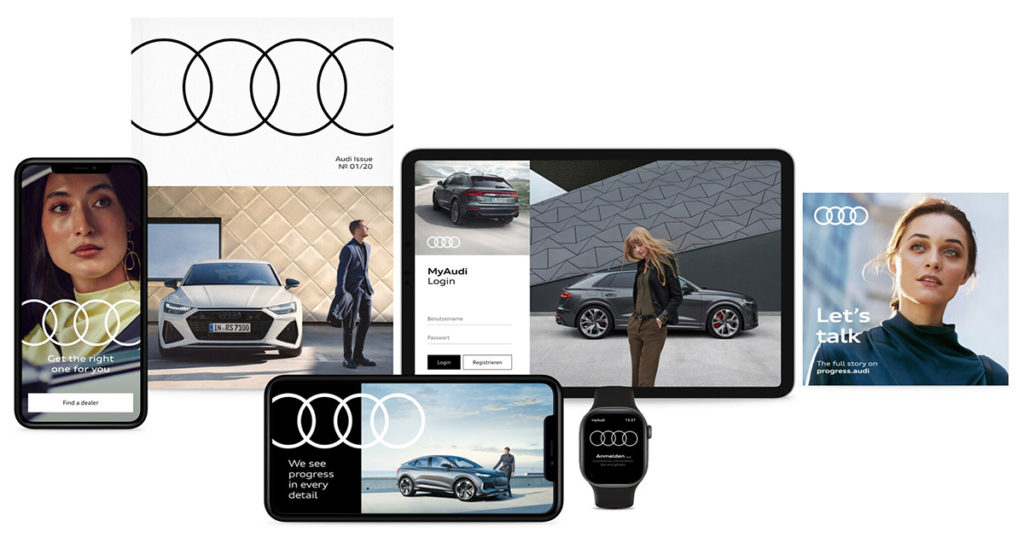
Update, 3/4/21: Audi, while not redoing their iconic “4 rings” logo, has redone the branding around that logo:
Update, 3/6/21: Speaking of Brand New, they have a good deal more information regarding Peugeot. Good stuff!
Update, 3/10/21:Dezeen has more on Peugeot, as well. And CarScoops has the first pictures of the new 308 — the new logo premieres on this model update — and discusses that, on the grille, some of the car’s sensors appear behind the logo. Interesting. (I still preferred the lion on the grille, myself. Not that we get Peugeots in the United States, anyway….) Check it out.
Update, 3/10/21: CarScoops has some more on Nizzan — uh, Freudian slip there: Nissan and their new logo.
Okay, who’s gonna be next…?
Update, 3/13/21: Uh… Renault!
Not as big a change as Peugeot, and more successful, too: single color, retains history well, still instantly recognizable, works at small sizes. Nice. Details from Motor1 or CarScoops.
Update, 3/20/21: Brand New discusses the new Renault logo:
There is nothing wrong at all with it and I do like the approach to its construction but, ultimately, it’s like it’s missing some emotion or passion or, pardon my French, a Je ne sais quoi to make it special.
I agree that the 1972 version is superior. Let’s see how this one evolves.
Way back in the day — that is, before the mid-nineties — publishing on the Mac consisted of Quark XPress. Okay, sure, there was Aldus Publisher and some bit players, but it was basically Quark or nothing. I used Quark in book design back then, and … basically hated it.
I was one of the early adopters of InDesign, dragging co-workers and companies along with me, as part of my time working at Tropicana. Not the juice cartons themselves — those were done in Illustrator — but the ancillary stuff, like marketing materials, sell sheets, and so on.
AppleInsider ran a piece a while ago (I’d missed it, initially), “How Adobe InDesign took over publishing with Steve Jobs’ help.” Good history for those of you who don’t know about those days or want a trip down memory lane, best summarized, in fact, by a commenter on the article: “This covers an interesting arc. Adobe went from an ambitious upstart trying to unseat an established, albeit arrogant, standard, to becoming the arrogant standard.”