Category: Logos

Logos are considered a subset of design in general. May include branding if appropriate.

  • Beautifully Briefed, Late March 2022: Type Museum, Toshiko Mori, and … Buick?

    Beautifully Briefed, Late March 2022: Type Museum, Toshiko Mori, and … Buick?

    Catching up with a few unrelated stories that I’ve been meaning to post — including one pretty significant failure on my part, one potentially significant failure, and because not everything should be about fail, an extremely interesting and thoughtful interview.

    Tiny Type Museum Sold Out

    I was cleaning up open Safari tabs on my phone the other day — the detritus that results from checking things on the fly when out and about, often or never closed — and noticed that I’d sort-of bookmarked something for action and … missed it. Crap!

    The Tiny Type Museum & Time Capsule, with specimens and those beautiful drawer pulls.

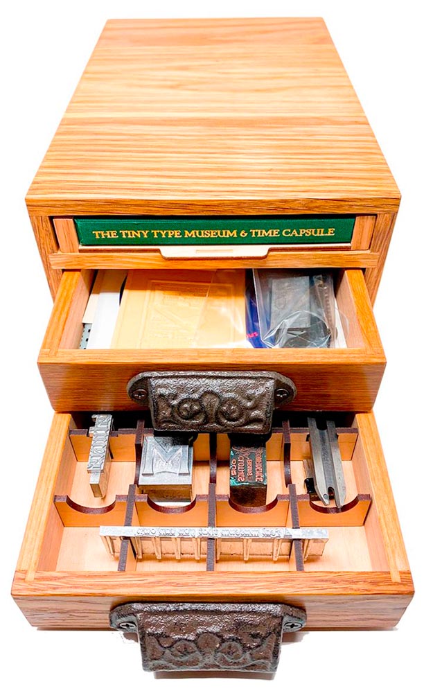
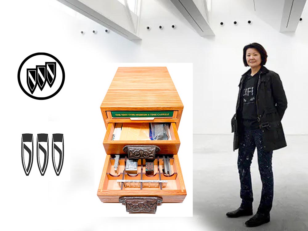
    The Tiny Type Museum & Time Capsule is a celebration by journalist and printing historian Glenn Fleishman of type and printing, and an effort at preserving history for future generations to re-discover. Each custom, handmade wood museum case holds several dozen genuine artifacts from the past and present, including a paper mold for casting newspaper ads in metal, individual pieces of wood and metal type, a phototype “font,” and a Linotype “slug” (set with a custom message), along with original commissioned art, a letterpress-printed book, and a few replicas of items found in printing shops.

    The Tiny Type Museum. (Bottom drawer.)

    The museum includes a letterpress-printed book written for the project, Six Centuries of Type & Printing, in which Fleishman traces the development of type and printing starting before Gutenberg printed his Bible around 1450 up through the present day. This book acts as “docent” for the museum, providing insight into the stages in technological and artistic development that took place, and explaining the importance and nature of the artifacts. It also slides out neatly as part of a sled from the top of the museum case, and provides the visible name.

    The letterpress book is still available: get your copy, or subscribe to the podcast. But even if you don’t, take a moment to appreciate the work that went into this — well done, indeed.
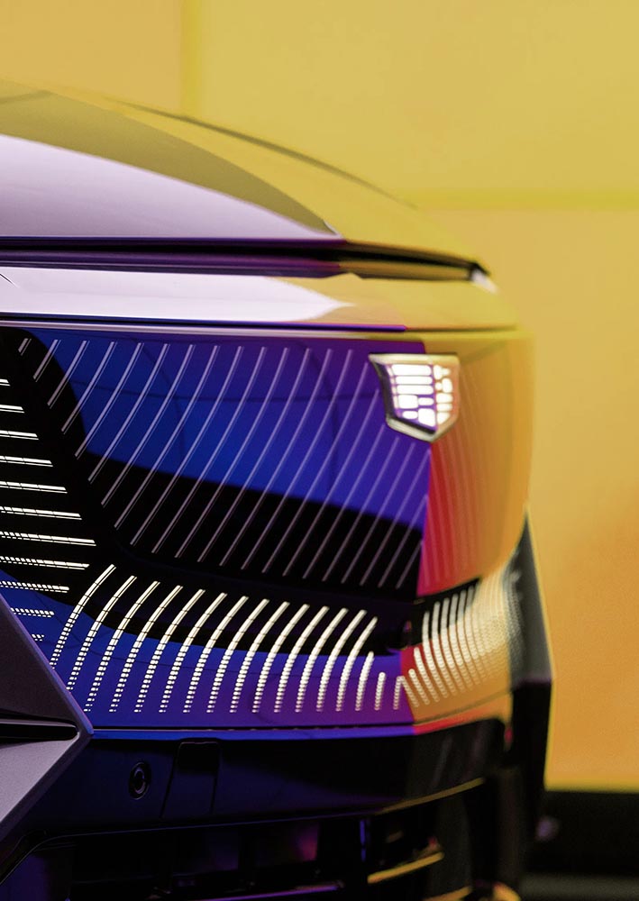
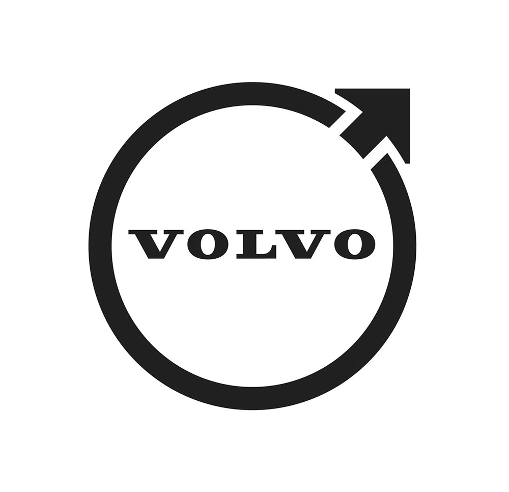
    Buick’s New Logo

    This one … I dunno. The race to do car logos flat black-and-white has seemed like a race to the lowest common denominator. (See previous coverage of BMW, Volvo, Cadillac, and more.) Below, Buick’s old (left) and new (right) logos, courtesy of Motor1:

    The trademark filing for Buick’s new logo.

    Thankfully, there’s been a leak — Instagram, natch, so no link here — demonstrating that it’ll still be in color:

    From Instagram (alas): The new Buick logo in living color.

    Still, not sure. Will have to see the official announcement and package that goes with it; Motor Trend suggests that it might be part of an EV-only future. Stay tuned for Brand New’s take, I guess….

    Toshiko Mori

    The former chair of Harvard’s graduate architecture program has given a great and wide-ranging interview to New Reader:

    I think innovation doesn’t come in one huge leap. It’s a series of small steps. Accumulations of small discoveries, followed by incremental implementation. And then it all adds up. Innovation is not a single idea—it’s incredibly incremental and additive. Even these small discoveries can change the way we think about things very quickly. So I think every step of the way—problematizing “what are the issues?” and “what are the solutions?” filtering issues of sustainability, supply chain, accessibility, will eliminate many solutions which are not possible. And then you end up with small nuggets of potential. In a way it’s very systematic, innovation, and so is experimentation. It’s the elimination of what’s not possible and focusing on goals.

    Toshiko Mori. Image courtesy of New Reader.

    You know, history is not about the past, really. History is about the story of an individual interpreting history. Historians cannot be unbiased narrators. Every history is a story, and then yes, there are facts—which are important, but the way you connect facts and then make diverse narratives is super interesting. 

    As you can see, Fox News provides false narratives, and a lot of times they skew the facts, and that’s a problem. It can be used dangerously, but it can also be used productively. I think that’s what makes history rich. It’s not about the past, it’s about projecting into the future. So when I teach students, I ask them to make their own story based upon their research. But it’s a story—so that’s kind of their own reality. And based upon that reality, they can develop diverse narratives and then communicate the story to others. It’s not as if you have different opinions, but you have different stories to share. It’s not about controversial opinions, but about the way we each look at life very, very differently—and that enriches everybody.

    The whole thing is definitely worth a read: Archinect News called it a “nuanced interview,” and if anything, that’s an undersell. Please go, reflect, and appreciate.

    Side note: New Reader‘s notes throughout the interview deserve special mention (see the red Greek letters and separate, well, sidenotes). Nice.

  • Architecture in Music

    Architecture in Music

    New Zealand-based photographer Charles Brooks, who happens to have spent years as a professional cellist, brings us some astonishing inside-the-instrument shots, including this one:

    1780 Lockey Hill Cello. © Charles Brooks

    The Colossal post, where I ran across this, is definitely worth a read. But let me just add one thing: He’s using an L-mount (yes!) Laowa probe lens, an insightful choice driven by curiosity. Well done, sir.

    His levitation shots are killer, too. And there’s behind-the-scenes (literally) stuff on his blog. Oh, and his logo is fantastic.

    Score! (Sorry — had to say it.) Go visit.

  • Cadillac and Mercedes Logos: New — or Not (Updated)

    Cadillac and Mercedes Logos: New — or Not (Updated)

    NOTE: See my previous car logo redesign coverage regarding BMW, Mini, etc., and more recently, Volvo.

    Update, 7 December, 2021: Brand New has, as usual, done a superlative job of discussing the new Cadillac logo. See their post here, remembering that they’re subscription now — possibly the best $20/year available.

    Original post follows:

    Cadillac has updated their logo, their first redesign since 2014. First, though, some history:

    Cadillac logo history

    The mid-century look, with the “crowned” logo, might be my favorite:

    Photo by Jill Refer
    Photo by Jill Reger

    As seen in the last line above, the 2014 logo is a simplification of the 2000 logo, sans the “old-person” wreath, and I thought quite successful:

    Fast-foreword (ahem) to 2021, and the monochromatic, flat-logo thing is in full swing. The latest “old-person” target is the Cadillac script, replaced with another trendy item, a custom “Cadillac Gothic” font.

    Cadillac Dealer, 2021

    Not only that, but there’s the new trend among luxury automobiles — mere cars aren’t good enough — of illuminated logos;

    Cadillac illuminated logo

    It’s Nice That has more on Mother Design’s new take on Cadillac.

    Mercedes, on the other hand, has just celebrated the 100th anniversary of the three-pointed star. Then:

    MB logo, historical

    Now:

    MB logo, now

    When it’s done right….

  • Beautifully Briefed: September, 2021

    Beautifully Briefed: September, 2021

    Let’s get the shock news out of the way first:

    Hoefler and Monotype

    It’s been thirty-two years, four months, and fourteen days since I hung out a shingle to announce that The Hoefler Type Foundry was open for business. What started as a sole proprietorship grew into the Hoefler&Co of today, a diversified design and technology practice with an international reach, still dedicated to the invention of original, thoughtful, and hard-working typefaces.

    Meanwhile, “nothing will change,” Jonathan Hoefler (previously) says, except that he’ll be stepping down. That’s kind of a big change, IMHO — but after using typography to “help elect a president,” where do you go from there? Read more here.

    In happier news, the much-delayed new Bond movie, No Time to Die, is finally in theaters next week.

    The 007 logo

    Ever wonder who was responsible for the above (slightly brilliant) graphic? Read Stephen Heller’s The Daily Heller: The Most Prolific Designer You’ve Never Known. Informative and great. Bang!

    Corp State of America: GA

    Keith Fleck has gotten a good deal of press for his Corporate States of America, but in case you haven’t seen it, it’s absolutely worth a look. Maine’s L.L. Bean, Florida’s Publix, and, of course, Georgia’s Coca-Cola are all winners. 51 bonus points!

    Lastly for this month, some book design:

    On Myself

    Daily Nous asks their readers to nominate the best philosophy book covers — Judging Philosophy Books By Their Covers — and there are some winners, some absolute losers, and a few funny moments, too:

    Black Sabbath, except not

    “This always reminded me of a rejected Black Sabbath album cover or something,” says the poster. Nice. (And only 185 cents!)

  • On Volvo’s New Logo

    On Volvo’s New Logo

    The “Iron Mark” has been given a makeover, and the result is … interesting. First, as a reminder, here’s the logo as it appeared previously — no, the one previous to that:

    2009 Volvo Iron Mark (on S80)
    My mother’s 2010 Volvo S80

    The blue has been associated with Volvo’s logo for a long while now, and it’s slowly been disappearing from the lineup (in favor of black in the same location). However, they’ve decided — they being both Volvo Cars and Volvo Group, two distinct entities (the latter including Volvo Trucks, the Volvo construction folks, Volvo Penta [marine], etc.) — to change to this new, more austere logo and word mark simultaneously. Aaaaaand:

    2021 Volvo Iron Mark

    Words fail me. Thankfully, there’s been plenty of coverage. See Brand New (subscription), CarScoops, and The Drive. What’s interesting — and largely gone under the radar — is that the logo debuted on a concept car back in June.

    Volvo Concept Recharge (2021)

    It’s part of a trend, too:

    2021 car logo redos

    See the previous coverage on Foreword. Can’t go, however, without a hat tip to Kristen Shaw at The Drive, who dug out this 1937 version — which, I’d argue, beats ’em all. Kudos.

    Volvo logo (1937)
  • Beautifully Briefed: Icons and Typography, Mid-June, 2021

    Beautifully Briefed: Icons and Typography, Mid-June, 2021

    Three items for you here, starting off with the 2021 Logo Trend Report, from the Logo Lounge. From the Asterisk to Electric Tape, Quads, Chains, and more:

    2021 Logo Trend Report

    Bill Gardner discusses all fifteen different trends, with logos to back ’em up (naturally).

    Next, “A Cabinet of Curiosities” from Hoefler & Co.

    Printers once used the colorful term ‘nut fractions’ to denote vertically stacked numerators and denominators that fit into an en-space. (Compare the em-width ‘mutton fraction.’)

    This is beautiful:

    Dutch Curio, H&Co

    A Dutch curio, representing the letters z-i-j.

    Read all of the rest.

    Lastly, these are amazing . . . and simple, the better form of “simply amazing.” Yeah:

    111 Shadow

    See the rest at This is Colossal.

    Happy June!

  • Peace, Ken Garland

    Peace, Ken Garland

    All of us recognize this symbol:

    Peace!

    Now, let’s take a moment to celebrate the creator: Ken Garland. Not your typical graphic designer, he reached out, embraced the 1960’s and ’70s, and never looked back.

    I couldn’t remember where I’d heard his name until I realized he was in toy and game design, and likely mentioned in one of the toy books I’ve worked on over the years. But there’s so much more. Read more of his life story at Dezeen (“Graphic designer Ken Garland dies aged 92“) and It’s Nice That (“Adrian Shaughnessy on Ken Garland, a ‘disruptive and questioning spirit‘”).

  • (More) Beautifully Briefed, Books and Design, May 2021

    (More) Beautifully Briefed, Books and Design, May 2021

    On David Hockney’s Piccadilly Circus logo:

    piccadilly-circus

    It’s been a minute since I’ve been in London — 2011, to be exact — and I’d love to go back. The food, the parks, the museums, the Thames, the short train rides to more interesting places (Hello, Cambridge?), and even the Tube. (We’ll leave the anti-Americanism aside for right now — we’re post-Trump and post-Covid, so traveling is at least an option!) Yet even the cultural masterpiece that is London is showing some cracks; from the New Statesman:

    Hockney’s Piccadilly Circus has also drawn criticism for its simplistic approach. Over on the cesspit of arts criticism that is Twitter, anonymous accounts that decry all art made post-1920 as an abomination have ridiculed Hockney’s scrawl as indicative of the death of art. Other critics have rightly argued that the work feels like a red flag to a bull: fuelling culture-war debates about the legitimacy of public art, rather than encouraging the public to get onside.

    I like it more every time I see it. Read more at It’s Nice That.

    On the NYC subway map:

    Speaking of It’s Nice That, an interesting new book from Gary Hustwit . . . on the debate over the New York City subway map. On the one side, the iconic Massimo Vignelli version, introduced in 1972, representing the less-is-more approach. On the other, the replacement version from John Tauranac, introduced in 1979, representing the more-accurate-is-more approach. (An updated version of the latter is still in use today.)

    But back in 1978, the two got up on stage at Cooper Union’s Great Hall — home to debates of, among others, Abraham Lincoln — and pitched their case:

    They Look Happy! (Subway debate 1978)

    Newly discovered photographs and audio lead to this new, smartly-designed, book. Read more at It’s Nice That; Dezeen has an interview with the author. Pre-order the book and get a limited-edition letterpress print at Oh You Pretty Things.

    Subway Map Debate Book

    On books and book design:

    Nice new cookbook chock full o’ seventies-era design, “Violaine et Jérémy returns with a cookbook for Molly Baz, featuring three of the studio’s much-loved typefaces,” at — wait for it — It’s Nice That:

    Nicoise Sandwich

    Sandwich Nicoice. Mmmmmmm.

    Lastly, just because, Kottke collects pencil photography to examine the typography. Nice.

    Kottke on Pencil Photography