Look out, look up, look forward, and look through in this edition of brief, link-filled goodness.
“You May Now Enter”
PRINT covers, uh, covers:
While the book blob dominated the discourse for the last few years, we’ve recently identified another trend splashing its way across new releases: the recurring symbol of doorways, open windows, and mysterious portals.
—Charlotte Beach and Chloe Gordon, PRINT
A couple of the examples they cite:
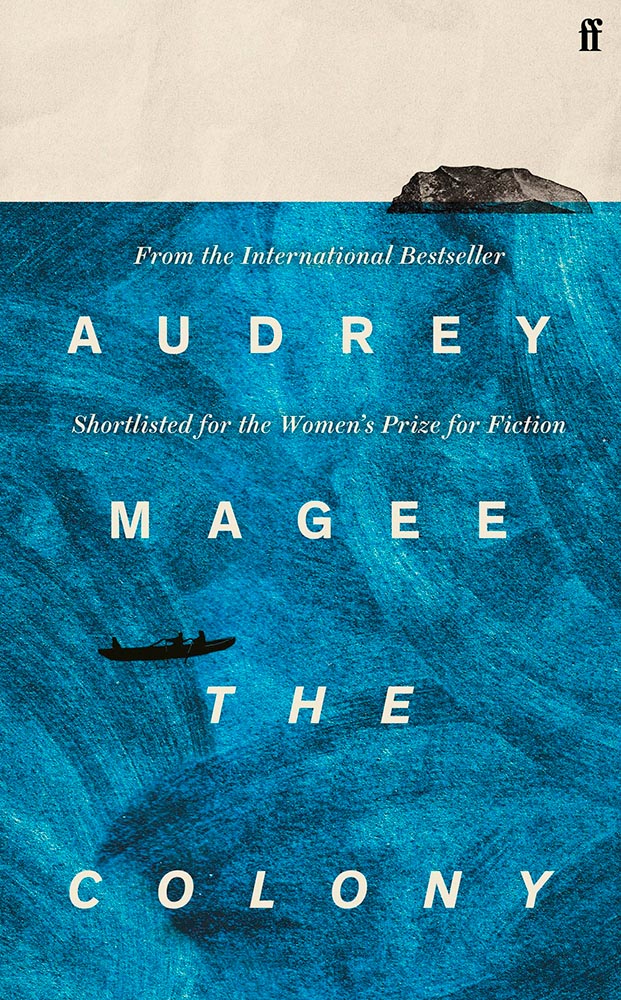
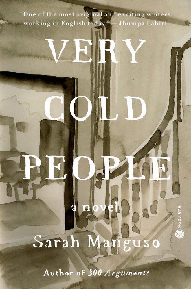
Not only a portal but a shelf. Cool.Not only a portal but also stairs. Nice.
Unlike the blob, I’m in favor of this one — the hint of the unknown is appealing in a visceral way that offers more while simultaneously offering more sales by asking potential readers to speculate and, thus, engage. Nice call, PRINT.
Here’s a question you’ve been absolutely asking yourself: what are the origins of the infamous Lorem Ipsum?
The lack of placeholders on the shelf is remarkably appropriate. (Photo: Scott Keir.)
Turns out it’s not as simple as Aldus [known as Adobe these days —Ed.] — or the even-more-infamous annonymous. Tim Carmody, the very capable guest chair at Kottke.org, fills it in: it’s Cicero. No kidding: Slate says so.
De finibus, indeed.
Fourteen Fonts to Follow
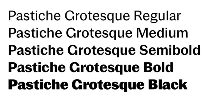
Creative Boom, where having eyes on you is actually fun, celebrates “14 Fonts to Fall in Love With” for Valentine’s Day. While Foreword may be late to the party, a couple of the type choices are first rate:
Irregardless1I absolutely want to steal their website design: the menu system is brilliant. and Pastiche, in order. (And no, I didn’t put those two together to be funny.) Read the article and pick your faves.
Art of Building Photography
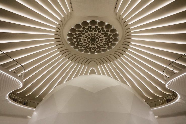
I wasn’t aware of the Chartered Institute of Building, or their Art of Building photography contest:2Their terms are good, too — something remarkably rare in contests.
“White Constellation,” by Francesca Pompei.
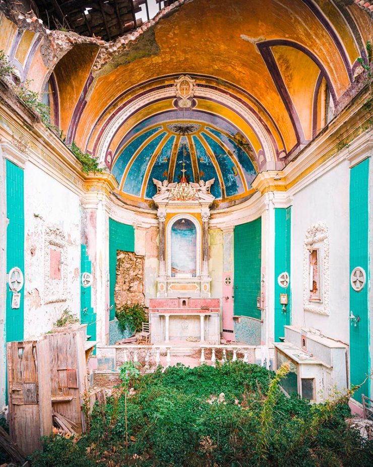
Since architecture and photography very much intersect in my camera, brain, and work, I’m glad to have found this great source of inspiration:
“House of God,” by Roman Robroek.“My own little cosmos within reach,” by Pati John.
This time, we’ve got some great book design (with a bonus), Hoefler educates on typography (with a bonus), and two updated car company logos. Let’s get right to it!
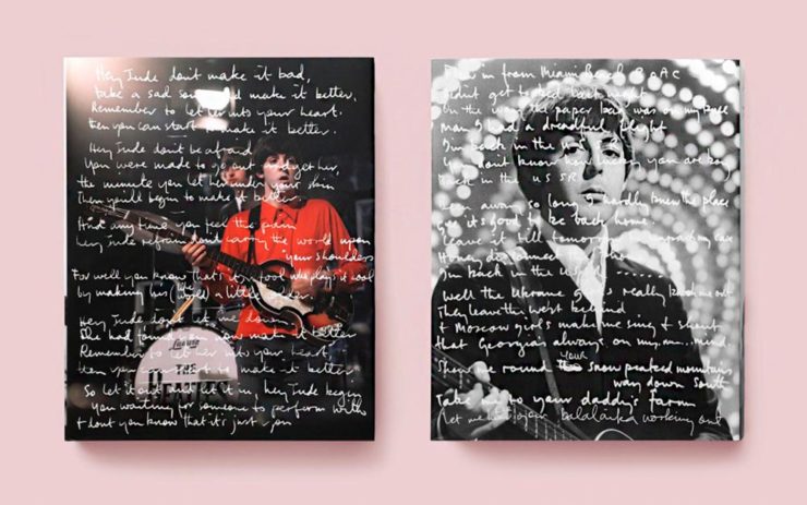
Print Magazine on the design of Lyrics
The still-very-relevant-in-2022 Print Magazine brings us a great feature on the design of Paul McCartney’s book, Lyrics:
Front and back covers of Paul McCartney’s Lyrics, by Triboro Design.
Turns out it was designed by an outfit called Triboro Design, from Brooklyn (appropriately). Print brings us an interesting interview with David Heasty, the principal:
I […] found him to be sharp, quick, articulate, and modest. Below, we discuss Paul’s involvement with the project, the book’s gorgeous bespoke typeface, and the importance of staying true to a legend’s vision.
Ellen Shapiro, Print Mag
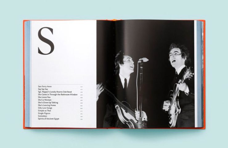
The “S” spread of Paul McCartney’s Lyrics, by Triboro Design.
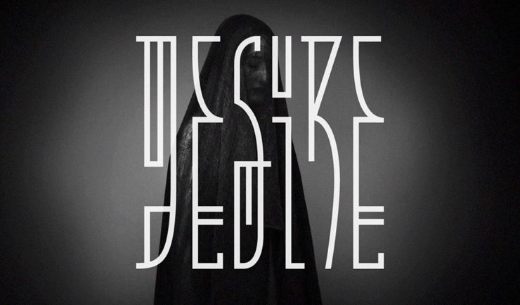
Bonus: Looking at Triboro’s website, this lovely piece of typography stood out:
Triboro Design’s Zolo Jesus album typography creates desire.
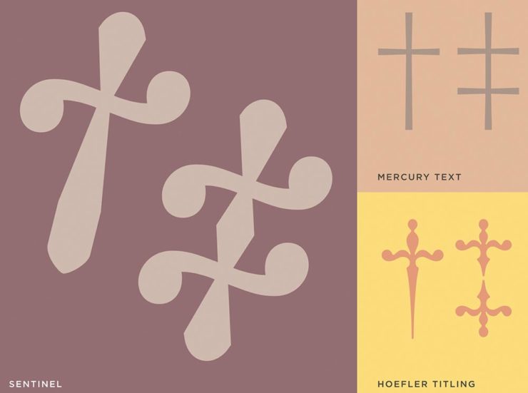
Hoefler Discusses Daggers
In “House of Flying Reference Marks,” Jonathan Hoefler talks about daggers, or, what you use when an asterisk isn’t enough:
Hoefler on daggers.
Beautiful examples, complete with a phrase you don’t hear everyday: “twisted quillon.” Read and enjoy. (If the opportunity presents, follow on with the ampersand article — which, uh, takes a stab at where the word came from. Nice.)
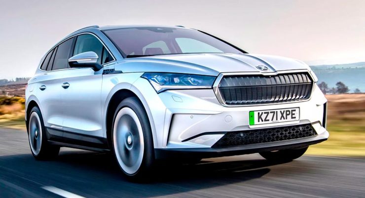
It seems like nearly all of the major car manufacturers have introduced a new logo in the past couple of years, but here are two more. One’s best described as “an update,” while the other … goes a little farther.
Skoda, for those that don’t know, is a Czech company and part of the massive VW Group. Frankly, it shows:
Skoda’s 2022 Kodiaq, a thoroughly VW Group product.
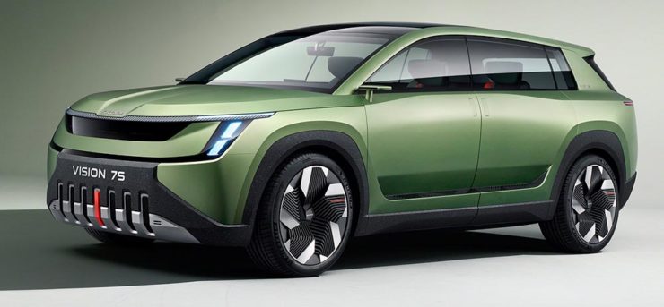
For 2023, they’re introducing a push to separate themselves from VW a little, resisting the downmarket image. As is (now) normal with updated car company identities, there’s a concept:
Skoda’s Vision 7s concept.
It’s … not inspiring. Maybe the actual updated logo will turn the corner:
Skoda’s 2022 logo.
Solid. (Pardon the pun.) But seriously, even an avid car nut like me didn’t know that represents a winged arrow — and I’m not sure the new version helps. At least they get points for consistency:
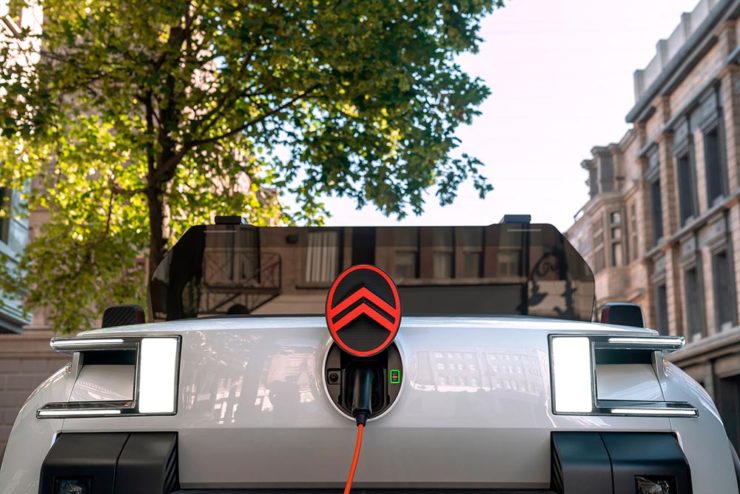
Then there’s Citroen. Even under the potentially-smothering corporate blanket that is Stellantis (there’s a name!), the pioneer of decades past still manages to actually thrive. First their new logo:
Citroen’s 2022 logo.
They’re not quite as consistent — the dual chevrons have varied a bit. This time, they’ve literally gone back to their roots, pulling the 1919/1921/1936 version out and dusting it off for modern use:
History of Citroen’s logos, 1919–2022.
Points to them for hinting at what’s to come, too:
Citroen’s 2022 logo, with just a slice of concept car showing.
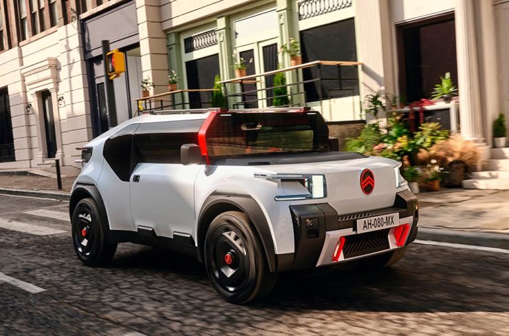
…Which turns out to be something with, ahem, Oli bits:
Citroen’s Oli: the antithesis of a Skoda.
“Nothing moves us like Citroen,” they say. The Oli moves me, to a point where I truly wish Citroen was once again available in the ’States. Cool and radically innovative, without losing sight of something VW has truly lost: fun. Well done.
Updated, 19 October, 2022:Brand New adds to Citroen’s new logo story, with a slightly-less-than-enthusiastic take on the logo and has frankly unkind things to say about the new, custom typeface (custom typefaces are now de rigueur — a policy as much related to rights ownership than creativity, alas).
I really like the cursive in this Vimeo screenshot:
YouTube? What YouTube? Citroen posts to Vimeo. Ahh, the French.
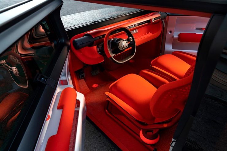
BN also includes a number of extra photographs of the simply awesome Oli, too. Here are a couple, for your enjoyment:
Plug-and-Citroen.
Note the removable Bluetooth speakers (the black tubes with “+” and “-“) and, especially, the seats:
A wide selection of items for the beginning of fall, from positive fonts to jolly cameras — with Adobe and Pantone pouring some cold water on things. Let’s get to it!
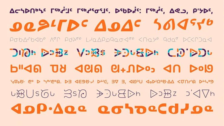
Indigenous Letterforms
As Americans, Europeans, or, more generally, Westerners, we take for granted that fonts will reflect the various pieces of individual type — that is, letterforms — that we’ll need. But not everyone falls into that category.
North American Indigenous fonts — with updated Unicode. Major Kudos. (Courtesy of Dezeen.)
“When [the Unicode Standard] doesn’t contain characters in a given language’s orthography, it is not possible for that community to accurately use their language on digital text platforms.”
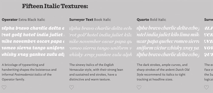
Italics can be the most colorful part of a type family, diverging dramatically from their roman cousins. Here’s a look at twelve kinds of italic typeface, with some notes on their cultural contexts, historical backgrounds, and practical applications.
Hoefler & Co.
Read the article, “Italics Examined,” at Hoefler & Co.’s Typography.com.
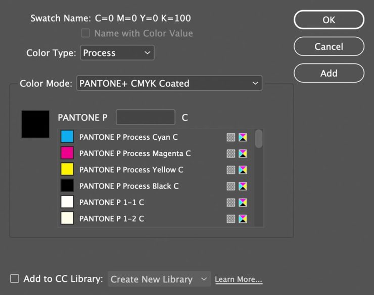
Adobe Types, “Stop.”
Adobe and Pantone are having a . . . thing. As a result, all Pantone spot libraries have been removed from Adobe products:
A classy move, completely in character for both companies, to reach into users’ machines and remove stuff they had paid for and may rely on because of some licensing spat.
Nick Heer, Pixel Envy
I didn’t get a notice in either InDesign or Photoshop, but a check in InDesign (the CC 2022, aka 17.4, version) shows only the CMYK libraries:
Adobe’s Pantone+ CMYK (Coated) color picker, from InDesign CC 2022
You can subscribe to the additional libraries from Pantone for $60/year. Book design is almost exclusively CMYK, so I won’t be . . . but grrrr.
Update, 28 September, 2022: Adobe got around to putting up a banner in my version of InDesign — blaming Pantone:
This notice showed up September 27th, 2022.
They’ve put up a “help” page. (I took a moment to fill in the feedback at the bottom of that page, too: “Removing features we’ve paid for is incredibly uncool, Adobe. Shame on you.”)
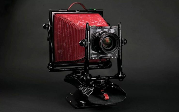
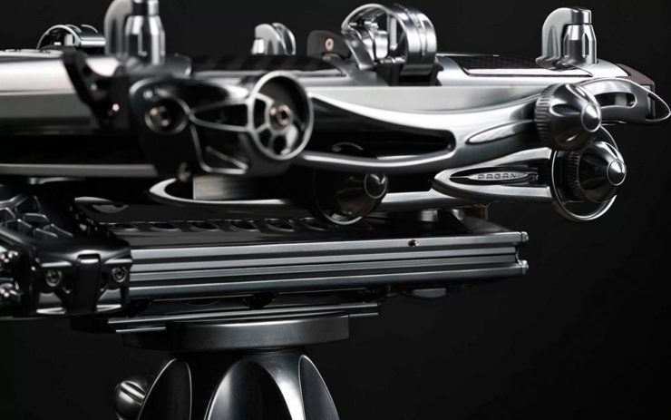
Two Awesome New Cameras, from $100 to $100,000
So Pagani, the multi-million-dollar sports car manufacturer, has decided to market large-format cameras. Okay!
One of Pagani’s new camera modelsA closeup of the (beautifully-detailed) tripod plate for Pagani’s new cameras.
Incredible, breathtaking detail and quality, based on Gibellini models but taken to 11. But like their cars, mere mortals need not apply: their cameras start over $100,000.
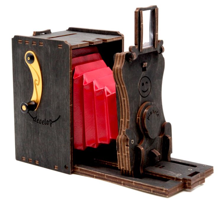
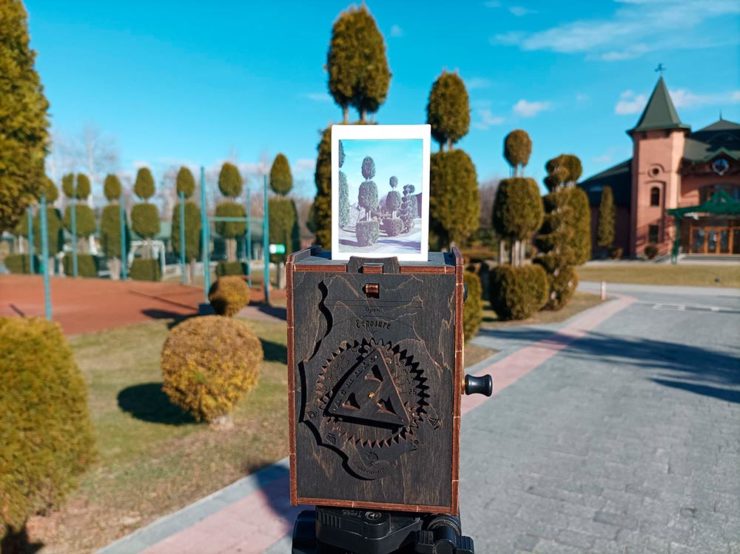
Mortals can dream, sure, but here on Earth, I encourage an order from this Ukrainian company instead:
Jollylook’s Pinhole Instant Mini film cameraJollylook’s Pinhole Instant Mini in situ
They’re based on instant film cartridges, are made of recycled materials, look incredibly cool, and a kit starts at an incredibly-reasonable $99. Throw in a few extra dollars to support Ukraine and . . . feel Jolly.
Three interesting logo redesigns this month, plus a moment where venti has nothing to do with coffee. Oh, and a airy bonus.
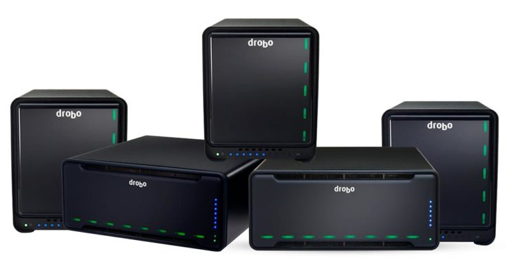
Drobo Declares Bankruptcy
Generally speaking, I’m not one to engage in schadenfreude, aka “enjoying the pain or suffering of another.” (Wiki. Anyone surprised that the Germans have a word for this … but I digress.)
A selection of expensive, unreliable junk.
Back in 2011, I lost two Drobos in short order — and with them, the majority of my back files. Project I’d worked on, photographs I’d taken, personal documents, years worth of stuff, just gone.
Drobo, the company, did nothing to help, offering neither solutions nor apologies. I wasn’t alone; forums across the ’net suggested that I should have chosen more carefully.
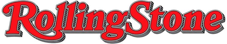
To call Rolling Stone‘s place in America culture iconic might be selling it short, and their logo plays a large role in that. In 2018, they flattened it — leading that trend, possibly — and it lost something.
However, this month, it’s back:
Rolling Stone’s 2022 logo redesign.
“The assignment was a paradox. How could we make the logo look like it did in the past, without making it feel dated? My hope is that loyal readers will believe the old logo is back, but on closer inspection will be surprised to notice how much it has been modernized.”
Jesse Ragan, XYZ Type
The “old logo” he’s referring to is the one that ran from 1981–2018, but there were others, too:
Rolling Stone’s lettering shapes through the years. See more at both links.
A great study in logo evolution: read more at the Type Network, and lettering specifics from XYZ Type. Awesome. (Hat tip to, as usual, Brand New.)
Aston Martin’s New Logo
On the subject of subtlety, Aston Martin usually isn’t the first thing that comes to mind. Their recent logo redesign, however, falls into that category:
Wings of Glory (so to speak)
The evolution of their logo emphasizes those small steps:
AM’s logo through the years.
Not a great amount of information on this one, but the accompanying photographs of the logomark being made are fantastic. See more at The Drive, with more at Brand New.
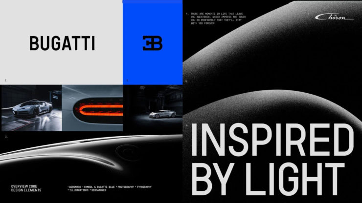
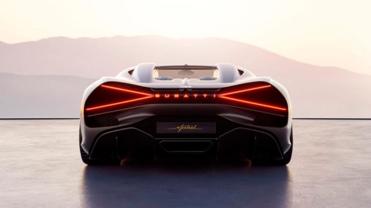
Bugatti’s New Logo
Subtlety and Bugatti rarely — if ever — fit in the same sentence. Aston is stratospheric as far as I’m concerned, so Bugatti would qualify as the antithesis of subtlety. But, but, but: there’s something about one.
The new Mistral. (Sorry, it’s sold out.)
They have a new logo and marketing campaign to go with:
Specifics, courtesy of Interbrand.The Mistral from the back, showing the new type treatment.
It’s been a busy August, including having to make a lightning trip through the usually-not-fun Atlanta airport. But there’s always a bright spot at the end of that tunnel: being the little boy again, awed by the simple act of flying.
Better still, the flight was on a 757, the sports car of big planes. Everybody around me had their window shades pulled and noses in their phones, but I was looking out the window:
Note: Click on the title above to see this post in one-column format, which includes larger graphics — helpful with some of these jackets especially. (This applies to any post here on Foreword, by the way.)
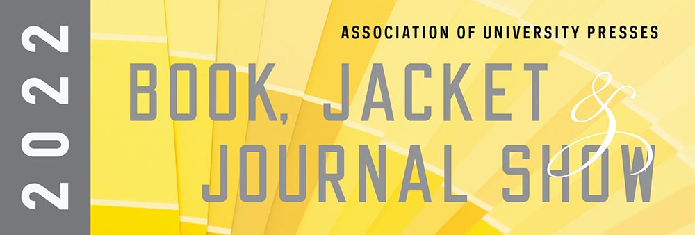
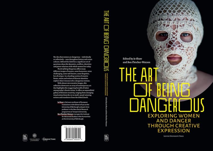
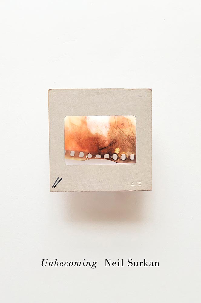
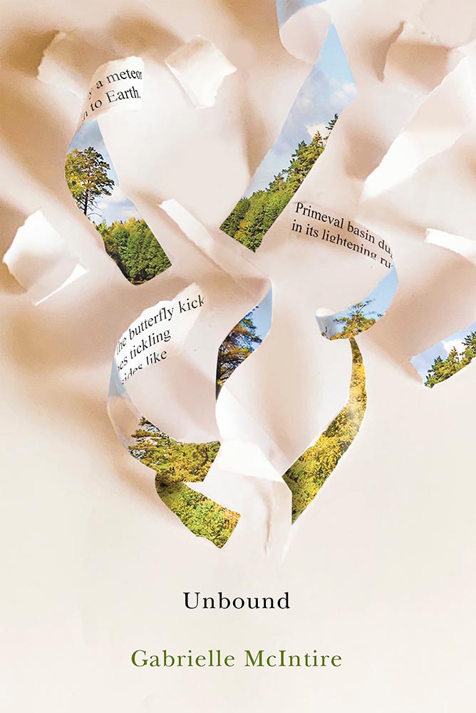
It’s time once again to celebrate the unsung heroes of the book world: the best items published by university presses.
The annual show, now in its 57th year, honors the university publishing community’s design and production professionals. The Association recognizes achievement in design, production, and manufacture of books, jackets, covers, and journals, and the Show serves as a spark to conversations and source of ideas about intelligent, creative, and resourceful publishing.
Association of University Presses 2022
This show, like the 50 Books, 50 Covers also announced around this time of the year, is cool in that it doesn’t just talk about a book’s exterior — there are covers and jackets, interior design, even awards for the quality of typography.
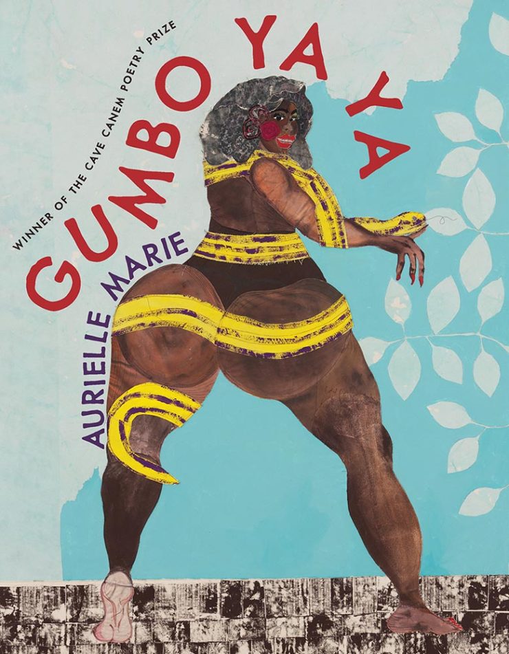
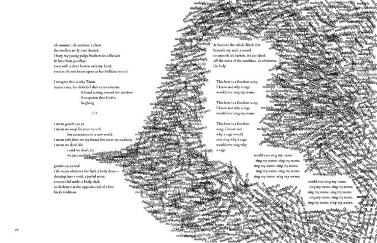
Let’s talk about titles with both covers and interiors first, starting with the great Gumbo Ya Ya from the Poetry category:
University of Pittsburg Press. Cover design by Alex Wolfe.University of Pittsburg Press. Interior design by Alex Wolfe.
The strength of this design, inside and out, towers head and shoulders and whatever else above — designer Alex Wolfe deserves this win and many kudos from me.
Georgetown University Press. Design by Jeff Miller.
Flag-as-fence. ’Nuff said.
McGill-Queen’s University Press. Design by David Drummond.McGill-Queen’s University Press. Design by David Drummond.McGill-Queen’s University Press. Design by David Drummond.
I don’t know that these are a series of titles as much as a style forthe titles — but, in either case, they work.
University of Pittsburgh Press. Design by Henry Sene Yee.
Not the only title here with textured paper, the simple typography with a fantastic — and fantastically-placed — bird wins for more than literature.
University of Minnesota Press. Design by Casalino Design.
The white border around this is difficult to see here, but adds to the overall in an interesting way; I also like the hand lettering over this amazing photograph.
University of Nebraska Press. Design by Nathan Putens
Additive color combined with the subtitle-of-the-year on this winner.
Princeton University Press. Design by Derek Thornton.
Great, great typography here. When combined with the radiating lines and provocative title, it makes for a title that I’d absolutely pick up.
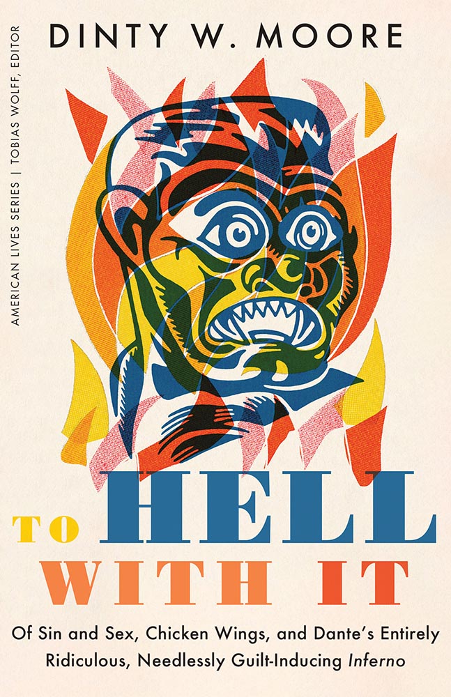
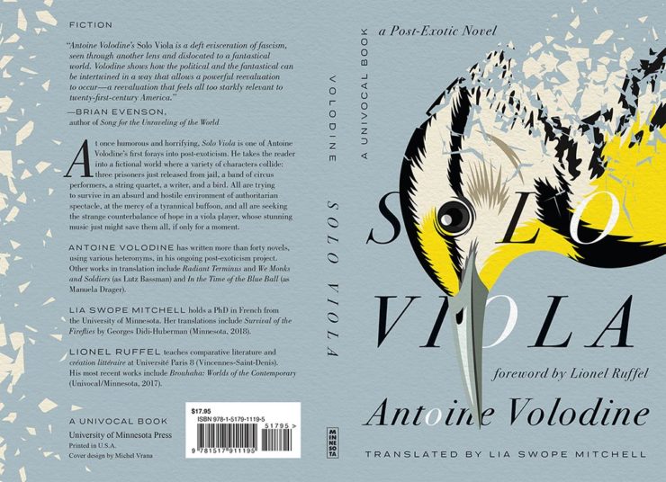
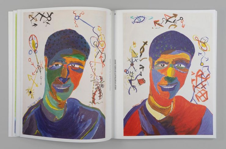
I’ve saved my favorite from the whole show for last:
University of Minnesota Press. Design by Michel Vrana.
Another appearance of textured paper is just the start here, with that illustration rocking so hard indeed — the eye! Fantastic in every way. (Bonus points for “A Post-Exotic Novel.”)
See all of the entries from this great Association of University Presses show here. (FYI, nothing from Spine yet, but kudos to the University of Chicago Press for blogging about their favorites.)
AIGA has announced their winners of the 2021 50 Books, 50 Covers competition:
With 605 book and cover design entries from 29 countries, this year’s competition recognizes and showcases excellence in book design from around the world. […] Eligible entries for the 2021 competition were open to books published and used in the marketplace in 2021.
AIGA Press Release
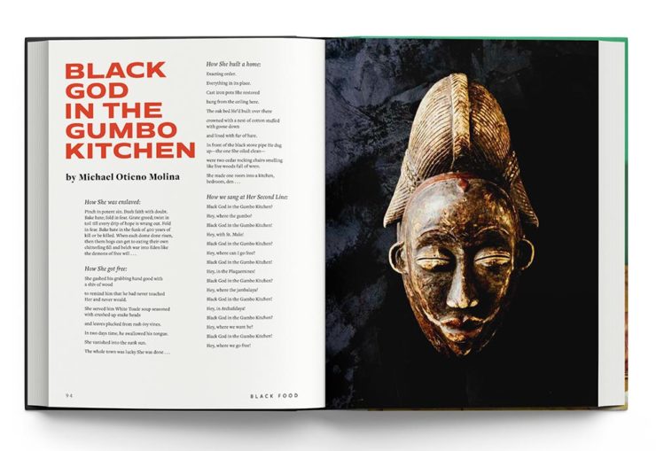
In this year’s competition, innovative book designs for topics ranging from designing and motherhood, African surf culture, stories of resistance, visual histories of Detroit, Black food traditions, and more all give our jury life, hope, and visible windows into new possible worlds. The covers and books we looked at had a diverse range of visual language and took aesthetic risks.
Silas Munro, AIGA [Competition] Chair
As usual, there are items here that I haven’t seen before, along with several that surfaced on others’ “best of 2021” book design lists (see that Foreword post for my faves). Also as usual, there are some excellent choices.
Further, there’s something in this competition that you don’t see in the usual “best of” posts: interiors. Half of the competition is covers, sure, but the other half considers the whole book design — and sometimes, as I can definitely attest, an underwhelming cover can lead to a treasure within.
But enough talking. My favorites, in no particular order:
Cover by George McCalman.Book design by George McCalman.
This is one from the 2021 “best of” finalists that I didn’t post about — but now that I’ve seen the interior…. So very worthy. (See more.)
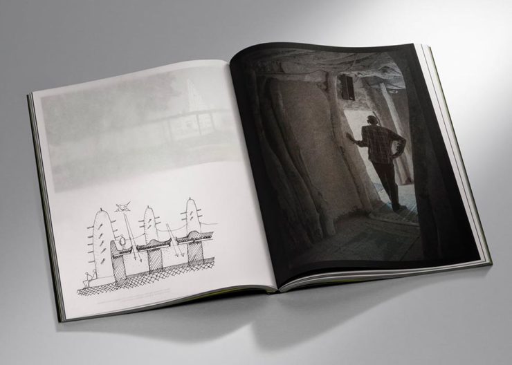
Cover design by David Chickey and Mat Patalano.Book design by David Chickey and Mat Patalano.
This series of three books not only have striking covers I’d not seen before but exceptionally competent interiors done on matte paper, a personal favorite. (Click through for more examples.) Excellent.
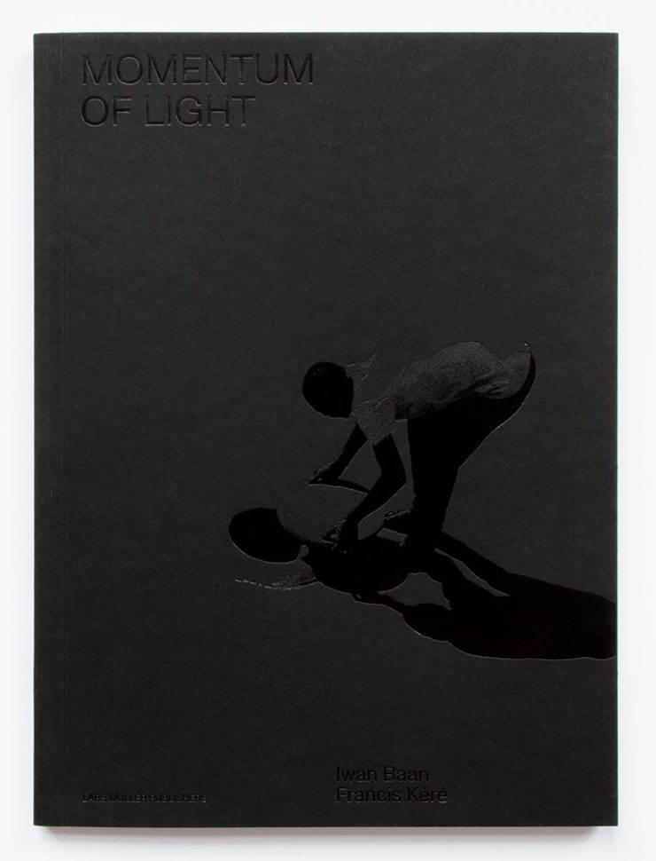
Design overseen by Haller Brun.Design overseen by Haller Brun.
In this fascinating book, architectural photographer Iwan Baan and (Pritzker-winning) architect Francis Kéré “set out to capture how the sun’s natural light cycle shapes vernacular architecture.” While I may be slightly biased in terms of architecture and photography, this one’s a winner. (Read the AIGA’s take.)
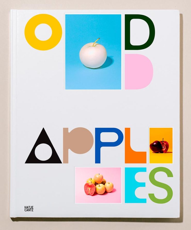
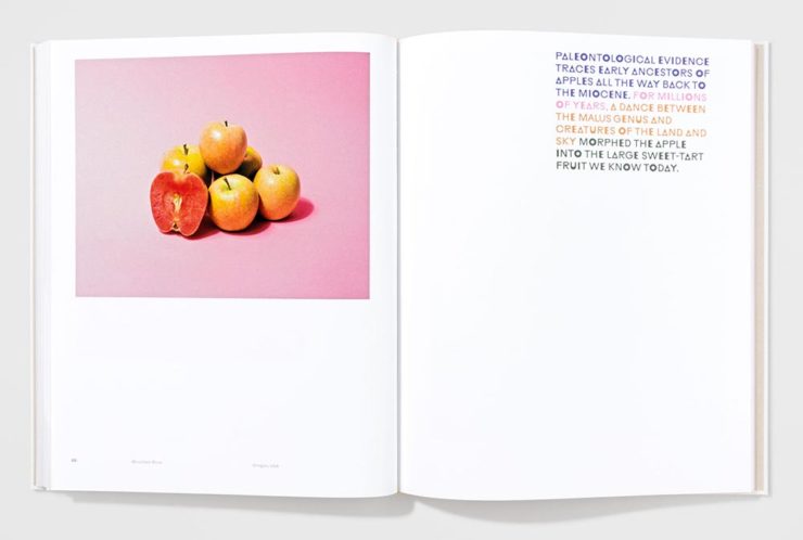
Cover by Andrea A. Trabucco-Campos.Book design by Andrea A. Trabucco-Campos.
“A little overly precious,” the AIGA says … while awarding it a prize. Completely fresh, I say, with interesting content presented in a way that does considerably more than interest. Well done. (See them apples.)
Cover by Gary Fogelson and Ryan Waller.Book design by Gary Fogelson and Ryan Waller.
“The type on the cover and in the body is perfect, in all ways and choices. The use of the gutter for captions is a great understanding of the art and a perfect way to save space. The page numbers too.”
Brian Johnson, AIGA Judge
This is one of those books that you have to say, “I wish I’d done that.” Great stuff. (See its individual entry.)
The Time Formula. Cover by Honza Zamojski.Book design by Honza Zamojski.
There always seems to be some projects that violate book design “rules” — this one doesn’t have a title on the cover, has page numbers in the gutters, and more. Yet this book, about a sculpture project, makes for interesting viewing indeed. (See more.)
Last, we have a couple that are only covers:
Cover by Janet Hansen.
This was considered for my favorites of 2021 (and made it onto others’ lists). I’m glad to have been given the chance to call it out. Excellent in its simplicity. (See the AIGA entry.)
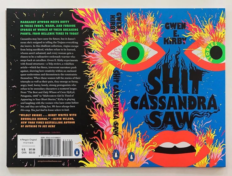
Last, but certainly not least:
Cover by Lydia Ortiz.
Another advantage of this competition: seeing more than the front cover. And this cover, front, back, and spine, is so much more — especially in person: black plus four neon inks. Wow. (See the AIGA’s praise.)
A book design treat for your Monday morning: four of my favorite new book covers from last month’s debuts.
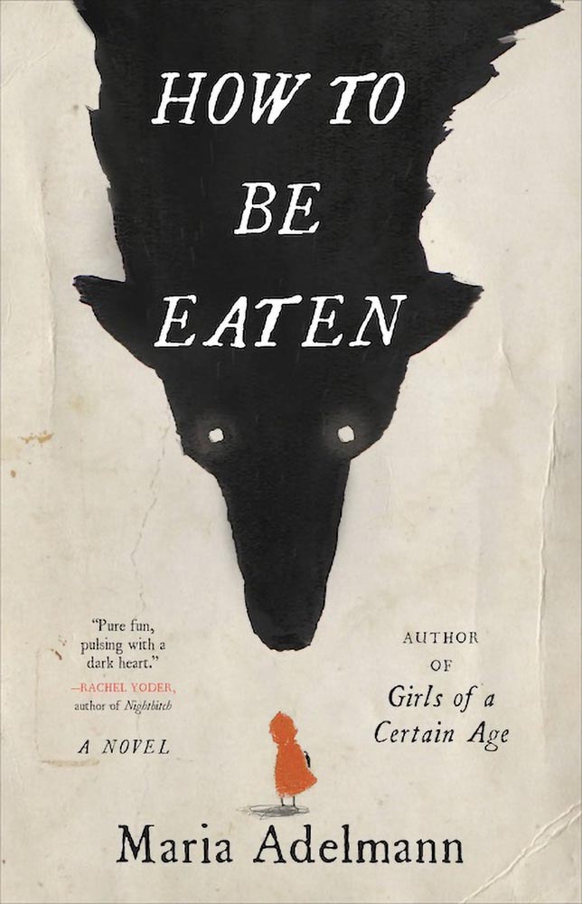
How To Be Eaten. Design by Julianna Lee.
Aged, distressed paper is a great look when done well, and this one hits all the right notes. The size relationship between the characters, the glow around the eyes, the two color choices, the type, all of it — great stuff.
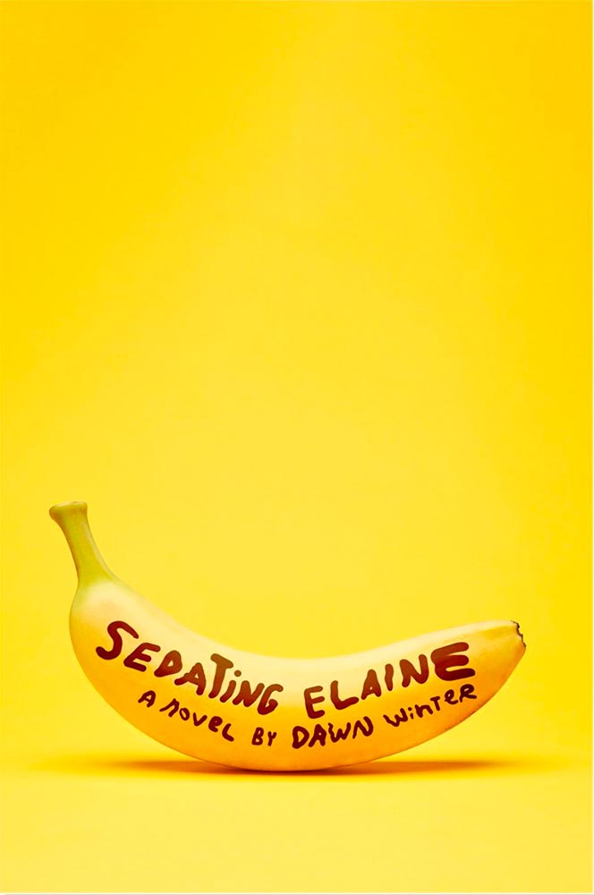
Sedating Elaine. Design by Janet Hansen.
A veritable how-to on less-is-more. Brilliant.
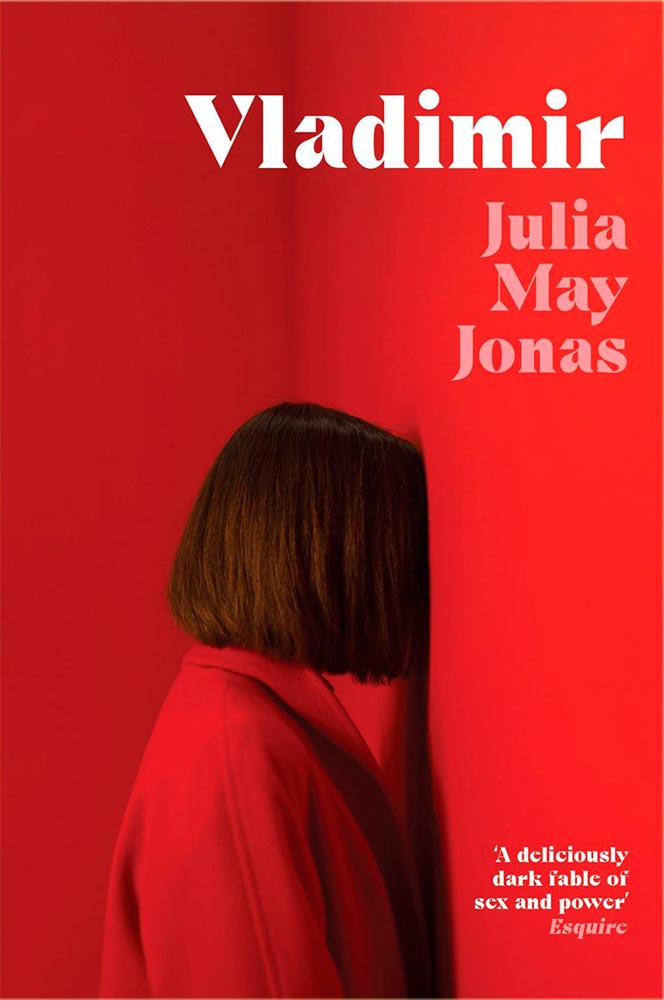
Vladimir. Design by Katie Tooke.
Another solid-color triumph. Great font choice here, too. Awesome.
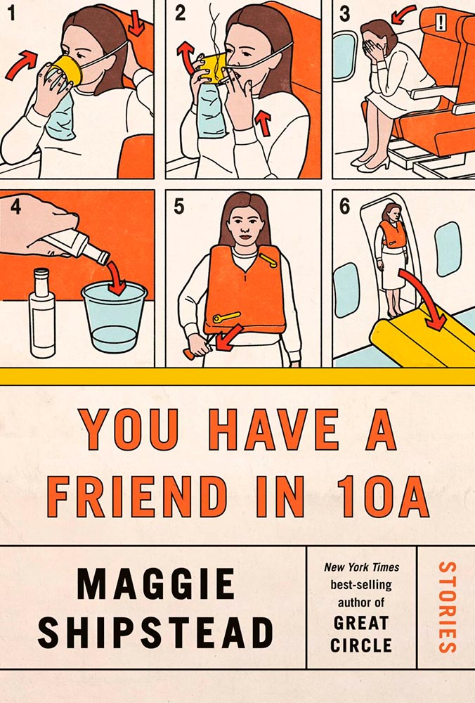
I’ve saved the best for last:
You Have a Friend in 10A. Design by Kelly Blair.
Great Circle has featured before, and this follow-up takes us inside the plane and into the safety brochure in the best possible way. Great, brilliant, and awesome wrapped into one.
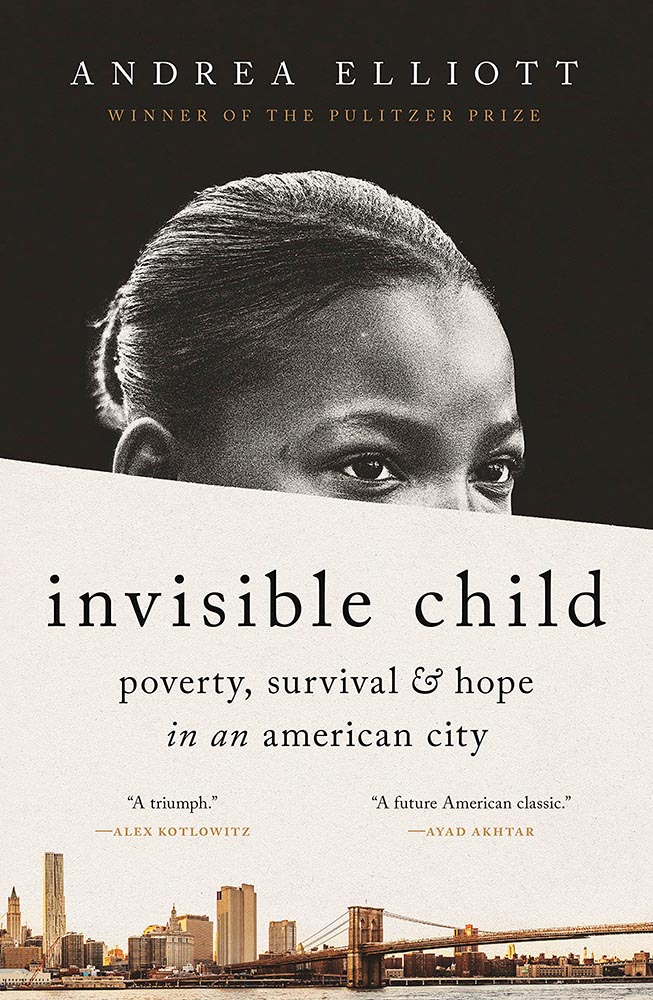
Update, June 20th: WABE, Atlanta’s NPR station, has a summer reading list out, highlighting Georgia books and authors — and I’d like to include two of the covers here:
Invisible Child.
The grainy photograph, the wonderfully placed city skyline, and classic typography, combined with the diagonal cutline, elevate this title from mundane to eye-catching.
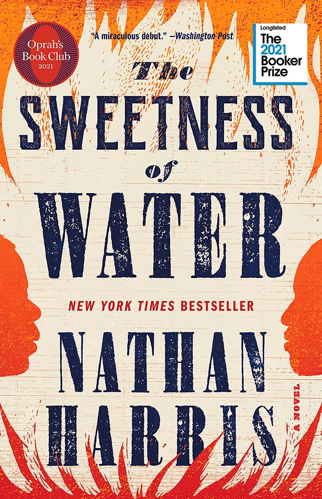
The Sweetness of Water.
Excellently distressed doesn’t begin to describe this, on many levels. Side note: it’s a terrible shame that the Oprah and Booker call-outs have been elevated to logo status in what can politely be described as a distraction (from a book designer’s point of view, at least).
This month’s favorites cover a delightful new extension of the typeface DaVinci, Google’s updated mega-font, Noto, photographs of a desert aircraft boneyard from above, and mega-photographs of the Milky Way.
Before we get there, however, I wanted to wish Jason Kottke — whose 24 years of web sleuthing has been a source for items here on Foreword dating back to its original iteration in the ’90s — good luck on his sabbatical:
“I need some space to think and live and have generative conversations and do things, and then I’ll make something, but I can’t tell you what it is just yet.”1Alexandra Bell, NYT That’s the sort of energy I need to tap into for a few months.
Hear, hear.
The Beautiful DaVinci Italic
It’s Nice That points us to a new, extended version of the font DaVinci, done for Sydney’s Biennale:
“When you do this sort of type exercise — based on printed letters — it gives a very organic shape and form, in opposition to the very metallic sharp shape from type materials.” Furthering this organic look by pushing the fluidity curse at its maximum, Virgile ended with a design “which is very historical, yet with a contemporary twist.”
Just look at those glyphs!
Makes you want to find an excuse to use it. But that’s not all: Flores is an incredibly diverse artist whose work both challenges and inspires. See more.
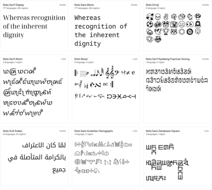
Google’s Noto
Called “A Typeface for the World,” Google’s Noto defines “megaproject.”
Noto is a collection of high-quality fonts with multiple weights and widths in sans, serif, mono, and other styles. The Noto fonts are perfect for harmonious, aesthetic, and typographically correct global communication, in more than 1,000 languages and over 150 writing systems.
Google’s Noto font collection.
According to Google,
“Noto” means “I write, I mark, I note” in Latin. The name is also short for “no tofu”, as the project aims to eliminate ‘tofu’: blank rectangles shown when no font is available for your text.
While the font itself has been around for a few years — 2013 seems like yesterday in so many ways! — it’s updated regularly, cover 150 out of the 154 scripts defined in Unicode, and deserves attention from every web designer and type nut. Read more at Google or Wikipedia. (Via Kottke.)
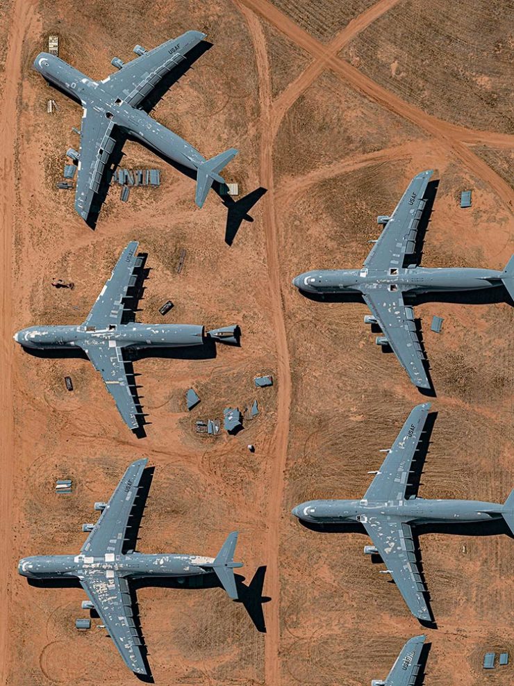
Aircraft Boneyard, From an Aircraft
This is Colossal introduces us to Davis-Monthan Air Force Base in Tucson, Arizona, whose desert conditions are ideal for storing — and scrapping — aircraft:
What happens when the military’s aircraft are end-of-lifed
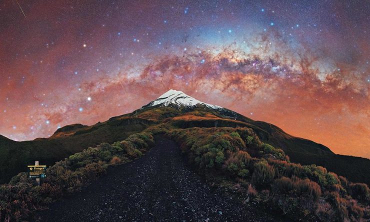
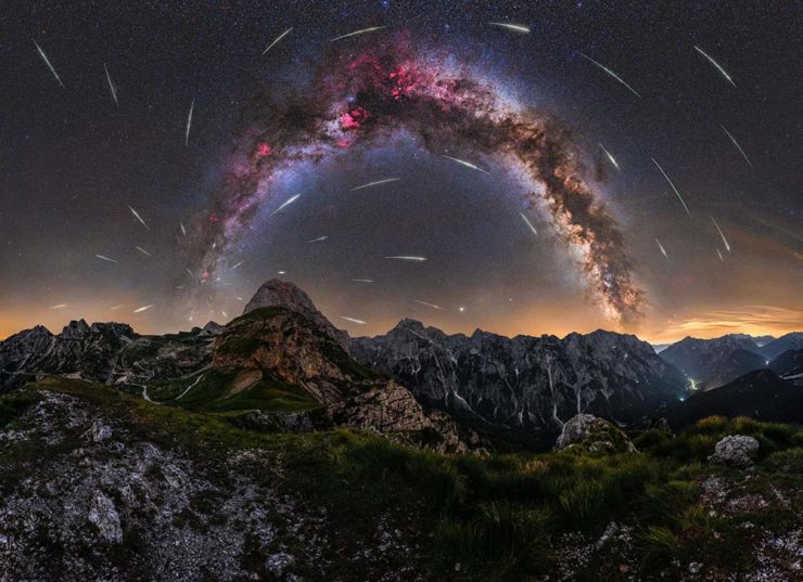
We don’t get many opportunities here in Middle Georgia, but in other, less populous (read: less light-polluted) places in the world, the Milky Way shines forth from the heavens:
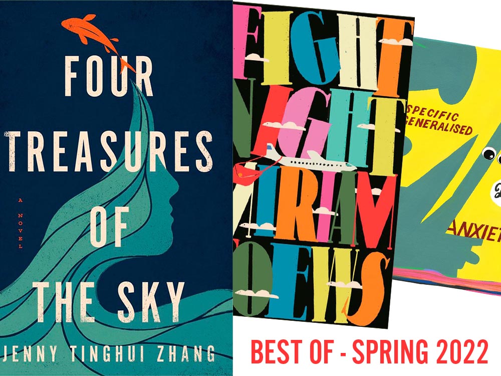
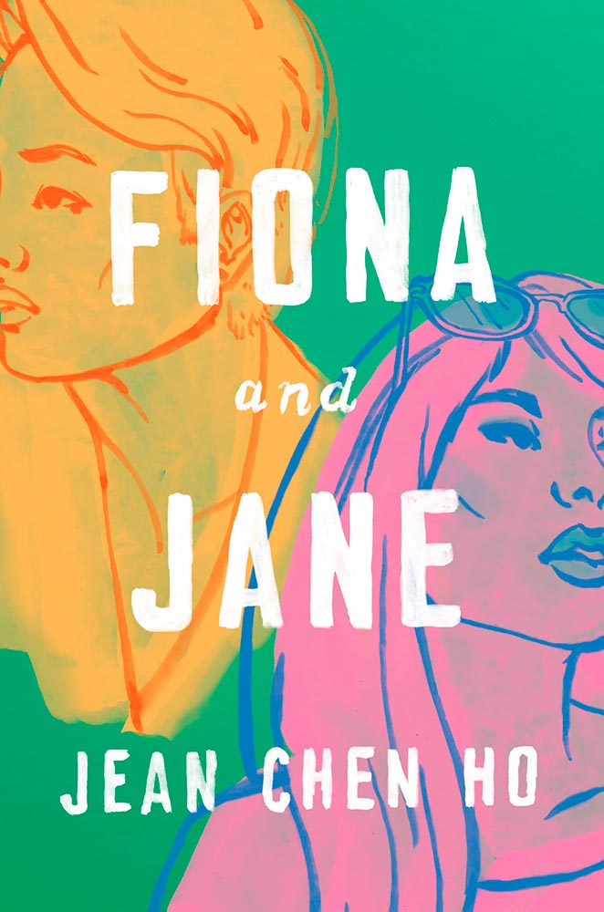
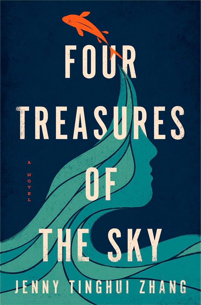
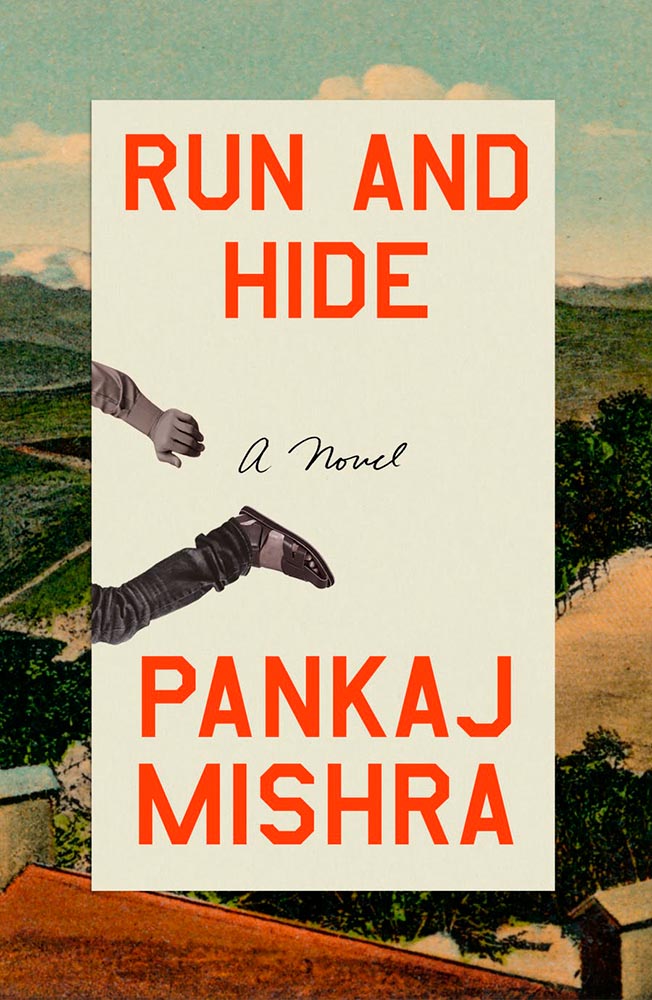
For your May Day, please take a closer look at twelve great book covers — and a bonus thirteenth! — spotted during the first four months of 2022.
In alphabetical order:
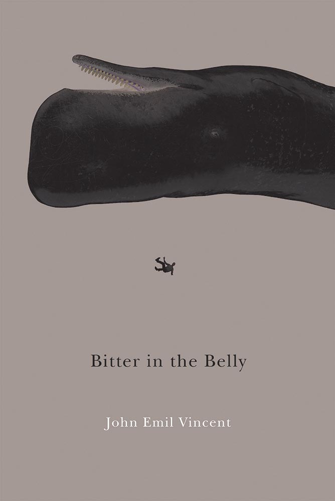
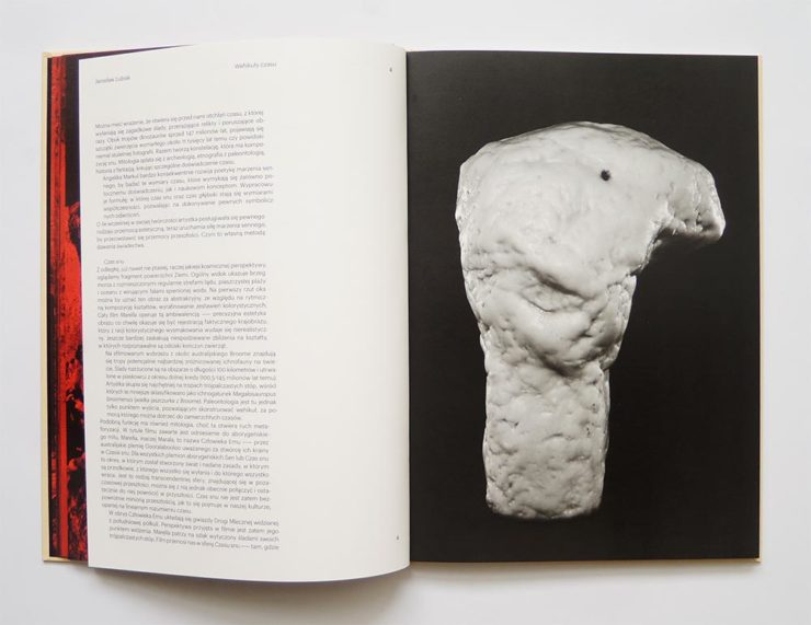
Book design: David Drummond
Brilliant: actual text, printed (on a great color paper, too), with actual string, photographed on said print. Not only is it exactly right for the subject matter, it’s simply and beautifully done.
Cover design: Brianna Harden
Another great background color choice, this time highlighting the awesome colors chosen for Fiona and Jane’s illustrations. The hand-painted text is perfectly done.
Cover design: Vi-An Nguyen
Woodcut or just aged? Doesn’t matter, as “brilliant” falls short when describing this title.
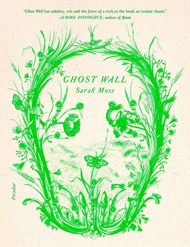
Cover design: Alex Merto
From It’s Nice That, we have a nice feature on Alex Merto — whose Ghost Wall cover is a great example of plant life adding so much more: “the force of a river to the head,” to paraphrase Emma Donoghue’s quote.
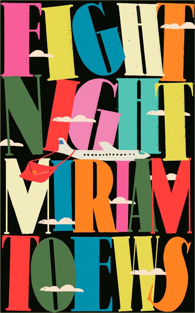
Cover design: Anna Morrison
The typography, awesome little plane — the purse(r)! — the clouds, all of it: sky-high levels of good.
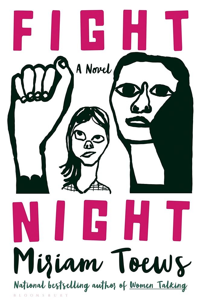
Interestingly, Fight Night‘s cover has gotten notice before:
Cover design: Patti Ratchford, illustration: Christina Zimpel
I can’t begin to imagine what caused the redesign, or why it wound up being so radically — 180 degree! — different. The old design wound up on some “best covers” lists (here’s LitHub’s October 2021 post, for instance); the new one has wound up on mine.
Cover design: Christopher Sergio
LitHub says this one has a very high “hang on the wall” factor. I can’t think of a better description — great stuff.
Cover design: Na Kim
Na Kim just can’t help but design the best covers: a wonderful, antique background complimented by brilliance. (Great typography, too.)
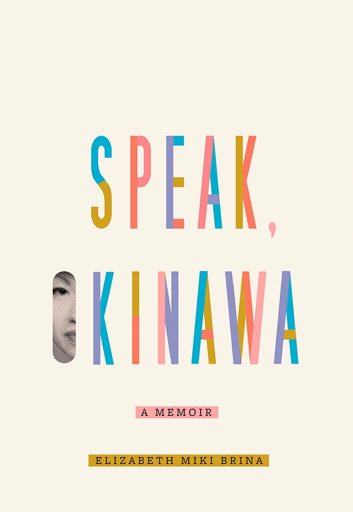
Cover design: Emily Mahon
It’s nigh-on impossibly to look at this cover and not flip it around to read the text trisecting the leopard. Take something simple, add the elusive more, get this. Yeah.
Cover design: Jim Tierney
Another fantastic example of plants adding more than the sum of their parts. The mottled green background and watercolor-style falloff is perfectly complimentary. Great stuff. (Except: This is one of those times when an editor or publicist somewhere says, “Hey, we need to add this quote at the top. Let’s do it without consulting the cover designer.”)
Cover designer … unknown. Credit where credit is due — when I can.
Never mind the great brushed color blocks or boat-rowing-the-ocean above the title. This is here for the overlap between color and island. Shortlisted for the prize for intersection-of-the-year.
Cover design: Leanne Shapton
This illustration being in grayscale is, at first, a little off. But, of course, that’s exactly the point. I overuse “brilliant,” but it’s the best description. (See a note from the designer at LitHub‘s cover reveal.)
So, the bonus. No, it’s not the extra Fight Night, above, it’s a fictitious cover. That’s right:
Cover design: Anna Hoyle
In another It’s Nice That post, we have Anna Hoyle: “Judge her fake books by their comical covers.” Okay!
More book design updates soon — ’cause, here in Georgia, USA, we’re done with spring. Summer starts . . . now.
Catching up with a few unrelated stories that I’ve been meaning to post — including one pretty significant failure on my part, one potentially significant failure, and because not everything should be about fail, an extremely interesting and thoughtful interview.
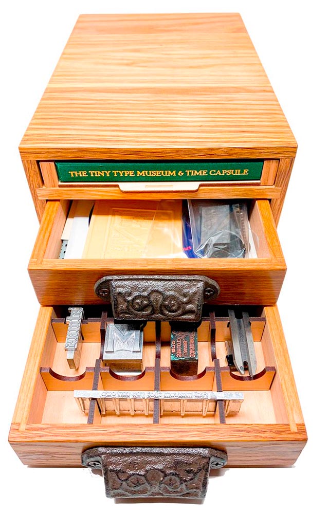
Tiny Type Museum Sold Out
I was cleaning up open Safari tabs on my phone the other day — the detritus that results from checking things on the fly when out and about, often or never closed — and noticed that I’d sort-of bookmarked something for action and … missed it. Crap!
The Tiny Type Museum & Time Capsule, with specimens and those beautiful drawer pulls.
The Tiny Type Museum & Time Capsule is a celebration by journalist and printing historian Glenn Fleishman of type and printing, and an effort at preserving history for future generations to re-discover. Each custom, handmade wood museum case holds several dozen genuine artifacts from the past and present, including a paper mold for casting newspaper ads in metal, individual pieces of wood and metal type, a phototype “font,” and a Linotype “slug” (set with a custom message), along with original commissioned art, a letterpress-printed book, and a few replicas of items found in printing shops.
The Tiny Type Museum. (Bottom drawer.)
The museum includes a letterpress-printed book written for the project, Six Centuries of Type & Printing, in which Fleishman traces the development of type and printing starting before Gutenberg printed his Bible around 1450 up through the present day. This book acts as “docent” for the museum, providing insight into the stages in technological and artistic development that took place, and explaining the importance and nature of the artifacts. It also slides out neatly as part of a sled from the top of the museum case, and provides the visible name.
The letterpress book is still available: get your copy, or subscribe to the podcast. But even if you don’t, take a moment to appreciate the work that went into this — well done, indeed.
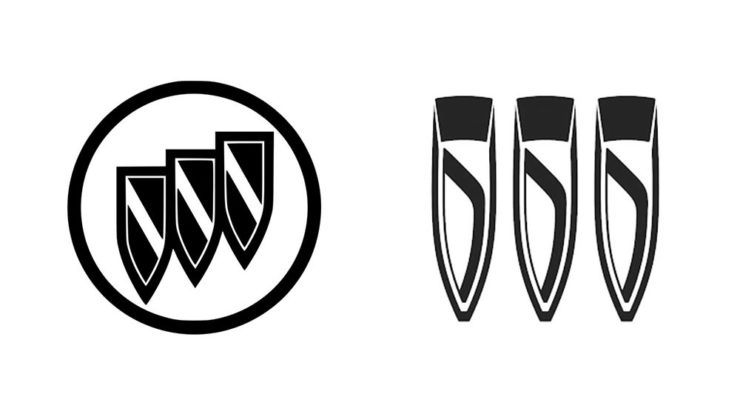
Buick’s New Logo
This one … I dunno. The race to do car logos flat black-and-white has seemed like a race to the lowest common denominator. (See previous coverage of BMW, Volvo, Cadillac, and more.) Below, Buick’s old (left) and new (right) logos, courtesy of Motor1:
The trademark filing for Buick’s new logo.
Thankfully, there’s been a leak — Instagram, natch, so no link here — demonstrating that it’ll still be in color:
From Instagram (alas): The new Buick logo in living color.
Still, not sure. Will have to see the official announcement and package that goes with it; Motor Trend suggests that it might be part of an EV-only future. Stay tuned for Brand New’s take, I guess….
I think innovation doesn’t come in one huge leap. It’s a series of small steps. Accumulations of small discoveries, followed by incremental implementation. And then it all adds up. Innovation is not a single idea—it’s incredibly incremental and additive. Even these small discoveries can change the way we think about things very quickly. So I think every step of the way—problematizing “what are the issues?” and “what are the solutions?” filtering issues of sustainability, supply chain, accessibility, will eliminate many solutions which are not possible. And then you end up with small nuggets of potential. In a way it’s very systematic, innovation, and so is experimentation. It’s the elimination of what’s not possible and focusing on goals.
Toshiko Mori. Image courtesy of New Reader.
You know, history is not about the past, really. History is about the story of an individual interpreting history. Historians cannot be unbiased narrators. Every history is a story, and then yes, there are facts—which are important, but the way you connect facts and then make diverse narratives is super interesting.
As you can see, Fox News provides false narratives, and a lot of times they skew the facts, and that’s a problem. It can be used dangerously, but it can also be used productively. I think that’s what makes history rich. It’s not about the past, it’s about projecting into the future. So when I teach students, I ask them to make their own story based upon their research. But it’s a story—so that’s kind of their own reality. And based upon that reality, they can develop diverse narratives and then communicate the story to others. It’s not as if you have different opinions, but you have different stories to share. It’s not about controversial opinions, but about the way we each look at life very, very differently—and that enriches everybody.


![Beautifully Briefed, Early October 2022 [Updated]: Triboro’s Lyrics, Hoefler’s Daggers, and Skoda and Citroen Provide Contrast](https://gileshoover.dreamhosters.com/wp-content/uploads/2022/10/BB-2022-early-oct.jpg)
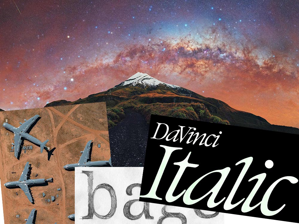
![Beautifully Briefed, Mid-September 2022 [Updated]: Indigenous Type, Italic Type, Adobe Types “Stop,” and Two Awesome New Cameras](https://gileshoover.dreamhosters.com/wp-content/uploads/2022/09/bb_sept-22-1.jpg)


![Beautifully Briefed, August 2022 [Updated]: Drobo, Rolling Stone, Aston Martin, and Bugatti](https://gileshoover.dreamhosters.com/wp-content/uploads/2022/08/bb_aug22.jpg)


![Beautifully Briefed [Updated]: Book Six-Fer, June ’22](https://gileshoover.dreamhosters.com/wp-content/uploads/2022/06/book-fourfer_jun22.jpg)