Category: Technology

Technology covers a tremendous amount of territory, from computers to cameras to cars to audio to … well, so much of life these days.

  • Beautifully Briefed 23.7: Items of Independence (Day)

    The mission for these posts is simple: independent, unrelated items which add up to something interesting. This time, it’s nifty type, aka NFTy.pe, photographic AI (or not), the 2023 Logo Trends Report, great London Review of Books illustrations, and a worthy art book list hijacked for a rant on stickers. Boom!

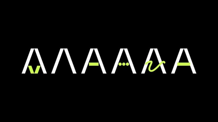
    Better Than it Sounds: NFTy.pe

    Typefaces have become, from this designer’s point of view, become commodities — perhaps even part of a broken system. Most clients don’t have a budget for unique type, there are too many spread across too many different sites, and, as Creative Boom puts it, “ownership has become poorly policed, if not non-existent.”

    NFType really flips the script on all of that and attempts to reimagine the industry from creation to sale. In a nutshell, NFTy.pe uses a combination of modular type design and generative scripts to create fonts with unique visual attributes. The upshot is that no two character sets are exactly the same. And thanks to smart contracts and embedded metadata, ownership is quick and easy to verify.

    — Craig Ward, NFTy.pe creator, via Creative Boom
    Create a unique typeface that rewards, in more ways than one.

    As pointed out, it’s not just for type users:

    There’s a lot of work to be done to put some distance between the dumpster fire that represents much of the NFT space and projects – like this one – with actual utility. I wouldn’t vouch for the worth of a lot of what I’ve seen out there, but the underlying tech – the smart contracts themselves – [is] actually genius and will be a game changer for any industry where provenance is a key factor – agriculture, property, fashion etc.

    — Craig Ward

    The whole article is worth a read, or go straight to the source.

    Photographic AI

    This year has been centered around AI, it seems — and, as illustrations go, some of the results are indeed a new form of art. Take this one posted by Dezeen as part of their AItopia competition:

    Created by Midjourney for Daniel Riopel.

    Fantastic. Its creator, a production technician in the prefabricated housing industry, deserves major kudos for describing something to the Midjourney engine that’s intricate and, if I dare use the term with AI, creative. (Several of the images there are excellent — check ’em out.)

    That said, I’m not a fan of articles like PetaPixel‘s recently-posted “Photographers May Have to Embrace AI, Whether They Want To or Not.” Simply put: no. I don’t have to embrace it, because nothing has changed — either I can get the photograph I want using the cameras and lenses I have or I can’t. I’m not going to “generate the fill,” pure and simple. (I don’t control the computational photography my phone produces, but Apple isn’t prone to creating what isn’t there.)

    I’ve been trying to write on this subject for a while, without success. Possibly because I don’t need a longer version of the above paragraph, possibly because it’s something else I haven’t been able to articulate yet — even to myself.

    The 2023 Logo Trends Report

    It’s back! BrandNew points us to the latest in styles and, as advertised on the tin, trends:

    “Sonics,” part of the 2023 Logo Trends Report.
    “Ritz,” as in the cracker, part of the 2023 Logo Trends Report.

    Always an interesting read, including this fantastic tidbit directly related to the previous section:

    “Don’t worry about AI stealing your job. To replace graphic designers with AI, clients will need to accurately describe what they want. We’re safe.”

    — Bill Gardner, LogoLounge

    Read the full report, “a whirlwind of ideas, symbols, and AI, evolving how creators like us create,” at LogoLounge.

    Illustrations at the London Review of Books

    Because we cover books here often (pun intended), an article on Jon McNaught’s awesome illustrations for the London Review of Books absolutely caught my eye. “A collaborative relationship,” it’s called — and the results produced not only illustrate a huge variety of subjects in a consistent style, but do so in a way that delights:

    A great illustration by Jon McNaught.
    Of the examples posted, there’s not a single one I don’t like. Copyright Jon McNaught.

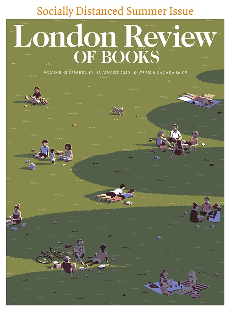
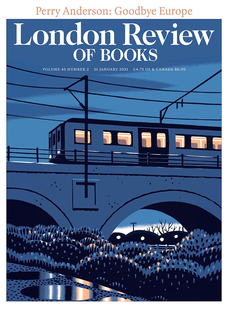
    Since 2011, Jon has been collaborating with the renowned literary journal, creating works that have a quietly mesmerising quality. His scenes breed comfort with their universality, but also their ability to evoke specific memories and feelings in the individual viewer. Through his covers, Jon artfully captures the essence of everyday life by representing the vastly contrasting nature of British weather, plus the uniqueness of London’s architecture, green spaces and public transport.

    — Olivia Hingley, It’s Nice That

    See many more illustration examples and read the article at It’s Nice That.

    Hyperallergic‘s Art Books to Read this summer

    Hyperallergic‘s coverage of art, despite the annoying pop-ups, is worth its bookmark — illustrated by this list of 11 Art Books to Add to Your Reading List This Summer. Some, like the Philip Guston I recently saw highlighted on Perspective, are as relevant as ever. It’s a great list.

    As usual, whenever I see something like this, I’m going to do something else at the same time: mine it for potentially great book design. Which, if you’ll indulge, leads to this short rant: I hate good covers marred by stickers.

    “Read with Jenna?” Seriously?

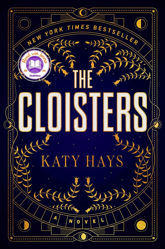
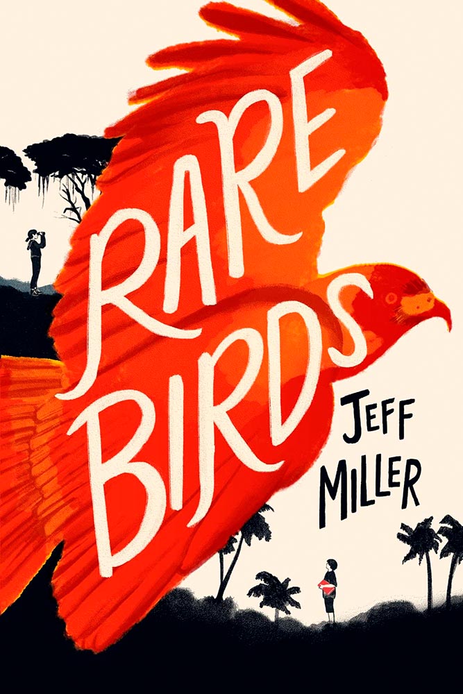
    Solid cover. Soooo, who’s Jenna? Is she important enough to mar the cover with? (I DuckDuckGo’d the answer: maybe … if you watch television. Not sure that’s the audience publishers should want to cater to.)

    This time, the “sticker” is National Book Award Finalist. Better, but still.

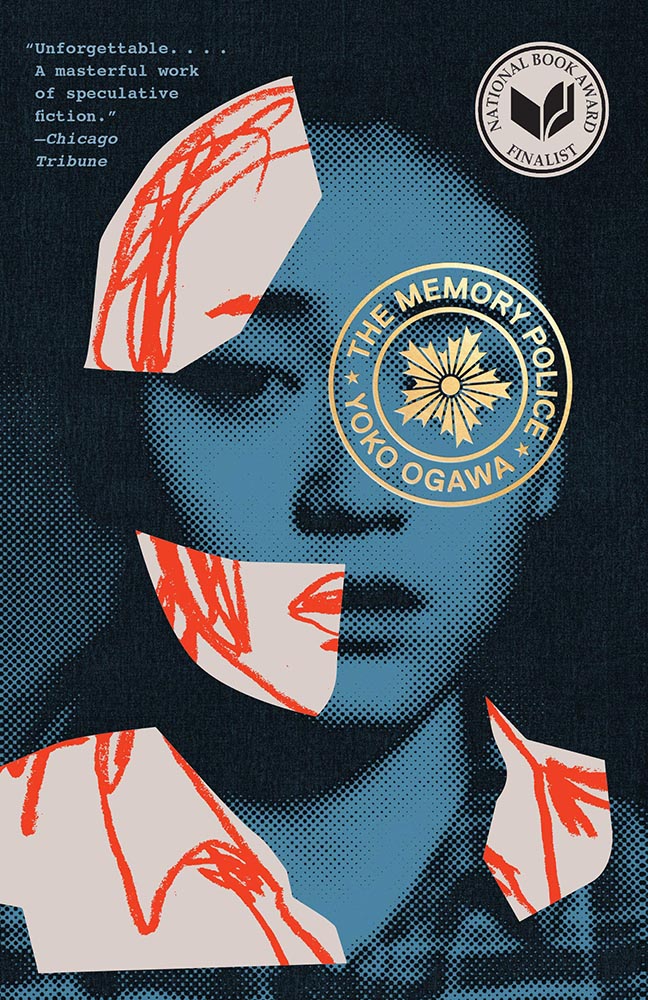
    Another solid cover — perhaps even really good, something that’s appropriate for a title up for the National Book Award. Real shame, then, that the sticker gets in the way, winding up completely distracting from the very nice circular title treatment (I’m sorry I don’t know either book designer to list here.)

    I understand that it’s a little like trying to hold back the tide with a shovel, but it’s something I needed to express. [/rant]

    Bonus #1 (awful): From the disturbing trends department: TikTok may start publishing books. Barf.

    Bonus #2 (amazing): Via Kottke, a fantastic poster and perhaps better question:

    Poster for the 2023 International Book Arsenal Festival, by Art Studio Agrafka

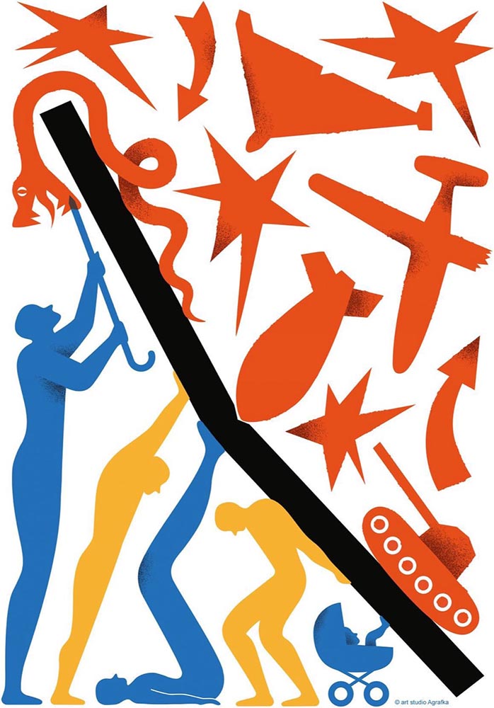
    A book festival. During a war. In a city under martial law. While schools and legislatures here in the US ban books about Black and LGBTQ+ experiences based on bad faith complaints of tiny fundamentalist parent groups. Tell me, who’s doing democracy better right now?

    — Jason Kottke, Kottke.org

    That’s all for early July, folks. Go forth and make your summer a better place.

  • Beautifully Briefed 23.1: Winter Potpourri

    Beautifully Briefed 23.1: Winter Potpourri

    From book design and minimalist photography to … well, book design and what absolutely isn’t minimalist photography, plus some street signs and another warning about Adobe. Let’s dig in.

    Book Design #1: People Really Do Judge a Book by its Cover

    From University College Cork — that’s Ireland, folks — we have something that, on the surface, seems obvious: a book cover “is the most likely factor to convince a person to read a book if they are unfamiliar with the work or its author.” Maria Butler, a PhD candidate in the School of English and Digital Humanities at UCC, reminds us why.

    Design by Kimberly Glyder.

    You’re reading Foreword, so you likely agree — and shown above is one of those worth-a-thousand-words images: the first of the 2023 titles I’ve set aside for my favorites of the year, and absolutely something good enough to make me pluck it off the shelf without knowing anything about either the title or author.

    Bonus: See 70 (!) more of my Favorite Book Covers of 2022.

    Book Design #2: Shift Happens

    A fantastic website has clicked our way: Shift Happens, for a book about keyboards.

    A screenshot from the Shift Happens website. Great stuff.

    This project not only scores with great web design — check the interactive version of the book, pictured above — but what also seems like great book design. It’s a Kickstarter project (or will be, next month), so the usual cautions apply, but I might just go ahead and take the leap.

    Couple of interesting book design items, by the way: the TOC is at the back, the endpapers are awesome, and the macro photography is tops. The book design reminds me of The Playmakers, still my favorite book design project ever.

    Bonus: Tim Walsh, author of The Playmakers, is still going strong. Nice.

    Photography #1: Minimalism

    The winners of the Minimalist Photography of 2022 awards are in, some are fantastic. Here are a couple of favorites, from the architecture category:

    “Prince Claus Bridge in the Netherlands,” by Arthur van Orden
    “Blue Window,” by Andrea Richey

    The Minimalist Photography Award is the only foundation that deals extensively and professionally with minimalist photography as a branch of photography in which the photographic artistic vision takes the lead.

    Milad Safabakhsh, President of Minimalist Photography Awards
    Photography #2: Wonders of Street View

    This is Colossal brings us another gem from Neal.Fun: the Wonders of Street View.

    “Wall Driver,” indeed.

    Direct quote, just because: “A man with three legs, a vintage car scaling a building, and an unsettling formation of people donning bird masks are a few of the scenarios highlighted in the terrifically bizarre Wonders of Street View.”

    I didn’t know it was a thing to dress up and pose for the Google cameras. Perfect.

    Street Sign Style Guide

    Speaking of street views, did you know there’s a style guide for highway signs? Would you believe that I’m a fan?

    Interestingly, there is an I-42/I-17 interchange in Phoenix, but this ain’t it: these signs are representational.

    As with most things government, there’s confusion, too many regulations, and yet it’s based around good ideas. Beautiful Public Data has a guide to the guide.

    Adobe Steps in it, Again

    From DPReview: “If you’re an Adobe Creative Cloud subscriber, you might want to go and turn off a new setting immediately. It’s been discovered that Adobe has automatically opted users into a ‘Content analysis’ program that allows Adobe to analyze your media files […] for use in its machine learning training programs.”

    It’s important to note that Adobe only uses the files saved in the “Creative Cloud,” something I don’t do as a matter of course, but even still, this is yet another example of Adobe using its monopoly position in the creative field to take advantage of its paying customers.

    Adobe, unsurprisingly, didn’t return DPReview’s request for a comment/clarification.

  • Beautifully Briefed, Holiday Edition (Late December, 2022): Nick Heer, Jason Kottke, Stealing Sheep, a Landscape Photograph, and Some Old Logos

    Beautifully Briefed, Holiday Edition (Late December, 2022): Nick Heer, Jason Kottke, Stealing Sheep, a Landscape Photograph, and Some Old Logos

    “The Bleak Cycle”

    I don’t usually think it’s fair to quote another blog post in its entirety, and I certainly won’t make a habit of it. With that out of the way, the always-interesting Pixel Envy, written by Nick Heer, hits us with a doozy — one that, due to its length and depth, requires the complete quote:

    The Bleak Cycle

    It’s a cycle. People create something, together, that reflects their energy and weird work; that thing becomes compelling as a result, and that makes it valuable, and at some point someone puts a price on it and someone else pays that price. It is at that moment that the thing begins to change. The new owner will almost always decide that what is most interesting about this thing is not the human essence that gave it value, but The Owner Himself, and will act accordingly. People will come back for the valuable stuff until the owner succeeds in crowding it out; when that crowding is done, the owned thing dies. Until then, what’s left is just what’s valuable—the humanity and brilliance and unpredictability and fun that all that cynical and idiotic and self-serving wealth is always and everywhere busy replacing with itself. There’s nothing to do but look for the good stuff until the looking becomes too challenging, or until it’s gone.

    David RothDefector

    Heer writes in response: “You may disagree with Roth’s headline thesis — ‘everything is Silicon Valley now’ — or his tie-in with the story du jour, Twitter, or his analysis of baseball’s problems. But the paragraph above? That is something to keep pinned in your brain. For most of us, it is a reminder to be wary of how things are changed in exploitative ways; for those in power, it should be seen as a cautionary pattern.”

    Pinned.

    Kottke is Back!

    After a few months off, Jason Kottke is back in the blogger’s seat to enrich all of our lives. As someone who’s been reading for years — he started in 1998, and I’m certain his site was in the blogroll of the old Foreword, back in the Aughts.

    Fine hypertext products indeed: Kottke.org, December, 2022.

    We might be waiting a while for his so-called “comically long what I did on sabbatical post,” but his Sabbatical Media Diet post is a gold mine of to-read and to-watch items.

    Welcome back, sir. May you blog for many seasons more.

    Stop Stealing [Free] Sheep

    No, not that — the type book:

    From Kottke, while we’re on the subject, one of his Quick Links from Dec 20th: “Google Fonts is offering a free download of the newly updated 4th edition of Erik Spiekermann’s Stop Stealing Sheep & Find Out How Type Works.” It’s a PDF, available now.

    9th Annual Landscape Photography Awards

    It’s fair criticism to say that I both decry photography contests and yet sometimes celebrate the results. But…:

    “The Winding Journey” by Max Rive, Border Between Chile And Argentina, Patagonia

    Wow. I couldn’t not highlight that photograph.

    Many more at the source. (Via DPReview.)

    Oldest Logos Still in Use

    Image Relay has an interesting item showing how long some familiar logos have been used — and, yeah, there’s a reason they’re familiar!

    The black triangle is when the company was founded, and the bar indicates how long a logo with elements still used today has been around.

    That’s but a sample of the complete listing; shown are nos. 3–8. Coca-Cola, the company I’d probably name if asked for the oldest logo, is no. 12. Click through for the rest.

    That’s it for this year

    Foreword will be back in January with our annual first-of-the-year best-of: my favorite book covers of 2022. Happy holidays, everyone!

    Top image: Tree Lights, December 2020, downtown Macon, Georgia.

  • Beautifully Briefed, Automotive Edition (December 2022): Audi, Lancia, Kia, and Mercedes-Benz

    Beautifully Briefed, Automotive Edition (December 2022): Audi, Lancia, Kia, and Mercedes-Benz

    This time, it’s three automotive logos . . . and Mercedes’ accounting department, plus a holiday bonus. Joy to the Auto!

    New Audi Logo Falls Flat

    Audi’s “Four Rings” have been around for a long time — since Auto Union was formed, ninety years ago:

    Now Audi follows the pack (see VW, Mini, Volvo, etc.) and converts their logo from three-dimensional to two; the rings now are either white and framed by a thin black border or dark grey with black borders.

    Four-ring closeup. (It’s hiding sensors, too.)

    Not an improvement, IMHO. One of the articles mentions the concept of “a consequence of digitalization,” and think that’s about as good a description as you’re gonna get.

    The change will roll out starting with the updated Q8 e-tron — which, thankfully, still looks good:

    Even better in Sportback form:

    Dezeen has the best coverage of Audi’s new logo, but see also Motor1 and CarScoops for more pictures.

    Lancia Debuts … a Mouse

    Okay, it’s not really — it’s a conceptual sculpture, titled “Pu+Ra Zero,” that represents their rebirth:

    They call it a “a three-dimensional manifesto,” and no, I don’t get it either. (The light signatures and, apparently, the circular sunroof will carry through to the new models, however.) The logo, their eighth in 116 years, is new as well:

    I didn’t know Lancia well (only in passing? Eh. —Ed.) until the famous Top Gear segment naming them “the Greatest Car Manufacturer of All Time,” although I knew of the Delta Integrale — and think that the Fulvia is one of the prettiest sedans ever:

    The 1972 Lancia Fulvia

    Let’s hope their new models, and conversion to an all-electric manufacturer, lives up to their past achievements. Meanwhile, The Autopian has the best roundup of the new Lancia.

    Kia, KN, and … Wait, What?

    30 thousand folks a year are doing Google searches for “the KN car.” Why? Kia’s logo, of course:

    Thankfully, the Autopian to the rescue:

    I’m not a huge fan of the new Kia logo — and can absolutely see the “KN problem” — but I think it speaks more to modern society that this is a news item than anything related to graphic design. Willing to be wrong.

    Mercedes: $1200/yr for Full Output

    This subscription thing has gotten seriously out of hand: Mercedes-Benz USA, in an effort to further bilk their customers — ’cause, y’know, MBs don’t cost enough — has decided that the last 60-110 horsepower available on their 2023 electric vehicles are only available for a yearly fee.

    The MB EQS gets even less attractive.

    Gak.

    Holiday Bonus: Free Online Automotive Design

    Interested in car design? Happy Holidays.

  • Beautifully Briefed, Early October 2022 [Updated]: Triboro’s Lyrics, Hoefler’s Daggers, and Skoda and Citroen Provide Contrast

    Beautifully Briefed, Early October 2022 [Updated]: Triboro’s Lyrics, Hoefler’s Daggers, and Skoda and Citroen Provide Contrast

    This time, we’ve got some great book design (with a bonus), Hoefler educates on typography (with a bonus), and two updated car company logos. Let’s get right to it!

    Print Magazine on the design of Lyrics

    The still-very-relevant-in-2022 Print Magazine brings us a great feature on the design of Paul McCartney’s book, Lyrics:

    Front and back covers of Paul McCartney’s Lyrics, by Triboro Design.

    Turns out it was designed by an outfit called Triboro Design, from Brooklyn (appropriately). Print brings us an interesting interview with David Heasty, the principal:

    I […] found him to be sharp, quick, articulate, and modest. Below, we discuss Paul’s involvement with the project, the book’s gorgeous bespoke typeface, and the importance of staying true to a legend’s vision.

    Ellen Shapiro, Print Mag
    The “S” spread of Paul McCartney’s Lyrics, by Triboro Design.

    Interesting and informative. Catch this interview when you can.

    Bonus: Looking at Triboro’s website, this lovely piece of typography stood out:

    Triboro Design’s Zolo Jesus album typography creates desire.
    Hoefler Discusses Daggers

    In “House of Flying Reference Marks,” Jonathan Hoefler talks about daggers, or, what you use when an asterisk isn’t enough:

    Hoefler on daggers.

    Beautiful examples, complete with a phrase you don’t hear everyday: “twisted quillon.” Read and enjoy. (If the opportunity presents, follow on with the ampersand article — which, uh, takes a stab at where the word came from. Nice.)

    Bonus: Creative Boom’s article, “18 highly respected type foundries that remain fiercely independent.” (I guess you could say I’m still surprised Hoefler is now, well, Monotype.)

    Skoda and Citroen have new logos

    It seems like nearly all of the major car manufacturers have introduced a new logo in the past couple of years, but here are two more. One’s best described as “an update,” while the other … goes a little farther.

    Skoda, for those that don’t know, is a Czech company and part of the massive VW Group. Frankly, it shows:

    Skoda’s 2022 Kodiaq, a thoroughly VW Group product.

    For 2023, they’re introducing a push to separate themselves from VW a little, resisting the downmarket image. As is (now) normal with updated car company identities, there’s a concept:

    Skoda’s Vision 7s concept.

    It’s … not inspiring. Maybe the actual updated logo will turn the corner:

    Skoda’s 2022 logo.

    Solid. (Pardon the pun.) But seriously, even an avid car nut like me didn’t know that represents a winged arrow — and I’m not sure the new version helps. At least they get points for consistency:

    Evolution of Skoda’s logo, 1895–2023.

    Read more at Brand New’s “Czech this Out,” or Carscoops’ more optimistic take, “Thriving Skoda Brand Forging Its Own Path Within The VW Group.”

    Then there’s Citroen. Even under the potentially-smothering corporate blanket that is Stellantis (there’s a name!), the pioneer of decades past still manages to actually thrive. First their new logo:

    Citroen’s 2022 logo.

    They’re not quite as consistent — the dual chevrons have varied a bit. This time, they’ve literally gone back to their roots, pulling the 1919/1921/1936 version out and dusting it off for modern use:

    History of Citroen’s logos, 1919–2022.

    Points to them for hinting at what’s to come, too:

    Citroen’s 2022 logo, with just a slice of concept car showing.

    …Which turns out to be something with, ahem, Oli bits:

    Citroen’s Oli: the antithesis of a Skoda.

    “Nothing moves us like Citroen,” they say. The Oli moves me, to a point where I truly wish Citroen was once again available in the ’States. Cool and radically innovative, without losing sight of something VW has truly lost: fun. Well done.

    Read more on the logo: Motor1, “Citroen Unveils Updated Retro-Flavored Logo And New Slogan,” and Carscoops, “Citroen Unveils New Logo Inspired From Its Past, Teases New Concept.” Read more on the Oli at the excellent Autopian: “The Citroen Oli Concept Is An EV Made From Cardboard And Good Ideas.”

    Updated, 19 October, 2022: Brand New adds to Citroen’s new logo story, with a slightly-less-than-enthusiastic take on the logo and has frankly unkind things to say about the new, custom typeface (custom typefaces are now de rigueur — a policy as much related to rights ownership than creativity, alas).

    I really like the cursive in this Vimeo screenshot:

    YouTube? What YouTube? Citroen posts to Vimeo. Ahh, the French.

    BN also includes a number of extra photographs of the simply awesome Oli, too. Here are a couple, for your enjoyment:

    Plug-and-Citroen.

    Note the removable Bluetooth speakers (the black tubes with “+” and “-“) and, especially, the seats:

    I love everything about this interior.

    Check the rest, and BN’s take, here.

    Apologies to both Skoda and Citroen for the lack of language-correct accents. WordPress needs a glyph function.

  • Beautifully Briefed, August 2022 [Updated]: Drobo, Rolling Stone, Aston Martin, and Bugatti

    Beautifully Briefed, August 2022 [Updated]: Drobo, Rolling Stone, Aston Martin, and Bugatti

    Three interesting logo redesigns this month, plus a moment where venti has nothing to do with coffee. Oh, and a airy bonus.

    Drobo Declares Bankruptcy

    Generally speaking, I’m not one to engage in schadenfreude, aka “enjoying the pain or suffering of another.” (Wiki. Anyone surprised that the Germans have a word for this … but I digress.)

    A selection of expensive, unreliable junk.

    Back in 2011, I lost two Drobos in short order — and with them, the majority of my back files. Project I’d worked on, photographs I’d taken, personal documents, years worth of stuff, just gone.

    Drobo, the company, did nothing to help, offering neither solutions nor apologies. I wasn’t alone; forums across the ’net suggested that I should have chosen more carefully.

    It turns out they should have, too. Good.

    Gloat Read more at DPReview or PopPhoto.

    Rolling Stone’s New Logo

    To call Rolling Stone‘s place in America culture iconic might be selling it short, and their logo plays a large role in that. In 2018, they flattened it — leading that trend, possibly — and it lost something.

    However, this month, it’s back:

    Rolling Stone’s 2022 logo redesign.

    “The assignment was a paradox. How could we make the logo look like it did in the past, without making it feel dated? My hope is that loyal readers will believe the old logo is back, but on closer inspection will be surprised to notice how much it has been modernized.”

    Jesse Ragan, XYZ Type

    The “old logo” he’s referring to is the one that ran from 1981–2018, but there were others, too:

    Rolling Stone’s lettering shapes through the years. See more at both links.

    A great study in logo evolution: read more at the Type Network, and lettering specifics from XYZ Type. Awesome. (Hat tip to, as usual, Brand New.)

    Aston Martin’s New Logo

    On the subject of subtlety, Aston Martin usually isn’t the first thing that comes to mind. Their recent logo redesign, however, falls into that category:

    Wings of Glory (so to speak)

    The evolution of their logo emphasizes those small steps:

    AM’s logo through the years.

    Not a great amount of information on this one, but the accompanying photographs of the logomark being made are fantastic. See more at The Drive, with more at Brand New.

    Bugatti’s New Logo

    Subtlety and Bugatti rarely — if ever — fit in the same sentence. Aston is stratospheric as far as I’m concerned, so Bugatti would qualify as the antithesis of subtlety. But, but, but: there’s something about one.

    The new Mistral. (Sorry, it’s sold out.)

    They have a new logo and marketing campaign to go with:

    Specifics, courtesy of Interbrand.
    The Mistral from the back, showing the new type treatment.

    Read up at It’s Nice That. Car and Driver has more information on the Mistral.

    Update, 20 Sept., 2022: Brand New weighs in on Bugatti’s updated logo.

    Bonus: In the Skies

    It’s been a busy August, including having to make a lightning trip through the usually-not-fun Atlanta airport. But there’s always a bright spot at the end of that tunnel: being the little boy again, awed by the simple act of flying.

    Better still, the flight was on a 757, the sports car of big planes. Everybody around me had their window shades pulled and noses in their phones, but I was looking out the window:

    Delta Ship 5654, Above Clouds and Sea

    See you in September!

  • Beautifully Briefed, Early July 2022: The Autopian, The Ford Heritage Vault, and an Eames Follow-Up

    Beautifully Briefed, Early July 2022: The Autopian, The Ford Heritage Vault, and an Eames Follow-Up

    Car site The Autopian scores with book design, Ford posts old marketing material gold mine, and more on the Eames Institute of Infinite Curiosity in this edition of Beautifully Briefed.

    Autopian suggests book design

    The Autopian, founded by a couple of former Jalopnik writers, is a new automotive gem: in these days of more-of-the-sameism sites trying to make money of others’ ideas, the Autopian has a retro style and interesting, original content.

    Including this short post from their Cold Start column:

    Sometimes you may encounter an old car ad and realize that the design of it could lend itself very well to something completely different. In this case, this 1958 Ford Zodiac ad, with its rich, saturated colors, striking dress on the model, and evocative name with understated typography just feel like something you’d see on modern book cover design.

    Jason Torchinsky, Autopian Founder

    The ad:

    A 1958 Ford Zodiac (European)

    His book design idea “realized”:

    Jason’s book cover mock-up. Love the author name.

    Nice.

    The Ford Heritage Vault

    Ford has taken the unusual step of posting a good chunk of their old — 1903 to 2003, their first 100 years — marketing materials online: “promotional materials, photographs, and all kinds of other historical goodies,” according to CarScoops.

    “Our archives were established 70 years ago, and for the first time, we’re opening the vault for the public to see. This is just a first step for all that will come in the future,” says Ted Ryan, Ford archive and heritage brand manager.

    Here’s a personal favorite: the 1965 full line brochure, showing the cars set in architectural drawings — presumably, matching the car to the house:

    The 1965 Ford Family of Cars brochure

    Fancy a drive down memory lane?

    More from the Eames Institute

    We discussed the Eames Institute of Infinite Curiosity back in April, but Metropolis magazine has published an extensive article covering a visit to the Institute.

    Modernism has largely been diluted from a series of ideas rooted in social change to one of just style—Instagram moments, if you will. The Eameses insisted that they did not have a style or even an “ism.” […] Modernism was an idea, not a style. With the establishment of the Eames Institute, I hope Charles and Ray will be remembered most of all for their ideas and processes.

    Kenneth Caldwell, Metropolis
    An exhibit at the Eames Institute of Infinite Curiosity.

    With our ongoing struggle to use materials more efficiently, many of the Eameses’ ideas and ideals need to be taken for the solutions that they are: style with incredible substance.

    Read the whole article at Metropolis. (Via ArchDaily.)

  • Beautifully Briefed, Late April 2022: Old Macs, More or Less, to the Fore(word)

    Beautifully Briefed, Late April 2022: Old Macs, More or Less, to the Fore(word)

    This time: System Six, from Glider’s programmer; MacOS 8 — including Glider — in your browser; and a pictorial history of Apple monitors. Nostalgia for your enjoyment!

    System Six

    John Calhoun, who wrote one of my all-time favorite games for the classic Mac, Glider, has taken a Raspberry Pi, an e-ink screen, and a great deal of ingenuity to make this:

    It’s only got the shape of a classic Mac — and yet….

    Calendar events, the current moon phase, and more, in a form that can’t help but bring a smile. Better still, he’s written about the process so others can make one, too. (Ahem, Gerald.) Best desk accessory evah, to coin a phrase.

    Infinite Mac
    Fastest MacOS 8 startup times in history.

    A project to have an easily browsable collection of classic Macintosh software from the comfort of a (modern) web browser. […S]ee what using a Mac in the mid-1990’s was like.

    Well, naturally, I’ve been . . . here:

    Glider works — and wastes time — just as well as on the original.

    MacOS8, with infinite fun. But that’s not all! For — wait for it — $0, you also get System 7 and KanjiTalk. (Set aside a few hours before clicking.)

    Mac Monitor history, detailed

    With the advent of the Apple Studio Display, Steven Hackett, of 512 Pixels fame (along with a variety of podcasts — he’s the co-founder of Relay FM), decided it was a good time to look back at some of Apple’s monitors. Starting with this gem:

    Apple IIc with its LCD screen!

    It takes a footnote — hmph — to get to what Steven and I both agree is a favorite, the last iteration of the CRT-based Apple Studio Display (you knew that name was familiar, right?):

    The last great CRT monitor, IMHO.

    And then there’s the 30-inch Cinema Display, shown here with the G5 tower:

    Awesome.

    I had several of these monitors, including one of the 30-inchers, and have loved every one of them. And while I, like a lot of creatives, use a 27-inch iMac these days, thanks to Apple’s discontinuation of said iMac, the next iteration of my office setup will include a standalone Apple monitor. I’m glad Steven took the time to remind us what’s been — thanks.

    Bonus: Steven has an eMac G4 article up, too. Great times.

  • Beautifully Briefed, Early March 2022: Monograph Impresses, Monotype Trends, and Media Waste

    Beautifully Briefed, Early March 2022: Monograph Impresses, Monotype Trends, and Media Waste

    Three diverse items in this round-up, from illustration to typography to whether or not ad-blockers are actually environmentally-friendly — along with a response that reminds us to look at the bigger picture.

    Malika Favre (Expanded Edition)

    CreativeBoom:

    French illustrator and graphic designer Malika Favre has been impressing audiences for years with her minimalist work for publications such as The New Yorker, Vogue, and Vanity Fair. Now over a decade’s worth of her work has been released in a new monograph from Counter-Print, which contains a suitably stripped-back aesthetic.

    Her style is distinctive; I’ve liked her New Yorker covers especially:

    Malika Favre (Expanded Edition) in English

    The book includes the illustrator’s own cover, and she had a big hand in designing the layout, too. CreativeBoom’s article is excellent — check it out.

    Monotype’s 2022 Trends

    It’s Nice That points us to the recently-released 2022 Type Trends Report from Monotype:

    Monotype’s 2022 Type Trends Report cover

    Throughout yet another “unprecedented year,” it’s safe to say that the macro trends influencing the type design community are nearly too long to list. Several socioeconomic, political, and cultural events continue to shape the way we approach creative work and how connect to each other online and offline.

    Biodiversity’s relationship to type, varying type styles in a single logo, and thin serifs — the one I’m likely to use somewhere — are in this year.

    New York’s Park Lane Hotel

    The above example, from New York’s Park Lane Hotel, is but one they cite (see that whole, very lovely project at Brand New). Check out the whole report, and get trendy.

    Perhaps we can convince Apple to go back to its also-lovely Garamond…?

    Media, Trackers, Blockers, and the Environment: There’s a Problem

    Did it ever occur that using an ad blocker in your browser is actually an environmentally-friendly move? No, I hadn’t put it together, either.1More from MIT on ecological impacts of cloud computing here.

    70% junk. Surprise and shock (not really).

    [U]p to 70% of the electricity consumption (and therefore carbon emissions) caused by visiting a French media site is triggered by advertisements and stats. Therefore, using an ad blocker even becomes an ecological gesture. But we also suggest actions web editors could take to reduce this impact.

    An interesting study, certainly, with information that many of us already use and some suggestions for action in case we don’t. But…:

    Another of Monotype’s 2022 Type Trends, appropriated for use here

    Nick Heer:

    I have qualms with this. The idea of a “carbon footprint” was invented by British Petroleum to direct focus away from environmental policies that would impact its business, instead blaming individuals for not recycling correctly or biking to work more. A “carbon footprint” is also a simplistic view of how anything contributes to global warming, and that it seems to be used here as a synonym for bandwidth and CPU consumption.

    I’m not sure whether I’ve called out the excellent Pixel Envy2A sort-of Daring Fireball with Canadian roots, but this is an example of why I should.

    That is where I think this well-intentioned study falters. Even so, it is absurd that up to 70% of a media website’s CPU and bandwidth consumption is dedicated to web bullshit. Remember: the whole point of web bullshit is that it is not just the ads, it is about an entire network of self justifying privacy hostile infrastructure constructed around them.

    • 1
      More from MIT on ecological impacts of cloud computing here.
    • 2
      A sort-of Daring Fireball with Canadian roots
  • Beautifully Briefed, Late February 2022: Photography, Font, and Furniture

    Beautifully Briefed, Late February 2022: Photography, Font, and Furniture

    A three-fer as we wind through this February: Peter Stewart, a really talented architecture photographer from Australia; VAG Rounded, Apple’s keyboard font and how it relates to Volkswagen; and a new site called The Apple Store Glossary leads to an interesting review of furniture in Apple Stores.

    Peter Stewart

    November’s Beautifully Briefed covered the 2021 Architecture Photography Awards shortlist, and one of the photographers is Peter Stewart, a self-taught Australian who wanders around Asia. Gotta say: he’s better than great.

    “Hanshins Web” Osaka, Japan. 2019, by Peter Stewart

    His eye for pattern and color is spot-on:

    “Four Columns” Tokyo, Japan. 2019, by Peter Stewart

    Archinect’s In Focus feature has a great 2019 interview that not only discusses the how and where, but also the why — including his thoughts on use of Photoshop and, perhaps most insightfully, how to thrive as a photographer in this crowded age:

    The hardest part of being a photographer today is finding a way to stand out among the crowd. In just the past few years Instagram has changed everything and given rise to a sizable number of highly talented new photographers. We are inherently influenced by the work we see from others, and as such has given rise to a lot of popular trends and styles of photography which has brought about a bit of a copycat culture. The point is, I think it’s important to find your own themes and ideas in order to progress, and not to simply emulate.

    Peter Stewart, Archinect Interview

    Check it out.

    VAG Rounded and Apple

    Daring Fireball is a daily stop for Apple geeks like me, but rarely does it cross into graphic design territory — except when it links to a Jalopnik article discussing how a Volkswagen font wound up on Apple’s keyboards.

    Good stuff. (Bonus ’80s Dasher brochure siting, too.) Enjoy.

    Apple Store’s Boardroom Furniture

    Some Apple Stores have additional, not-usually-open-to-the-public spaces called boardrooms. And, as you might imagine, they’re filled with interesting stuff.

    A new (to me, at least) site called The Apple Store Glossary has information and photographs of all aspects of Apple Stores, from the new Pickup area to the behind-the-scenes Boardrooms.

    The latter started out as something called Briefing Rooms, intended for business customers and special events. However, they’ve evolved: more casual, more comfortable. And more interesting:

    Apple Boardroom (Passeig de Gràcia store, Barcelona, Spain)

    9to5Mac has a great roundup of these rooms we don’t see, from the accessories (bonus Eames Bird sightings) to the books, and perhaps most interestingly, the furniture.

    Grab a seat, get comfortable, and get info.