Tag: beautifully briefed

  • Beautifully Briefed, January 2022: Airplanes, Architecture, and Typography

    Beautifully Briefed, January 2022: Airplanes, Architecture, and Typography

    Happy New Year! Stephen Colbert called it, “an unprecedented third year of 2020.” Let’s hope it turns out better than that.

    To that end, here are some neat things to catch your eye.

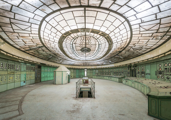
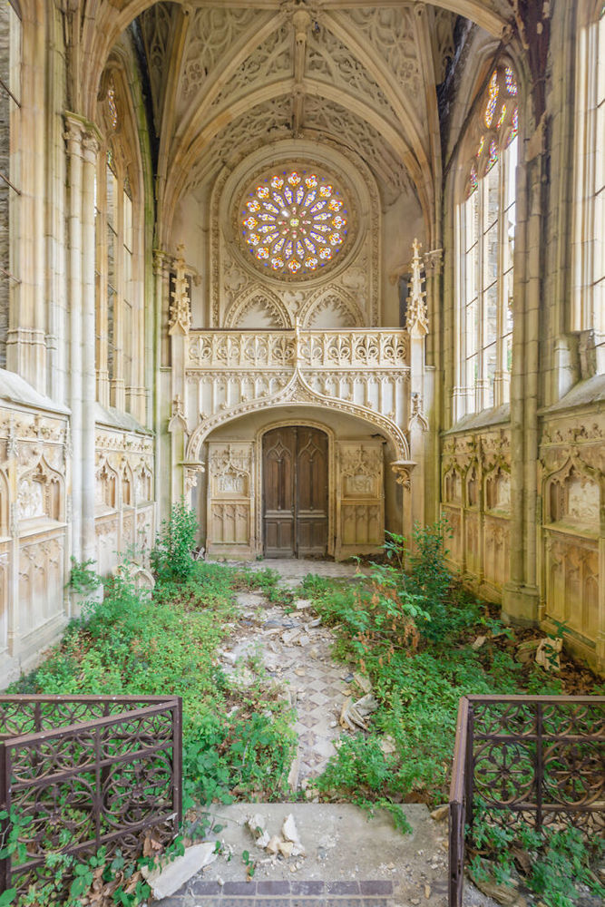
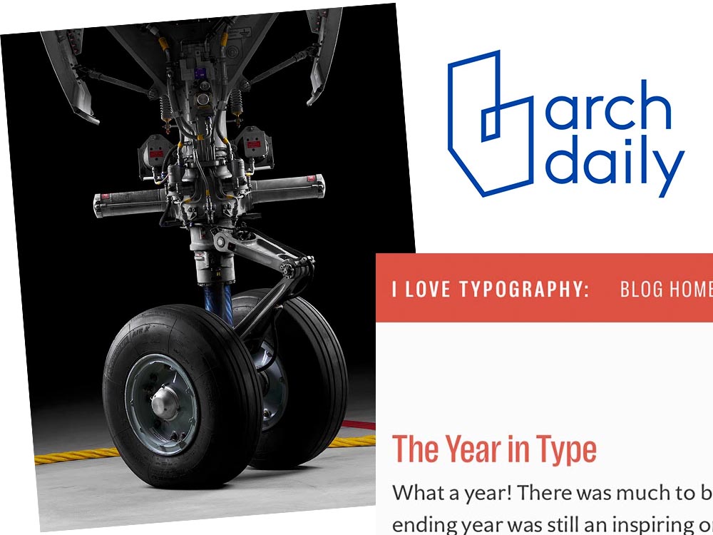
    Airliner Photography, to the nth degree
    MG - no bogies here

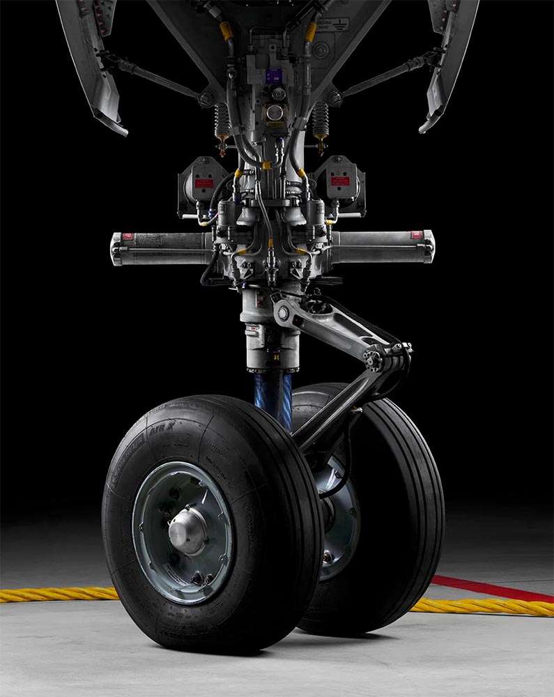
    I’ve been a plane junkie since, well, forever; to this day, I watch YouTube videos of things flying around, often the big ‘uns. I follow Airliners.net’s Civil Aviation forum, and can tell you at a glance whether something sitting at the gate is a Embraer 190 or Airbus 220. So this new title by photographer Maxime Guyon has my complete attention.

    MG engine

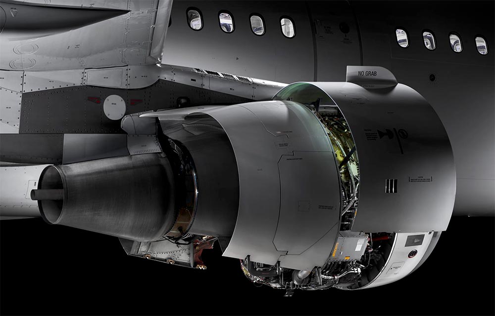
    Very much looking forward to getting my hands on. Beautifully done, sir. (Via a great article at It’s Nice That.)

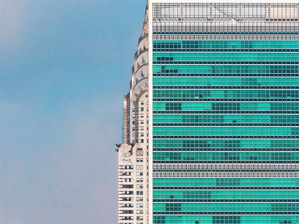
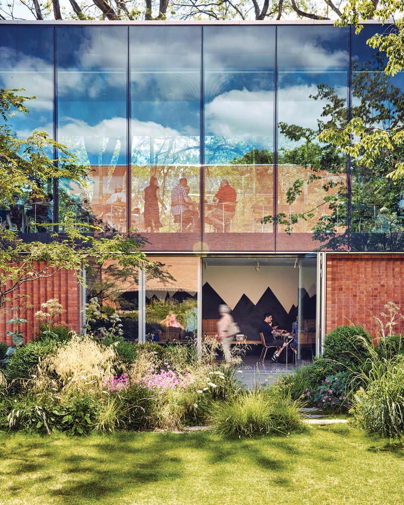
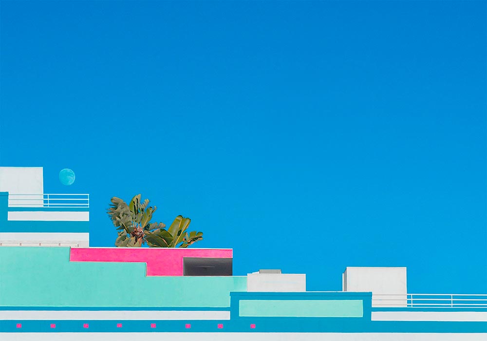
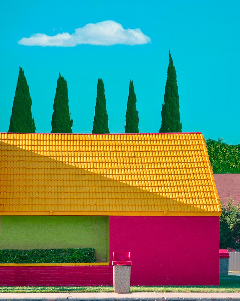
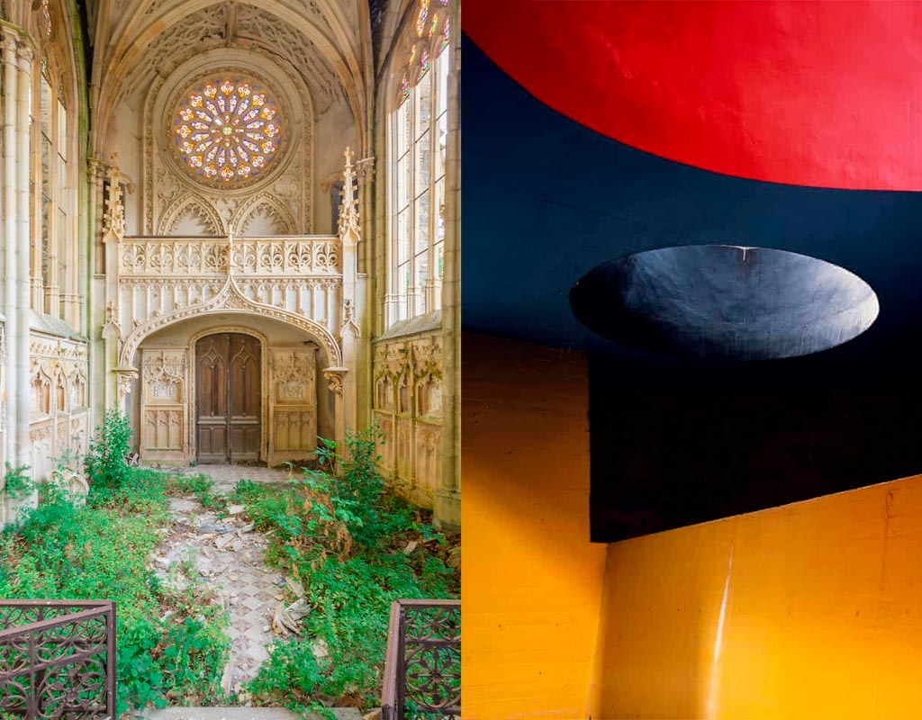
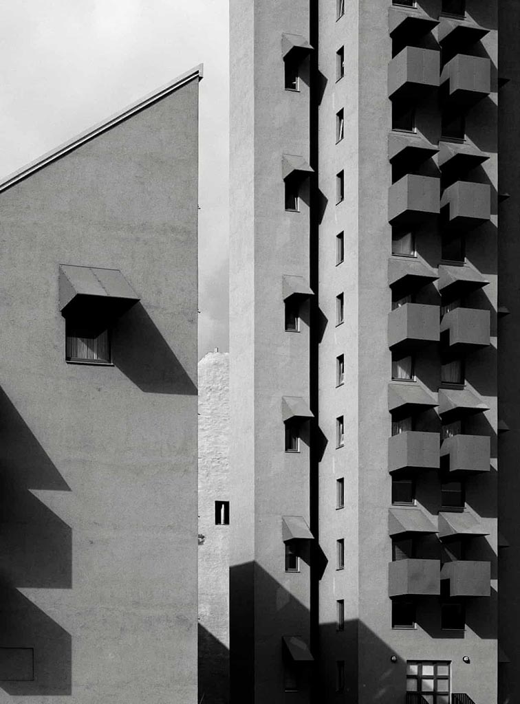
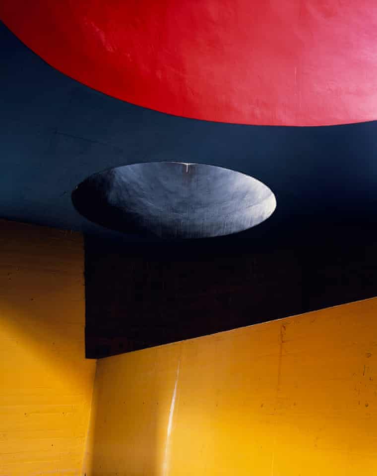
    ArchDaily’s New Branding

    Meanwhile, another subject I follow:

    ArchDaily 2022

    Arch Daily has already teamed up with Architonic, a site for products, last year. For 2022, they’ve rebranded and both sites are now linked with DesignBoom, one of the web’s original sites for design and architecture (since 1999!). Dezeen has more.
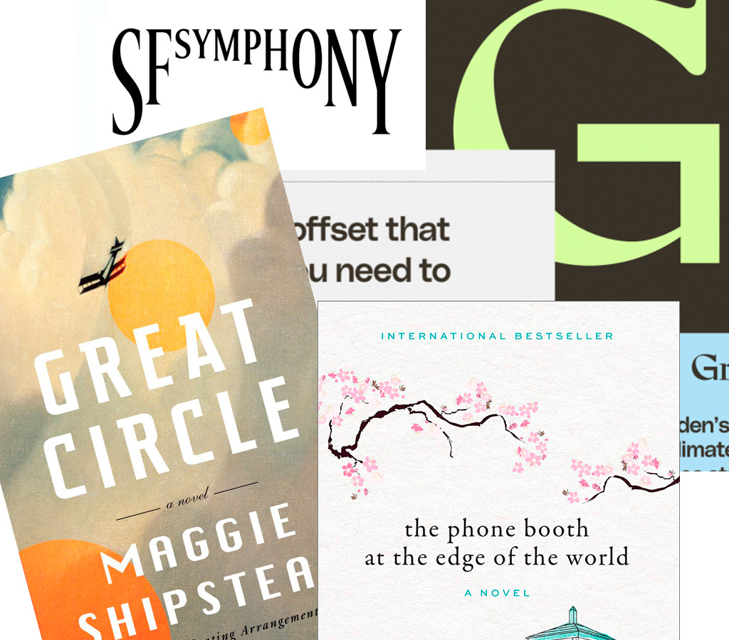
    The Year in Type

    Last but certainly not least, I Love Typography has a great roundup of 2021: The Year in Type.
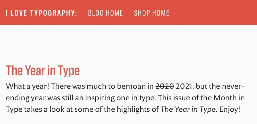
    The Year in Type, 2021

    Enjoy, indeed.

  • Beautifully Briefed, December 2021: Holiday Edition

    Beautifully Briefed, December 2021: Holiday Edition

    It’s the yearly wrap-up and the holiday season! Recap and Rejoice!

    Hermès Does Windows

    “Journey of a Lifetime” is this year’s window display for Hermès — yes, Hermès should have an accent, but I can’t seem to summon it today fixed! — so let’s go with a picture instead:

    Hermes window display

    All in paper. No, let me repeat that: it’s all paper. (Well, perhaps some glue.) From artists Zim and Zou. Here’s another, one of their earlier works:

    Zim and Zou, previously

    Read more at This is Colossal about the window and the church. Nice.

    Yule Ogg

    While we’re on the subject of the holidays, check this out:

    Yule Ogg

    That’s right, it’s one of those four-hour Yule log videos — but with a twist. Those are wooden type pieces going up the flame. Check it out, along with the backstory, at It’s Nice That.

    Top Architectural Photography Projects

    Closing out, we start the year’s “best of” round-ups, this one Dezeen’s top 10 architectural photography projects of 2021:

    Soviet (Asia) Photography

    Above, Soviet architecture, central Asia, by Roberto Conte and Stefano Perego. Below, Structure Photography by Nikola Olic:

    "Poetic" Architecture Photography

    The latter is called “poetic,” a description I’d completely agree with. The Mother Road, USA, by Hayley Eichenbaum (previously mentioned) is there, too. Enjoy.

    That’s it until after the holiday. Around the first, stay tuned for my favorite book designs of 2021 and more. Take care!

  • Beautifully Briefed, November 2021: Four on Photography

    Beautifully Briefed, November 2021: Four on Photography

    Four different, yet valuable, interesting, and informative links to photography items heading into this Thanksgiving weekend.

    Architectural Photography Awards

    Starting with ArchDaily: The Architectural Photography Awards 2021 Announces its Shortlist. Some great stuff here:

    ArchDaily 1
    ArchDaily 2
    ArchDaily 3
    ArchDaily 4
    ArchDaily 5

    All simple, yet so much more. Well done.

    Natural Landscape Photography Awards

    Next, the Natural Landscape Photography Awards. Many here to choose from, as well, but a couple of faves:

    Nature Award 1
    Nature Award 2
    Landscape Photography Best of How-to

    So, we all ask ourselves, how to you get from the everyday stuff to the best-of-the-best? DPReview has answers, with Erez Marom: On Originality in Landscape Photography.

    It has been, and continues to be, a rough time for a nature photographer who makes a living shooting around the world. This kind of time period sometimes makes we artists think about our life missions and convictions, and delve deeper into our beliefs and the way we view our art and what makes it worthwhile. While some people don’t see photography as art, I definitely do, and for that reason I feel that a discussion is needed about what makes photography an art form rather than technical labor.

    Some examples:

    On Originality 1
    On Originality 2

    Read the whole essay. Excellent stuff.

    Route 66 Photography

    Lastly, some art from Dezeen: Hayley Eichenbaum captures the “punchy absurdity” of Route 66 roadside architecture:

    Dezeen 1
    Dezeen 2

    Enjoy all four — and enjoy the turkey weekend! Happy (Photography) Thanksgiving.

  • Beautifully Briefed, October 2021: Architecture Photography

    Beautifully Briefed, October 2021: Architecture Photography

    Two very different yet very impressive architectural photography items caught my eye this month.

    Hélène Binet’s Architecture Photography

    Let’s start with an article in the Guardian (UK) on Hélène Binet:

    “It’s like being a musician in front a big audience. You can’t get it wrong. In that instant, you have to be the best of yourself, you bring your mind to a place, not to lose that unique moment.” Hélène Binet is explaining her commitment to working with the venerable techniques of analogue, as opposed to digital, photography[…].”

    She manages to capture exactly the kind of thing I strive for — potentially abstract, detail-oriented, yet somehow . . . different:

    HB3740

    And:

    HB3k

    Beautiful. If you’re in the UK, check out Light Lines: The Architectural Photographs of Hélène Binet, at the Royal Academy, London W1, 23-October-23 January.

    Romain Veillon’s Architecture Photography

    Meanwhile, from France, we have another: award-winning photographer Romain Veillon with architectural “decay:”

    RV1

    Brilliant. More:

    RV5
    RV2
    RV4
    RV3

    He’s got a book out — Green Urbex: The World Without Us (French-language only, alas) — but the photographs don’t need translation. Learn more on ArchDaily.

  • Beautifully Briefed: September, 2021

    Beautifully Briefed: September, 2021

    Let’s get the shock news out of the way first:

    Hoefler and Monotype

    It’s been thirty-two years, four months, and fourteen days since I hung out a shingle to announce that The Hoefler Type Foundry was open for business. What started as a sole proprietorship grew into the Hoefler&Co of today, a diversified design and technology practice with an international reach, still dedicated to the invention of original, thoughtful, and hard-working typefaces.

    Meanwhile, “nothing will change,” Jonathan Hoefler (previously) says, except that he’ll be stepping down. That’s kind of a big change, IMHO — but after using typography to “help elect a president,” where do you go from there? Read more here.

    In happier news, the much-delayed new Bond movie, No Time to Die, is finally in theaters next week.

    The 007 logo

    Ever wonder who was responsible for the above (slightly brilliant) graphic? Read Stephen Heller’s The Daily Heller: The Most Prolific Designer You’ve Never Known. Informative and great. Bang!

    Corp State of America: GA

    Keith Fleck has gotten a good deal of press for his Corporate States of America, but in case you haven’t seen it, it’s absolutely worth a look. Maine’s L.L. Bean, Florida’s Publix, and, of course, Georgia’s Coca-Cola are all winners. 51 bonus points!

    Lastly for this month, some book design:

    On Myself

    Daily Nous asks their readers to nominate the best philosophy book covers — Judging Philosophy Books By Their Covers — and there are some winners, some absolute losers, and a few funny moments, too:

    Black Sabbath, except not

    “This always reminded me of a rejected Black Sabbath album cover or something,” says the poster. Nice. (And only 185 cents!)

  • Beautifully Briefed, July/August 2021

    Beautifully Briefed, July/August 2021

    It’s been a busy summer here in Middle Georgia; after regular updates to Foreword for several months, things have slowed down a little. Thus, some good items have piled up.

    Starting with a book design I really like:

    NPR describes it as, “A Monk And A Robot Meet In A Forest … And Talk Philosophy.” Interesting description, interesting design. I’d pick it up off a shelf.

    Speaking of bookshelves, a notable quote from Andy Hunter, of Bookshop.org:

    Take a look at this graph. The blue is Amazon’s share of book sales in the past six years. The orange is where we are headed if their average growth rate (8%) continues. If nothing slows their momentum, Amazon will control nearly 80% of the consumer book market by the end of 2025. Every single book lover should worry. After we’re done worrying, we must change the way we buy books.

    The graph:

    I’m not a fan of Medium — Andy, please choose a better place to post your very valid point — but it’s worth reading. Then change your book-buying habits if possible!

    Also from the book category, check out Skidmore, Owings, and Merrill’s latest book of built work 2009-2019. Tons of great work here, but one example might tower over the others:

    Great photography, too. designboom has more, in their famous all-lower-case style.

    While we’re talking about great photographs of New York City, check this out — complete with 1WTC in the background:

    A winner from the recent 2021 iPhone Photography Awards, which I enjoyed … until I found out it’s just another contest, complete with entry fee. (Hey, at least they don’t reassign copyright.)

    While we’re at the intersection of photography and architecture, these shots of modern churches across Europe are stunningly beautiful:

    From the nearby intersection of photography and illustration:

    The whole series is great, great stuff, and has very deservingly been used by the likes of Apple, The New Yorker, and more. Read on.

    Last and almost certainly least, I’ve updated the Musella gallery:

    Check that gallery out, look at the Middle Georgia collection, or peruse all my Georgia photographs on the road to purchasing a print or getting in touch to let me know you’d like to use something in a book or design project. Thank you.

    On to September!

  • Beautifully Briefed: Icons and Typography, Mid-June, 2021

    Beautifully Briefed: Icons and Typography, Mid-June, 2021

    Three items for you here, starting off with the 2021 Logo Trend Report, from the Logo Lounge. From the Asterisk to Electric Tape, Quads, Chains, and more:

    2021 Logo Trend Report

    Bill Gardner discusses all fifteen different trends, with logos to back ’em up (naturally).

    Next, “A Cabinet of Curiosities” from Hoefler & Co.

    Printers once used the colorful term ‘nut fractions’ to denote vertically stacked numerators and denominators that fit into an en-space. (Compare the em-width ‘mutton fraction.’)

    This is beautiful:

    Dutch Curio, H&Co

    A Dutch curio, representing the letters z-i-j.

    Read all of the rest.

    Lastly, these are amazing . . . and simple, the better form of “simply amazing.” Yeah:

    111 Shadow

    See the rest at This is Colossal.

    Happy June!

  • (More) Beautifully Briefed, Books and Design, May 2021

    (More) Beautifully Briefed, Books and Design, May 2021

    On David Hockney’s Piccadilly Circus logo:

    piccadilly-circus

    It’s been a minute since I’ve been in London — 2011, to be exact — and I’d love to go back. The food, the parks, the museums, the Thames, the short train rides to more interesting places (Hello, Cambridge?), and even the Tube. (We’ll leave the anti-Americanism aside for right now — we’re post-Trump and post-Covid, so traveling is at least an option!) Yet even the cultural masterpiece that is London is showing some cracks; from the New Statesman:

    Hockney’s Piccadilly Circus has also drawn criticism for its simplistic approach. Over on the cesspit of arts criticism that is Twitter, anonymous accounts that decry all art made post-1920 as an abomination have ridiculed Hockney’s scrawl as indicative of the death of art. Other critics have rightly argued that the work feels like a red flag to a bull: fuelling culture-war debates about the legitimacy of public art, rather than encouraging the public to get onside.

    I like it more every time I see it. Read more at It’s Nice That.

    On the NYC subway map:

    Speaking of It’s Nice That, an interesting new book from Gary Hustwit . . . on the debate over the New York City subway map. On the one side, the iconic Massimo Vignelli version, introduced in 1972, representing the less-is-more approach. On the other, the replacement version from John Tauranac, introduced in 1979, representing the more-accurate-is-more approach. (An updated version of the latter is still in use today.)

    But back in 1978, the two got up on stage at Cooper Union’s Great Hall — home to debates of, among others, Abraham Lincoln — and pitched their case:

    They Look Happy! (Subway debate 1978)

    Newly discovered photographs and audio lead to this new, smartly-designed, book. Read more at It’s Nice That; Dezeen has an interview with the author. Pre-order the book and get a limited-edition letterpress print at Oh You Pretty Things.

    Subway Map Debate Book

    On books and book design:

    Nice new cookbook chock full o’ seventies-era design, “Violaine et Jérémy returns with a cookbook for Molly Baz, featuring three of the studio’s much-loved typefaces,” at — wait for it — It’s Nice That:

    Nicoise Sandwich

    Sandwich Nicoice. Mmmmmmm.

    Lastly, just because, Kottke collects pencil photography to examine the typography. Nice.

    Kottke on Pencil Photography