As seen in the last line above, the 2014 logo is a simplification of the 2000 logo, sans the “old-person” wreath, and I thought quite successful:
Fast-foreword (ahem) to 2021, and the monochromatic, flat-logo thing is in full swing. The latest “old-person” target is the Cadillac script, replaced with another trendy item, a custom “Cadillac Gothic” font.
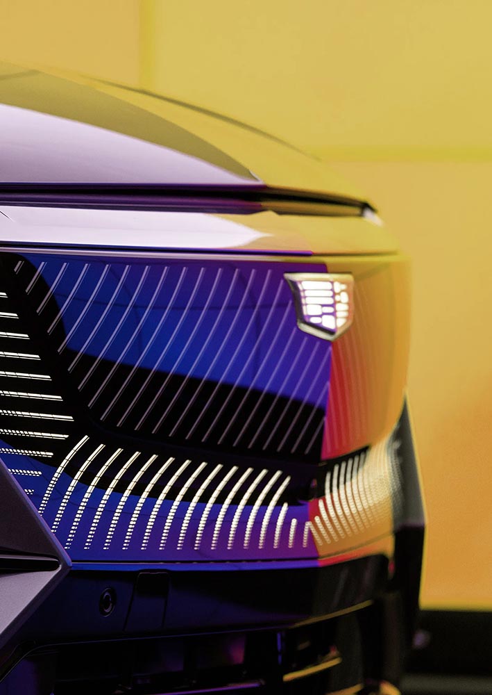
Not only that, but there’s the new trend among luxury automobiles — mere cars aren’t good enough — of illuminated logos;
Although books as objects have been around for many hundreds of years, by looking at the history of the dust jacket, we can see how young the modern book design really is.
Back in the ’90s and Aughts, my ex-wife and I ran a popular book design blog called Foreword. For a variety of reasons, from divorce to moving to Georgia and then deciding to do photography full-time, I got away from it. I even let the company name, ospreydesign, get away from me.
I’ve been seriously regretting losing Foreword for a while now — and its return one of the driving reasons for the new web site. Part of that has to do with a return to book design, and wanting to comment on the same, but also because I don’t do social media and have wanted a space to talk about — and get feedback on — items to do with book design, photography, and so much more. There’s no place better than your own web site. Thus, Foreword is back, this time as part of my personal site: gileshoover.com.
Memory Lane
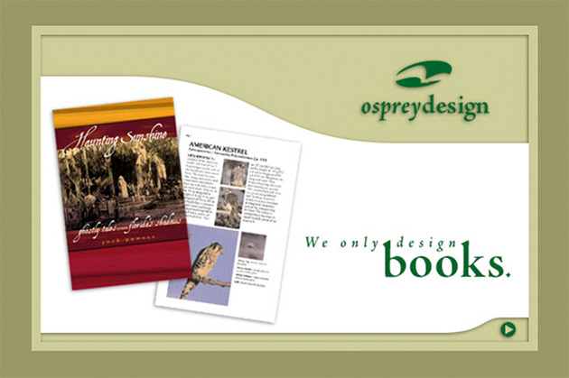
Here’s what ospreydesign looked like way back when:
ospreydesign as of February, 2001
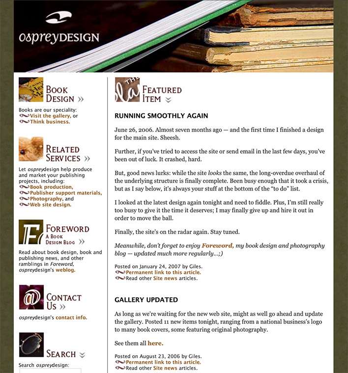
The site evolved, but only to a point — those were the days of having to pay attention to screen width. Remember: 15-17-inch screens were the new hotness; 13-inch was more normal. (Hence the small layout.) There was something comforting about it, though, and this look preserved for years. Here’s another screenshot:
ospreydesign’s home page, as of January, 2007
Foreword, a relatively new item called a weblog, or blog, was both a vehicle of discussion and publicity. And it worked — this little blog grew and gained followers, basically riding the early “wave” of blogs.
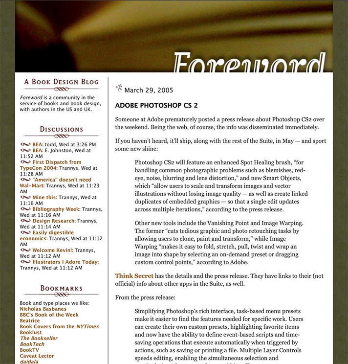
Here it is from 2005:
Foreword in March, 2005
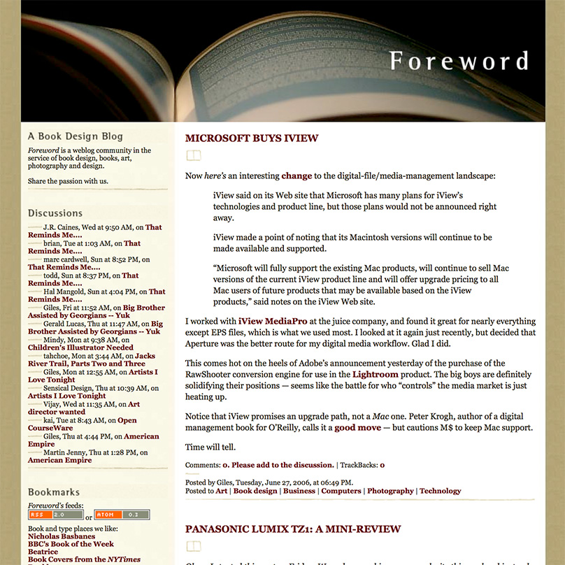
The “look” changed shortly after, while the popularity continued to grow. Here’s another, from fourteen months later:
Foreword‘s new, wider-columned look, from June, ’06
At this point, Foreword was at its utmost; thousands of readers, #1 in a Google search for “book design,” pretty much everything — and I, quite frankly, decided to throw it all away.
The Photography Era
Changing my priority to photography full-time was both awesome and a completely mixed bag. I absolutely loved the instant results of digital photography, and enjoyed the possibilities of editing them; filters, textures, black and white, and more. The creativity was more immediate, as well, in that I was my own “editor,” for lack of a better term, not answering to as many people as designing books can be.
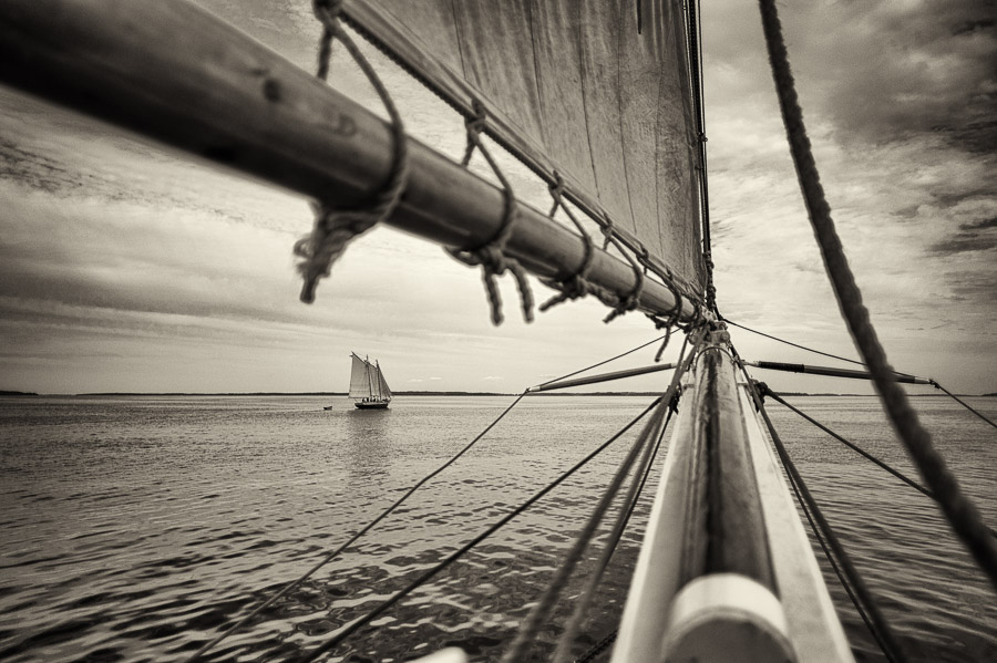
Making money was more difficult than with book design, but somehow more exciting; in many ways, it’s a performance art — I had to get it right at the time (there are no redos — events move on!), then make it better in the edit. But, I quickly found that weddings and events were not my strong suit. Like many making a profession out of a passion, I too often clashed with the “vision” thing; what I wanted to do — architecture, landscapes, “things” more than people — wasn’t what you made money on.
Maine Schooners, 2009
Worse, I was ahead of an extremely powerful wave: photography as something ubiquitous. With the rise of everything from a flood of new folks doing photography full-time to practically everyone “being” a photographer with just their cell phone, there was absolutely no way I could make the success out of it that I could have had I just stayed with book design first and photography second. Sure, I still did book design — I was early in the photography book genre — but photography as a career proved unsustainable.
Lesson learned.
New Memories
So, book design is again what I describe my profession as, with photography back to being a passion instead of a full-time job, and Foreword has returned. I’m better for it, frankly; so, hopefully, will my readers, as we can again share my love book design — along with why I’ve returned to it full-time.
Having a blog again also gives me a chance to talk about design, book production, photography and how they’ve changed in the intervening years, and recommit myself to regular posting; something I’ve missed and hope others have, too.