Tag: kottke

  • Beautifully Briefed 24.5: On Into Summer

    Beautifully Briefed 24.5: On Into Summer

    This time, we welcome the start of summer with a selection of photography and book design items — with, as usual, a couple of bonuses. Oh, and a computer item with its own “bonus.” The Summer of Joy starts now.

    SteerMouse

    Like many who spend a ton of time mousing, my production Mac sports an aftermarket pointing device: a Logitech MX Master 3S. It’s a great mouse: ergonomic, covered in button options, and with a freewheeling scroll wheel that makes both design and surfing a joy.

    Unfortunately, Logitech’s software doesn’t live up to the hardware’s promise. I’m certainly not alone in thinking this way, but like many, I’d resigned myself to living with it . . . with one glaring, continually-irksome exception: over the years, they’d actually removed a regularly-used feature.

    There’s something significant missing from the available options. (Logitech.com screen capture.)

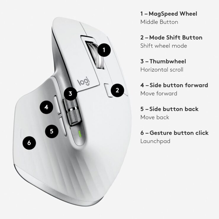
    That’s right — there is no way to reprogram the two main buttons. They’re a single click (left) and a command/control click (right), whether you want ’em that way or not. Most of the time, I don’t.

    It’s fine for surfing, sure, and for other applications as well. But for book design, not so much. The right button has to be a double-click. That way, word, sentence, paragraph and section selections are readily available through a combination of first- and middle-finger clicks. Sure, they could be assigned to the side buttons (4 and 5, above), but if you’ll forgive me mangling an analogy, race drivers don’t try to get their feet on the door handles when clutching.

    Thankfully, while sitting in a tire shop the other day — speaking of driving — I was making the wait more palatable by listening to Accidental Tech Podcast, wherein Steven Hackett’s post on Logitech software was briefly mentioned. And the clouds parted.

    Okay, sure, it was technically unrelated. But he’s trying SteerMouse — and that’s all the recommendation I needed:

    It may not look as flashy, but it’s the content that counts. Kudos.

    My double-click is back! Quality independent software, highly recommended.

    Special Bonus #1: From another chapter of less-than-ideal software, Adobe continues to flub the landing. PetaPixel has been on their case in a significant way, with Adobe Says AI is the New Digital Camera, Adobe’s CEO is Just Not on the Same Wavelength as Artists, Adobe Throws Photographers Under the Bus Again: ‘Skip the Photoshoot’, and ASMP Calls Out Adobe for Its ‘Shocking Dismissal of Photography’. Whew.

    A Couple Library of Congress Photographs

    Speaking of PetaPixel, they’ve posted a story on someone retiring from what seems like a great way to spend a career: “The Prints and Photographs collection in the Library of Congress number more than 15 million images. Maintaining the archive is a big job and a retiring librarian has picked her favorite pictures after working there for 34 years. [Read] Jan Grenci’s final blog post.”

    Even the cats know the refrigerators contain plenty of food at the Casa Grande Farms. Pinal County, Arizona. Photo by Russell Lee, 1940.
    Two pigeons on a ledge with a view of the Chrysler Building in the background. Photo by Angelo Rizzuto. June 1957.

    The LOC’s Picture This has a plethora of great posts, and 15 million photographs is a great way to pass a rainy afternoon (or two). Enjoy.

    Special Bonus #2: From the archives comes another PetaPixel post on Getty’s Open Content Program, with its 87,000 free-to-use photographs: “Add a print of your favorite Dutch still life to your gallery wall or create a shower curtain using the Irises by Van Gogh — the possibilities are endless,” Getty explains.

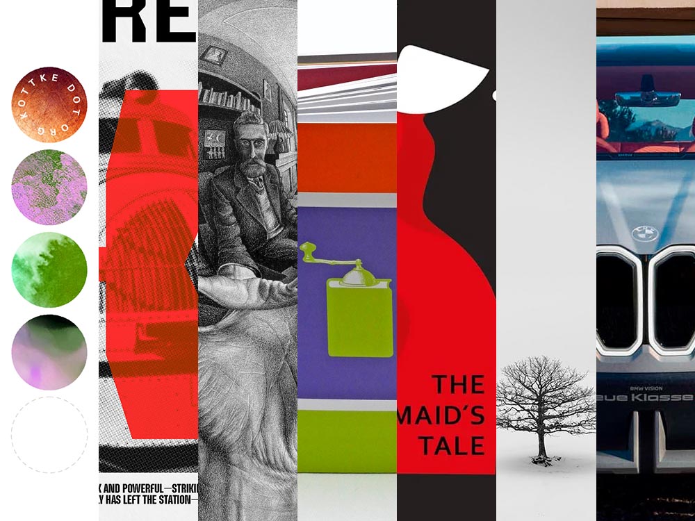
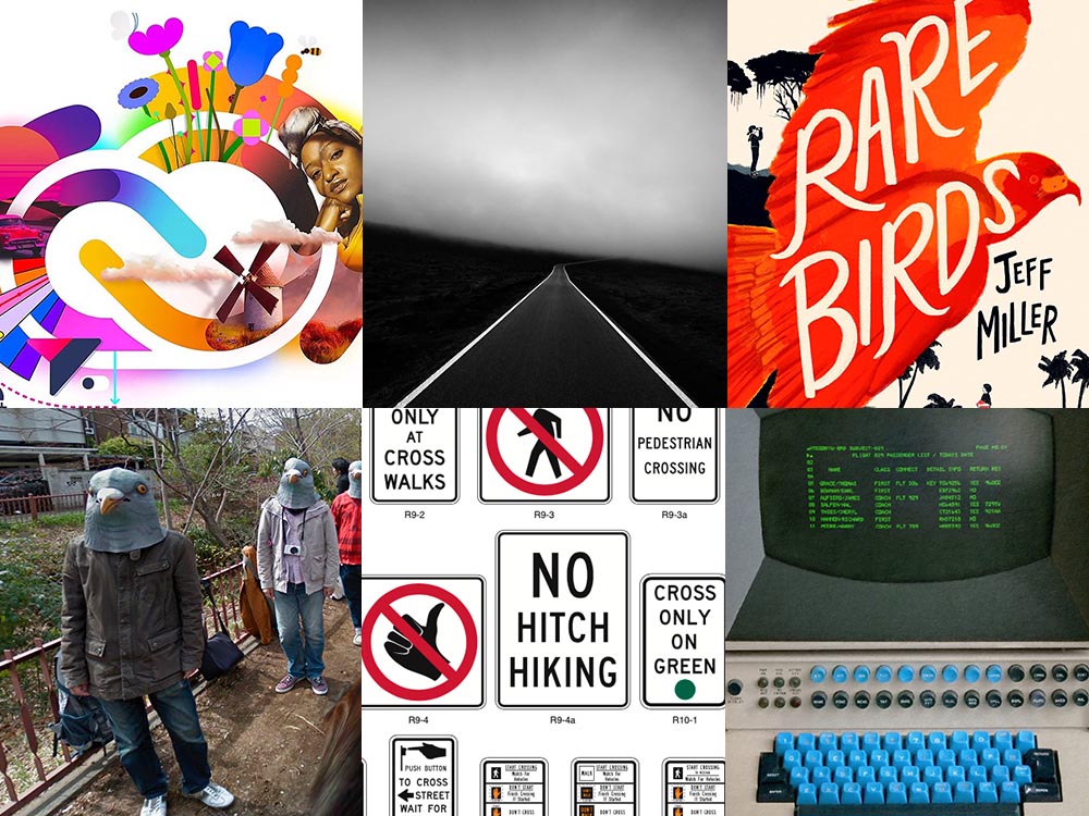
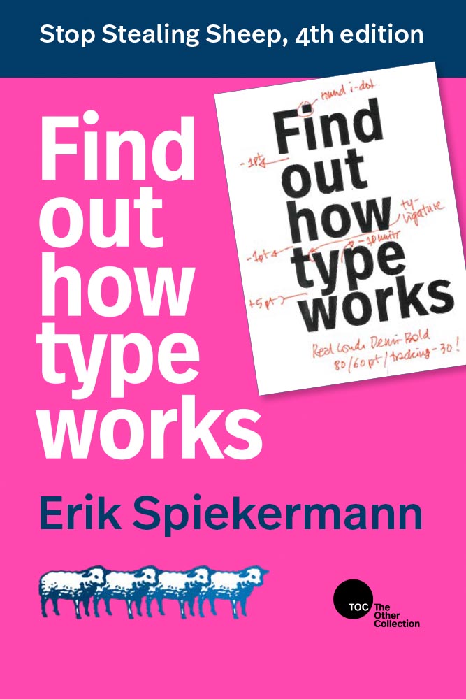
    Kirkus: 20 Books that Should Be Bestsellers

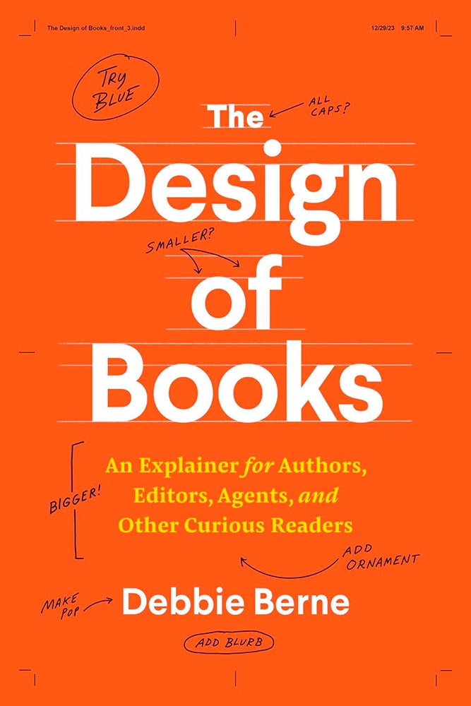
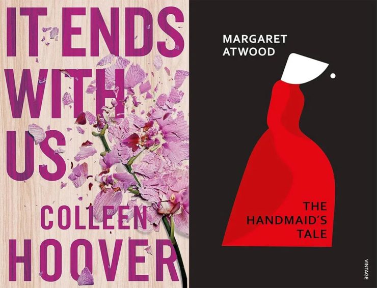
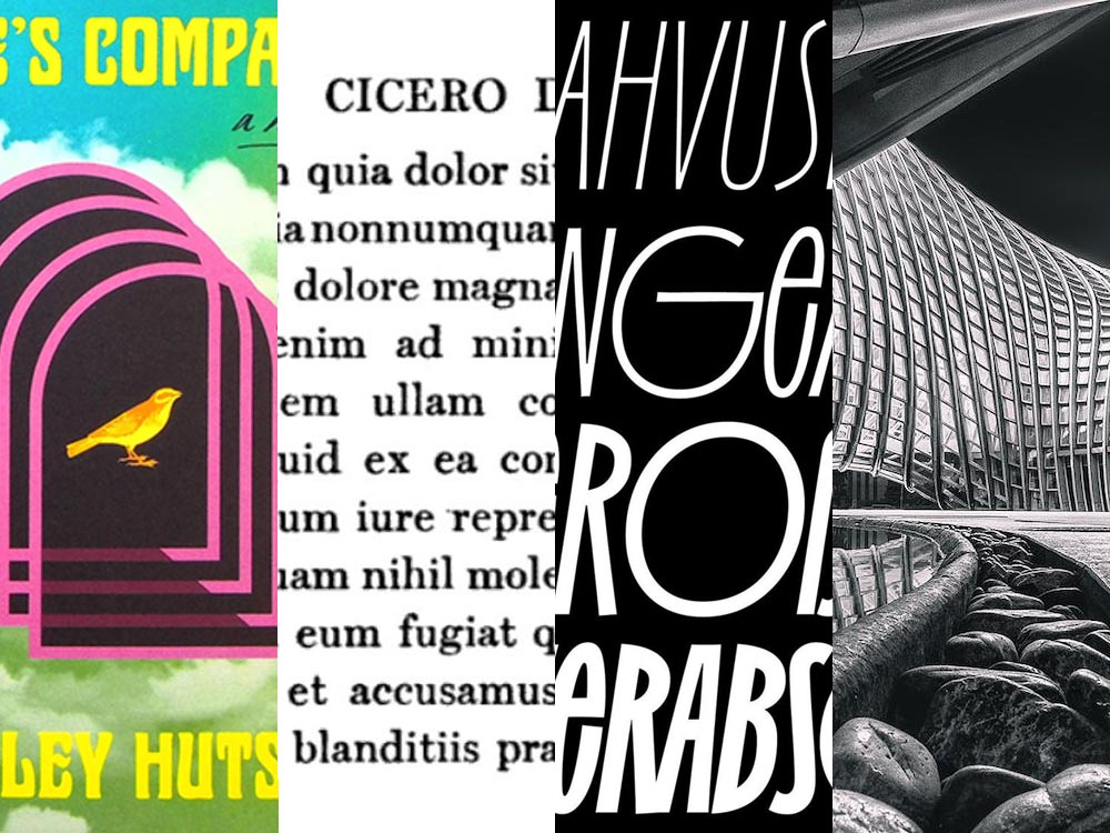
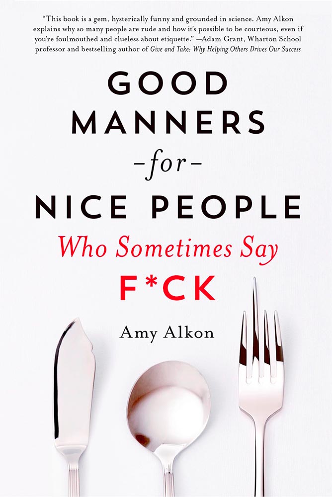
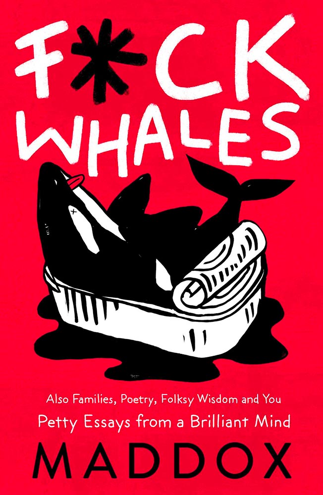
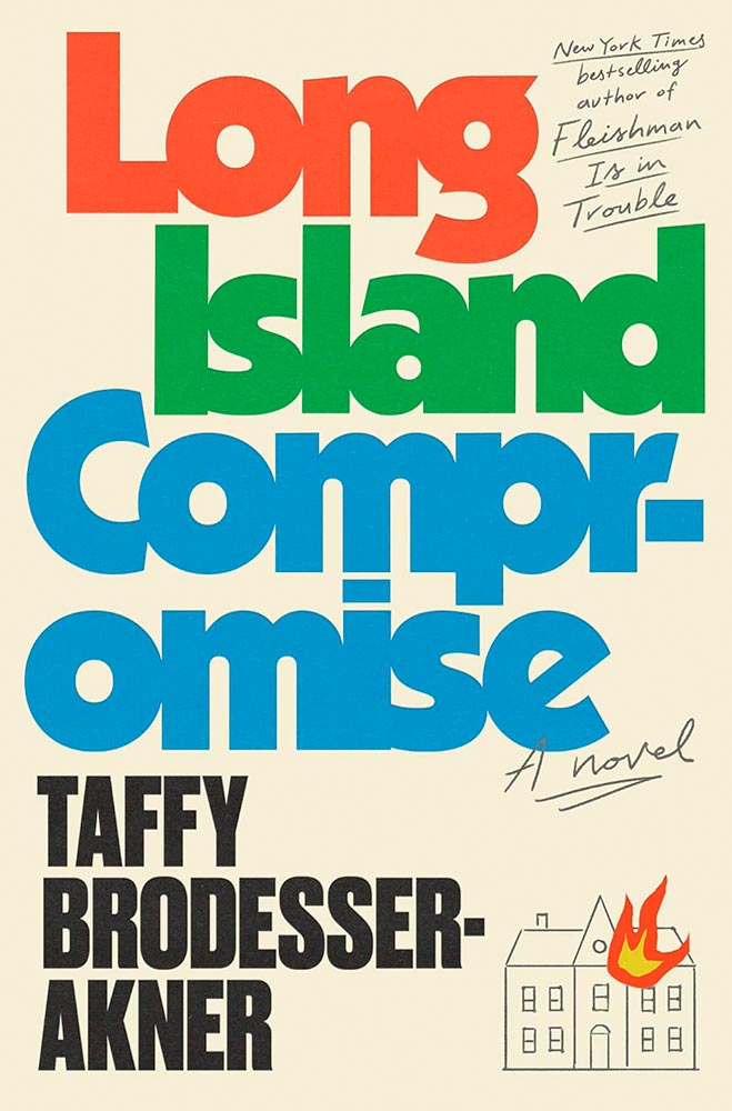
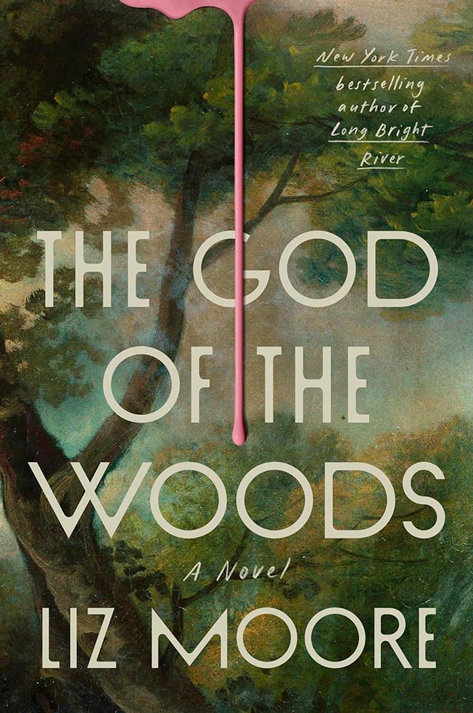
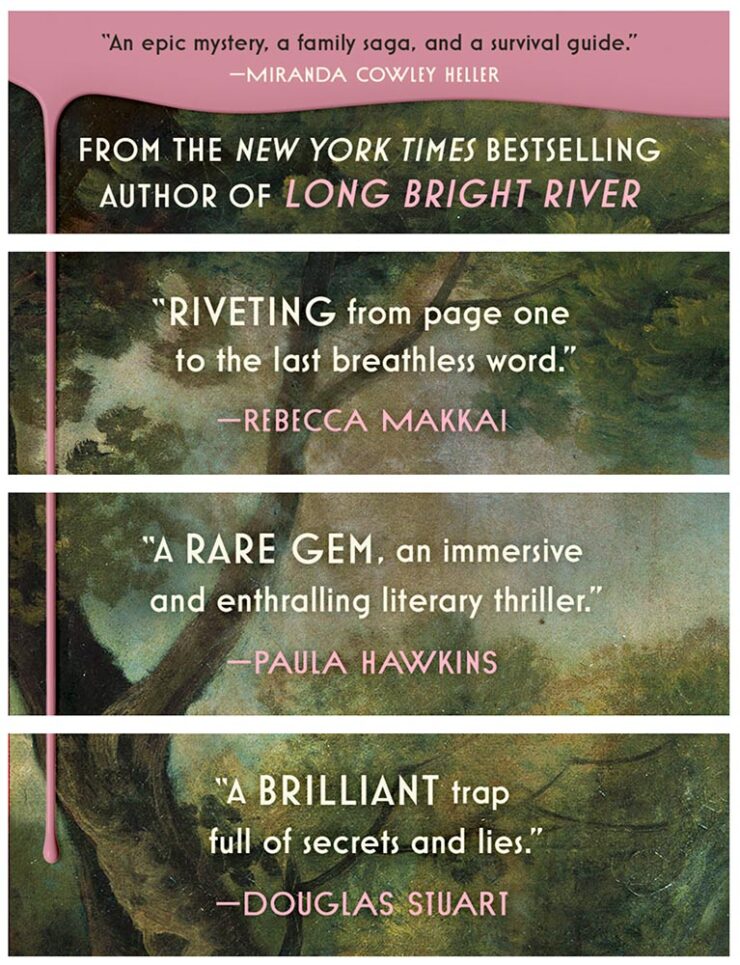
    Kottke points us to a Kirkus Reviews post, 20 Books that Should be Bestsellers. Some good book design here:

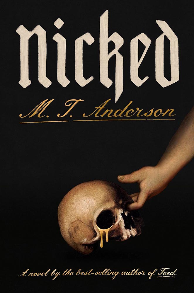
    Both of the above have been added to my “potential best covers” folder (without designer attribution, alas); the former for what I’d call “the quintessential 2024 style,” and the latter for the quintessential book cover purpose: fantastic type treatment and compelling imagery combined with the-question-that-has-to-be-answered. (“The seven-hundred-year-old bones of Saint Nicholas […] weep a mysterious liquid that can heal the sick,” Amazon explains.) Good stuff.

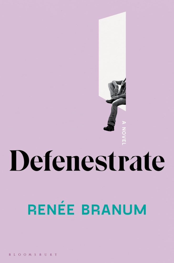
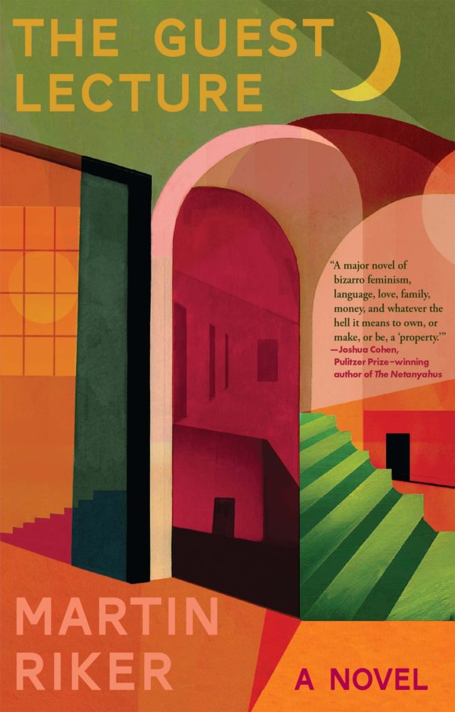
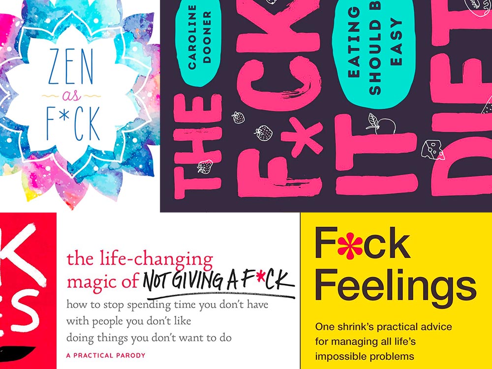
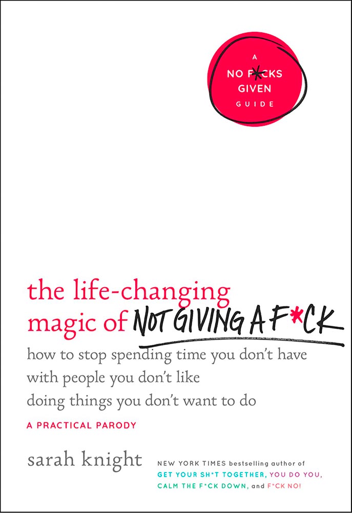
    There’s also this, which isn’t quite up to the above but still interesting:

    …with its box o’ quotes on Amazon:

    Nice.

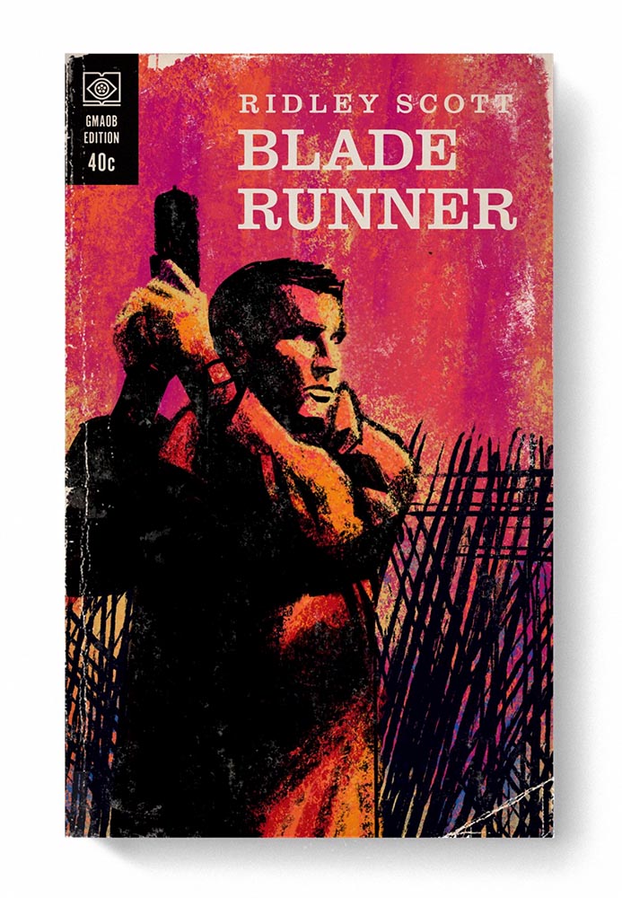
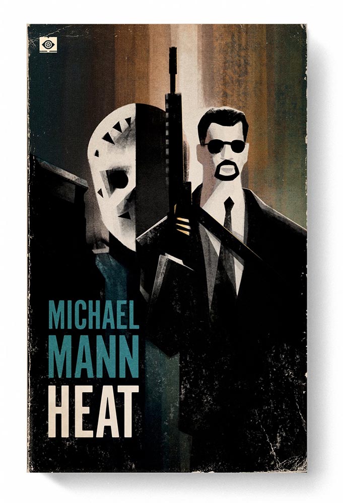
    Special Bonus #3: Chip Kidd has been promoted: “VP and art director at Knopf and graphic editor at Pantheon.” Few are more deserving, as the long list of accomplishments on his Wiki page attests.

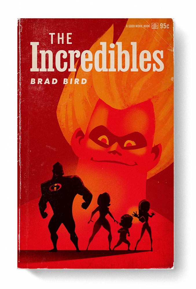
    A couple of faves from “Good is Dead,” a selection of book covers he’s designed:

    Cover design by Chip Kidd.
    Cover design by Chip Kidd.

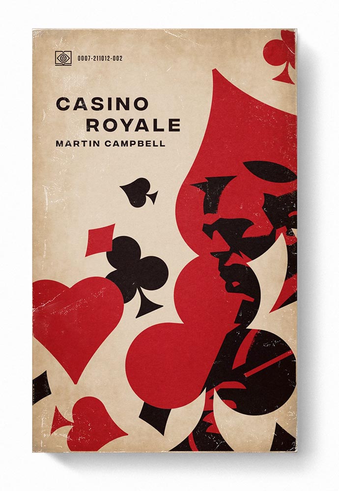
    And, of course, Naked, in this post’s cover image. Kudos.

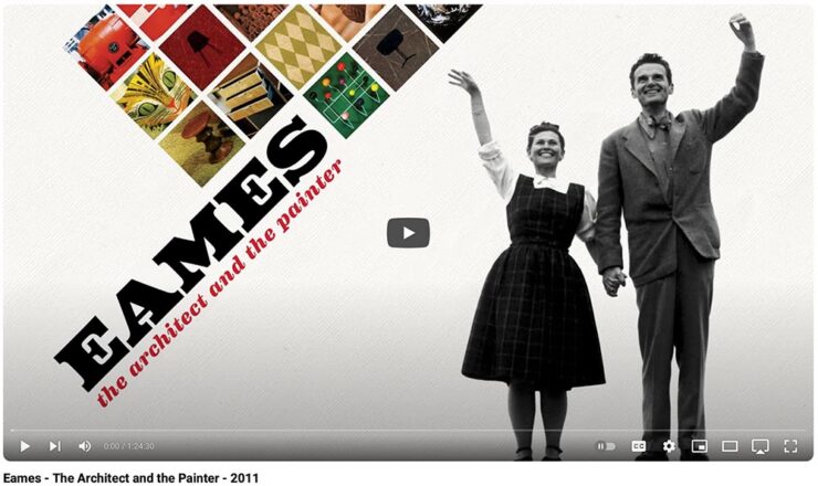
    Special Bonus #4: One the subject of great designers, this film on Charles and Ray Eames was a winner. (It’s from 2011, but was new to me — and hopefully you, too.) Watch when you can:

    YouTube won’t allow me to embed this, unfortunately — click the link above to view.

    Special Bonus #5: The lede-of-the-day award: “Do all book covers look the same today? Euronews Culture goes under the dust cover with those that design them.”

    The interesting thing here is a discussion of risk — ’cause, of course, in today’s culture, a book cover alone can result in a title getting cancelled banned — revolving around things, um, yellow:

    One of my favorite covers of 2023, still without a cover designer attribution. (Darn.)

    Special Bonus #6: Penguin Books reveals the Cover Design Award 2024 shortlist, a contest for non-professionals to take a crack at Penguin greatness. (Via CreativeBoom.) My favorite:

    Cover design by Charlotte Gill.

    Update, 27 June 2024: The winners for the Penguin item, above, have been posted. CreativeBoom covers it.

  • Beautifully Briefed 24.4: April Snow(ed Under)

    Beautifully Briefed 24.4: April Snow(ed Under)

    This April has been busy — meaning that I’ve not marked as many items for this column as usual. (I generally keep a browser tab group going throughout the month with items that could potentially be added, then weed them out/down as posting time gets near; usually, I aim for four or five diverse items.) This month, a great young Egyptian photographer and some details on what goes on, er, under the covers of book design.

    Karim Emr, Photographer
    Infinity, Karim Emr, 2021. The print is 64×64 inches(!).

    Just look at that — awesome. The moment it appeared on Kottke, it got marked for posting. It’s fantastic to see a familiar locale taken with a fresh perspective, proving once again that no matter how many cameras exist in the world, it’s what you do with it that matters.

    This is great, too:

    “Water, Water, Water,” Karin Amr, 2021. (Forgive the color banding; that’s my fault, not the photographer’s.)

    I didn’t realize that was flooded at first — the desert plays many tricks. For more, check out his Instagram or order prints at 1stDibs.

    The Design of Books

    You’re reading Foreword, so it’s safe to assume at least a passing interest in book design. So this one’s a natural to highlight:

    New title by book designer Debbie Berne

    Professional book designer Berne debuts with her first self-authored (and designed) title that seemingly anticipates every question people curious about book production might ask, as well as many they probably hadn’t thought about. . . . This title illuminates all that goes into producing and designing a book.

    — Library Journal
    Interior highlights from The Design of Books.

    From crop marks to the editorial workings, a worthy read for those in need of better understanding the process, those in the process (you’d be surprised: it’s more than authors and editors), and, as the author — and the LJ — say, “other curious readers.” Recommended.

    Special Bonus #1: The above is courtesy of another Kottke post, which has a comment regarding the redesign of the Book of Common Worship for the Church of England. It’s long and detailed, but it you have a minute: An account of the making of Common Worship: Services and Prayers for the Church of England. [PDF]

    Special Bonus #2: HarperCollins, one of the biggest publishers in the world, has something to tout: saving trees through “eco design.”

    It’s painfully clear which is easier to read: a change for the better . . . ?

    Fast Company reports on this, although to be honest I’m not sure it’s an improvement — while it’s impressive that, “so far, these subtle, imperceptible tweaks have saved 245.6 million pages, equivalent to 5,618 trees,” perhaps the startling statistic there is that a single tree can produce nearly forty-four thousand book pages. (Along with some bark mulch, presumably.)

    In any case, the VP of creative operations and production at HarperCollins — apparently an actual title — is proud of their “learnings.”

    Doctor? No, Book Designer

    The AIGA Eye on Design‘s book design category, always full of gems, highlights the career path of another book design professional, Jason Ramirez:

    One of the first in his family to attend college, he studied biological sciences and later religious studies at the University of Rochester, and after graduation he began taking night classes in typography, color theory, graphics, and web design. At nearly 30-years-old, he applied and was accepted into Parsons School of Design, where a course with cover designer Gabriele Wilson opened up a world of possibility.

    —Laura Feinstein, AIGA

    He’s done well:

    Cover design: Jason Ramirez

    A great read on the how’s and why’s of five worthy book cover designs when you have a moment.

    Special Bonus #3: CreativeBoom profiles another book designer, this time Leah Jacobs-Gordon, a freelancer in England.

    Cover design: Leah Jacobs-Gordon

    Enjoy your spring!

  • Beautifully Briefed 24.3: Bloomin’ Breadth

    Beautifully Briefed 24.3: Bloomin’ Breadth

    The end of March here in Middle Georgia means flowers aplenty, and usually with that, some photography — but I’ve not yet had a chance. (Stay tuned.) I have, however, been saving up links o’ interest: fonts, books, photography, and new(ish) car logos. Let’s go!

    Kottke Meets 2024

    Starting with one of the very few places that is still around from Foreword’s old days, the always-interesting Jason Kottke:

    2024 marks Kottke.org’s 26th year on the ’net.

    Great new looks for great content, with better Quick Links — the previews are ace — and incredibly-appreciated gift links to places like The New York Times and The Atlantic. If you haven’t been in a while, click and enjoy.

    Fab Spring Type

    With “a plethora of captivating new typefaces,” CreativeBoom celebrates spring with 11 new faces to tempt, inspire, and bring joy:

    Arillatype.Studio brings us a thousand glyphs of greatness.

    Zanco, with its bell-bottom style; Seabirds, inspired by 1930s book covers; Module, a “fluke side hustle;” and Graffeur, improvised from gaffer tape and glimpsed in this post’s header image, are all great. My far-and-away favorite, though, is At Briega, “inspired by the concept of hybridisation” and shown above.

    See ’em all here.

    Literary Three-Fer
    M.C. Escher’s Lesser-Known Works
    “The Drowned Cathedral,” a 1929 woodcut.

    “Unique perspective” never does justice to someone whose name defines the term. See some never-before-seen images alongside old favorites in a new Escher book highlighted at Hyperallergic.

    Multidimensional Libri

    “Experimental books are flourishing, [a]nd the evidence is seen” in this Daily Heller from PRINT: a traveling exhibition on three-dimensional books, all published titles.

    Oh, those Italians. Read on.

    Book Design Snobbery
    Hoover vs. Atwood — no joke.

    “Don’t get held back from the simple pleasures of reading,” argues Natalie Fear at CreativeBloq, “not everything needs to be minimalist.” Justification for commercialism or a common-sense explanation for the bookshelves’ current look? You decide.

    Photography Three-Fer
    Winners of Monochromatic Minimalism
    “Black Pearl” by Sascha Kohne. An honorable mention for the magazine, but a winner for me.

    Some incredibly good stuff here — but perhaps more importantly, did you know of Black & White Minimalism Magazine? There’s no end to today’s continued diversification, methinks.

    “Traveling through Costa da Morte, Galicia. 600m above sea level where the mountains separate the Cantabria sea from the Atlantic Ocean,” explains third-place winner Alexandre Caetano.
    Aging Facades of France

    “Shuttered blinds, peeling paint, and aging doors don’t usually indicate an invitation, but for French photographer Thibaut Derien, the fading facades of long-closed shops are well worth a stop,” This is Colossal says.

    Sony Photography Awards: Architecture
    The Ciudad de las Artes y las Ciencias (City of Arts and Sciences) in Valencia, Spain: “Hemispheric,” by Eng Tong Tan, Malaysia.

    ArchDaily‘s coverage of the annual Sony awards shortlist announcement was an insta-click.

    New Bull: Now Flat. (And a BMW.)

    Lamborghini practically defines flamboyant. So it’s worth a link when their logo gets less interesting:

    Old logo, left, new, right.

    Late at following the industry trend of flat-is-better, because, well, Volkswagen. (Okay, I undersell. Perhaps.) Read the lack of news at Motor11Motor1 also has a decent roundup of new car logos, from 2016-present, which underscores the “flatness” trend. or The Drive, where they manage to convey the brand’s use of the phrase “digital touchpoints.”

    I don’t know whether this will make any more sense in a few or even many months — which is relevant because of BMW. Four years ago, one of the industry’s design leaders expressed strong this new style, and I didn’t get it. But it’s worn better than most, and superlatively on occasion — check out the logo’s use on the Vision Neue Klasse X:

    Rather than a standalone, plastic part sitting on the paint, it’s etched into the finish. Man, I hope that makes it into production.

    Neue Klasse: do like. Bull? No so much.

    Update, 2 April: BrandNew, itself sporting a new look, has weighed in on the new Lambo style, calling it “not good.” (FYI, BrandNew is a subscription, quite possibly the best $20/year someone interested in design can spend.)

    • 1
      Motor1 also has a decent roundup of new car logos, from 2016-present, which underscores the “flatness” trend.
  • Beautifully Briefed 23.8: Summer Stew

    Beautifully Briefed 23.8: Summer Stew

    The August heat is met with some refreshingly cool items for you this time: beloved movies reimagined as vintage paperbacks, graphic design on the Internet Archive, and winners of the 2023 iPhone photography awards. Plus, a bit on social media that hopefully won’t leave an aftertaste. Let’s dig in.

    “Good Movies as Old Books”

    This is Colossal points us to an extraordinary personal project by graphic designer Matt Stevens: classic, acclaimed movies visualized as vintage paperback books. Everything about these spells “win.”

    From the aged look, illustration choices, and director-as-author to the logo and occasional price, these are all … perfect.

    Volume One is 100 titles, and while that book is sold out, prints are available at his website. The items in Volume Two, due this month, are guaranteed to be awesome.

    Graphic Design on the Internet Archive
    Emigre #20 – Expatriates. Courtesy of the Internet Archive via archive.digital.

    Another treasure via Jason Kottke:

    archives.design is a labor of love site run by Valery Marier where she collects graphic design related materials that are available to freely borrow, stream, or download from the Internet Archive. I’ve only scratched the surface in poking around, but so far I’ve found Olivetti brochures, a collection of theater programs from the 19th and early 20th centuries, several Apple thingsThe Vignelli Canona specimen book of wood type from the 1880s, and many issues of Emigre. What a resource!

    Jason Kottke, kottke.org
    An advertising brochure for the Olivetti Tetractys, circa 1956.

    Some of these are fantastic — set aside some time to explore and enjoy.

    2023 iPhone Photography Winners

    I don’t always link to these contests — it often seems like the publicity (and rights!) are all about the folks holding the contest rather than the people entering them — but I often look, and am always impressed with the quality coming out of a “simple” iPhone.

    Long Nguyen, France – 1st Place, Travel – “Last Night before Xmas”
    Scott Galloway, United States – 1st Place, Nature – “Wonder Wheel”

    And while both of the above are (relatively) recent phones, in the latter case showing the macro capabilities of an iPhone 12 Pro Max, even older phones can highlight the talent of the person using it:

    Derek Hager, United States – 3rd Place, Photographer of the Year – “Tucson Morning”

    Shot on a 2017 iPhone X. Nice.

    See all the winners, for 2023 and years past, at IPPAwards.com. (Via PetaPixel.)

    A Moment Regarding Social Media

    I’m not going to spend much time on this; I eschewed pretty much all forms of social media years ago now, and don’t regret it. That said, I do keep up with social media in the meta sense (a word that’s been stolen, as far as I’m concerned, by — wait for it — a social media company), and have noted the pain and concern associated with the implosion of Twitter.

    While this conversation started with Nick Heer and the always-excellent Pixel Envy, it’s obviously evolved as the year has seen one extraordinary cage fight event after another.

    Threads on Apple’s App Store, via the BBC.

    For the past decade, It’s been all but required for serious brands to maintain a social media presence […] yet instead of scrambling to claim digital real estate across all these newly emerging platforms, some companies are choosing to be more judicious about which platforms they choose to join. In some cases, they’re learning from brands who jumped the social media ship years ago.

    Chris Stokel-Walker, BBC

    The quote above, from the BBC, attempts to answer the question, “Why your favourite brand may be taking a social media break.” Short answer: it’s complicated. I’d argue there’s an even shorter answer — it’s smart! — but for people and brands that aren’t yet established, social media is often key to discoverability.

    This may be especially true for artists, designers, photographers, and others in the self- and small-business-employed creative field. Indeed, let’s go to a great source for those in the arena, Creative Boom, who recently spent a minute asking, “Creatives are saying social media is over… so what next?”

    Like any new craze, it was fun for a while. But there’s certainly nothing new about it any more. Facebook’s now been around for almost two decades. Twitter’s 17 years old. Even Instagram has reached its teens. And while many of us joined these platforms during their fun, “anything goes” eras, when everything was about the users, now it’s all about the algorithms and their use to make venture capitalists vast amounts of money.

    Tom May, Creative Boom

    While I agree that social media is a mess and has been for a while, I’m absolutely not going to tell you to give it up — only to remind you that I have given it up and continue to be completely okay with the decision.

    I do want to ask you, though, to choose wisely:

    Facebook’s “Threads (an Instagram app),” their answer to the Twitter/X debacle, as shown via Apple’s iOS App Store privacy report.
    Tapbot’s “Ivory,” available in Apple’s iOS App Store and showing that app’s privacy report, for the Mastodon social platform.

    Enough said. Turn off the computer, go forth, and enjoy a beautiful summer’s day.

  • Beautifully Briefed 23.3: Kottke’s 25, The Book Cover Review, B&N Back to its Roots, The End of Type 1 Fonts, and I Don’t Want to Log In

    Beautifully Briefed 23.3: Kottke’s 25, The Book Cover Review, B&N Back to its Roots, The End of Type 1 Fonts, and I Don’t Want to Log In

    This time, the twenty-fifth anniversary of one of my favorite websites, a new book cover review site, an interview with B&N’s CEO, the end of Type 1 fonts, and a world-class rant.

    Kottke Turns 25
    “Fine Hypertext Products,” indeed.

    Jason Kottke has been publishing a blog continuously for twenty-five years — more than half his life — and along the way, earned many an eye. (It’s been a full-time job since 2005.) Some of his thoughts from the anniversary post:

    My love for the web has ebbed and flowed, but mainly it’s persisted — so much so that as of today, I’ve been writing kottke.org for 25 years. A little context for just how long that is: kottke.org is older than Google. 25 years is more than half of my life, spanning four decades (the 90s, 00s, 10s, and 20s) and around 40,000 posts — almost cartoonishly long for a medium optimized for impermanence.

    I had a personal realization recently: kottke.org isn’t so much a thing I’m making but a process I’m going through. A journey. A journey towards knowledge, discovery, empathy, connection, and a better way of seeing the world. Along the way, I’ve found myself and all of you. I feel so so so lucky to have had this opportunity.

    — Jason Kottke, Kottke.org

    Cited here often, always brimming with interesting items, and a regular source of learning, Jason deserves massive congratulations. Happy 25! Here’s to many more.

    Bonus: Kottke was a guest on Daring Fireball’s The Talk Show. Check the links — Textism! — and enjoy a trip down blogging’s memory lane.

    The Book Cover Review
    NYT? No, English, actually.

    FastCompany points us to a new and interesting cover review site: mostly classic titles, covered in ~500 words “from a range of voices around the world.” Good stuff, with a NYT Book Review look and feel, updated regularly. Give it a try.

    The Verge interviews B&N’s CEO
    Decode B&N with James Daunt

    I’m not a regular listener of The Verge’s Decoder — it’s usually business-centric, going so far as to describe itself as secretly about org charts — but this one’s interesting: an interview between Nilay Patel and Barnes and Noble CEO James Daunt. They cover changes at B&N (with emphasis on why) and, of course, the elephant in any room:

    [Amazon is] really terrible at putting a book in front of you that you never thought you’d want to read, that you have no reason to read and no tether to at all. Whereas a bookstore is precisely the place that does that. You pick up the book that you never thought you would want to read, might read, or could even think about reading, by an author you’ve never even heard of until that moment. When a bookseller says, “Look at that,” “Read that when you next come in,” or “I love that,” or whatever it is, all those small, little recommendations are personal and able to attach themselves to books that otherwise have nothing going for them at all.

    James Daunt, CEO, B&N

    Props to The Verge for providing a full transcript, especially helpful for folks who would rather read the interview than listen to it. Whether you want to read or listen, though, book lovers in the US should take in this interview.

    Adobe Discontinues Type 1 Support
    Flying Suitcases.

    Back in the old days, Type 1 fonts were the backbone of desktop publishing. They were multi-part, often incomplete or corrupted, and always getting in the way of perfect print output — and yet beautiful and opening never-before-appreciated horizons of possibility for your projects.

    Now, in these days of OpenType, Google Fonts, and digital output, Adobe has taken the decision to discontinue support for the legacy Type 1 format. TypeNetwork has the full story, along with some options, and there are other converters if you need ’em.

    Bonus: TypeNetwork also has all of the Adobe Originals, from back when Adobe was your go-to instead of the corporate behemoth. Classy classics: see the list.

    The end of an era. (Via BrandNew.)

    The Perfect Rant: Solved
    There’s a park calling your name.

    One more from The Verge: “I don’t want to log in to your website.” The surge of login and email requests before being allowed to read “free” content is addressed brilliantly:

    So what we’re looking at here is creating a worse user experience in order to pursue a variety of scummy money-making schemes. And that sucks because there are no real public spaces on the internet. Here in reality, I can fuck off to a park and hug a tree and sit on a bench and do stuff without ads, without anyone trying to track me, and without having to pay a dime. There was a time within my memory when people tried to make websites feel like semipublic places — you could hang out on someone’s cool blog and enjoy yourself. 

    Elizabeth Lopatto, The Verge

    Read the whole thing, nod in agreement, and go enjoy that park.

  • Beautifully Briefed 23.2: Book Cover Portals, Lorem Ipsum, Favorite Fonts, and Building Photography

    Beautifully Briefed 23.2: Book Cover Portals, Lorem Ipsum, Favorite Fonts, and Building Photography

    Look out, look up, look forward, and look through in this edition of brief, link-filled goodness.

    “You May Now Enter”

    PRINT covers, uh, covers:

    While the book blob dominated the discourse for the last few years, we’ve recently identified another trend splashing its way across new releases: the recurring symbol of doorways, open windows, and mysterious portals.

    —Charlotte Beach and Chloe Gordon, PRINT

    A couple of the examples they cite:

    Not only a portal but a shelf. Cool.
    Not only a portal but also stairs. Nice.

    Unlike the blob, I’m in favor of this one — the hint of the unknown is appealing in a visceral way that offers more while simultaneously offering more sales by asking potential readers to speculate and, thus, engage. Nice call, PRINT.

    See more: Several of the covers on my Favorite Book Covers of 2022 follow this trend. (Some very enjoyable blobs, too.) Or, for another trend….

    Dummy Text?

    Here’s a question you’ve been absolutely asking yourself: what are the origins of the infamous Lorem Ipsum?

    The lack of placeholders on the shelf is remarkably appropriate. (Photo: Scott Keir.)

    Turns out it’s not as simple as Aldus [known as Adobe these days —Ed.] — or the even-more-infamous annonymous. Tim Carmody, the very capable guest chair at Kottke.org, fills it in: it’s Cicero. No kidding: Slate says so.

    De finibus, indeed.

    Fourteen Fonts to Follow

    Creative Boom, where having eyes on you is actually fun, celebrates “14 Fonts to Fall in Love With” for Valentine’s Day. While Foreword may be late to the party, a couple of the type choices are first rate:

    Irregardless1I absolutely want to steal their website design: the menu system is brilliant. and Pastiche, in order. (And no, I didn’t put those two together to be funny.) Read the article and pick your faves.

    Art of Building Photography

    I wasn’t aware of the Chartered Institute of Building, or their Art of Building photography contest:2Their terms are good, too — something remarkably rare in contests.

    “White Constellation,” by Francesca Pompei.

    Since architecture and photography very much intersect in my camera, brain, and work, I’m glad to have found this great source of inspiration:

    “House of God,” by Roman Robroek.
    “My own little cosmos within reach,” by Pati John.

    See many more, read some press coverage, and “celebrate the built environment,” as they put it. (Thanks to Archinect for the tip.)

    Then, go outside, find some nature, and celebrate spring. See you in March.

    • 1
      I absolutely want to steal their website design: the menu system is brilliant.
    • 2
      Their terms are good, too — something remarkably rare in contests.
  • Beautifully Briefed 23.1: Winter Potpourri

    Beautifully Briefed 23.1: Winter Potpourri

    From book design and minimalist photography to … well, book design and what absolutely isn’t minimalist photography, plus some street signs and another warning about Adobe. Let’s dig in.

    Book Design #1: People Really Do Judge a Book by its Cover

    From University College Cork — that’s Ireland, folks — we have something that, on the surface, seems obvious: a book cover “is the most likely factor to convince a person to read a book if they are unfamiliar with the work or its author.” Maria Butler, a PhD candidate in the School of English and Digital Humanities at UCC, reminds us why.

    Design by Kimberly Glyder.

    You’re reading Foreword, so you likely agree — and shown above is one of those worth-a-thousand-words images: the first of the 2023 titles I’ve set aside for my favorites of the year, and absolutely something good enough to make me pluck it off the shelf without knowing anything about either the title or author.

    Bonus: See 70 (!) more of my Favorite Book Covers of 2022.

    Book Design #2: Shift Happens

    A fantastic website has clicked our way: Shift Happens, for a book about keyboards.

    A screenshot from the Shift Happens website. Great stuff.

    This project not only scores with great web design — check the interactive version of the book, pictured above — but what also seems like great book design. It’s a Kickstarter project (or will be, next month), so the usual cautions apply, but I might just go ahead and take the leap.

    Couple of interesting book design items, by the way: the TOC is at the back, the endpapers are awesome, and the macro photography is tops. The book design reminds me of The Playmakers, still my favorite book design project ever.

    Bonus: Tim Walsh, author of The Playmakers, is still going strong. Nice.

    Photography #1: Minimalism

    The winners of the Minimalist Photography of 2022 awards are in, some are fantastic. Here are a couple of favorites, from the architecture category:

    “Prince Claus Bridge in the Netherlands,” by Arthur van Orden
    “Blue Window,” by Andrea Richey

    The Minimalist Photography Award is the only foundation that deals extensively and professionally with minimalist photography as a branch of photography in which the photographic artistic vision takes the lead.

    Milad Safabakhsh, President of Minimalist Photography Awards
    Photography #2: Wonders of Street View

    This is Colossal brings us another gem from Neal.Fun: the Wonders of Street View.

    “Wall Driver,” indeed.

    Direct quote, just because: “A man with three legs, a vintage car scaling a building, and an unsettling formation of people donning bird masks are a few of the scenarios highlighted in the terrifically bizarre Wonders of Street View.”

    I didn’t know it was a thing to dress up and pose for the Google cameras. Perfect.

    Street Sign Style Guide

    Speaking of street views, did you know there’s a style guide for highway signs? Would you believe that I’m a fan?

    Interestingly, there is an I-42/I-17 interchange in Phoenix, but this ain’t it: these signs are representational.

    As with most things government, there’s confusion, too many regulations, and yet it’s based around good ideas. Beautiful Public Data has a guide to the guide.

    Adobe Steps in it, Again

    From DPReview: “If you’re an Adobe Creative Cloud subscriber, you might want to go and turn off a new setting immediately. It’s been discovered that Adobe has automatically opted users into a ‘Content analysis’ program that allows Adobe to analyze your media files […] for use in its machine learning training programs.”

    It’s important to note that Adobe only uses the files saved in the “Creative Cloud,” something I don’t do as a matter of course, but even still, this is yet another example of Adobe using its monopoly position in the creative field to take advantage of its paying customers.

    Adobe, unsurprisingly, didn’t return DPReview’s request for a comment/clarification.

  • Beautifully Briefed, Holiday Edition (Late December, 2022): Nick Heer, Jason Kottke, Stealing Sheep, a Landscape Photograph, and Some Old Logos

    Beautifully Briefed, Holiday Edition (Late December, 2022): Nick Heer, Jason Kottke, Stealing Sheep, a Landscape Photograph, and Some Old Logos

    “The Bleak Cycle”

    I don’t usually think it’s fair to quote another blog post in its entirety, and I certainly won’t make a habit of it. With that out of the way, the always-interesting Pixel Envy, written by Nick Heer, hits us with a doozy — one that, due to its length and depth, requires the complete quote:

    The Bleak Cycle

    It’s a cycle. People create something, together, that reflects their energy and weird work; that thing becomes compelling as a result, and that makes it valuable, and at some point someone puts a price on it and someone else pays that price. It is at that moment that the thing begins to change. The new owner will almost always decide that what is most interesting about this thing is not the human essence that gave it value, but The Owner Himself, and will act accordingly. People will come back for the valuable stuff until the owner succeeds in crowding it out; when that crowding is done, the owned thing dies. Until then, what’s left is just what’s valuable—the humanity and brilliance and unpredictability and fun that all that cynical and idiotic and self-serving wealth is always and everywhere busy replacing with itself. There’s nothing to do but look for the good stuff until the looking becomes too challenging, or until it’s gone.

    David RothDefector

    Heer writes in response: “You may disagree with Roth’s headline thesis — ‘everything is Silicon Valley now’ — or his tie-in with the story du jour, Twitter, or his analysis of baseball’s problems. But the paragraph above? That is something to keep pinned in your brain. For most of us, it is a reminder to be wary of how things are changed in exploitative ways; for those in power, it should be seen as a cautionary pattern.”

    Pinned.

    Kottke is Back!

    After a few months off, Jason Kottke is back in the blogger’s seat to enrich all of our lives. As someone who’s been reading for years — he started in 1998, and I’m certain his site was in the blogroll of the old Foreword, back in the Aughts.

    Fine hypertext products indeed: Kottke.org, December, 2022.

    We might be waiting a while for his so-called “comically long what I did on sabbatical post,” but his Sabbatical Media Diet post is a gold mine of to-read and to-watch items.

    Welcome back, sir. May you blog for many seasons more.

    Stop Stealing [Free] Sheep

    No, not that — the type book:

    From Kottke, while we’re on the subject, one of his Quick Links from Dec 20th: “Google Fonts is offering a free download of the newly updated 4th edition of Erik Spiekermann’s Stop Stealing Sheep & Find Out How Type Works.” It’s a PDF, available now.

    9th Annual Landscape Photography Awards

    It’s fair criticism to say that I both decry photography contests and yet sometimes celebrate the results. But…:

    “The Winding Journey” by Max Rive, Border Between Chile And Argentina, Patagonia

    Wow. I couldn’t not highlight that photograph.

    Many more at the source. (Via DPReview.)

    Oldest Logos Still in Use

    Image Relay has an interesting item showing how long some familiar logos have been used — and, yeah, there’s a reason they’re familiar!

    The black triangle is when the company was founded, and the bar indicates how long a logo with elements still used today has been around.

    That’s but a sample of the complete listing; shown are nos. 3–8. Coca-Cola, the company I’d probably name if asked for the oldest logo, is no. 12. Click through for the rest.

    That’s it for this year

    Foreword will be back in January with our annual first-of-the-year best-of: my favorite book covers of 2022. Happy holidays, everyone!

    Top image: Tree Lights, December 2020, downtown Macon, Georgia.

  • I Swear, This Title….

    I Swear, This Title….

    Kottke recently revisited a theme that’s been running for a few years now: titles with a swear — f*ck, in this case — in the title. According to Slate, the practice stems from the 2011 parenting title Go the F*ck to Sleep, and has accelerated over the years.

    I’m more interested in the design of such a title. Bookstores, advertisers, and publicists demand that the swear never be completely spelled out, but that doesn’t restrict great design ideas. Here are a few of my favorites:

    Love the fork. (So to speak.)
    The less-is-more approach.
    Whales as sardines.
    Interesting choice with the capitals, or lack thereof.

    Note the over-arching theme: no, not that — the lack of photography. The vast majority of these titles are text based, supposedly because something competing with the swear would detract from the shock value. There’s a primary color thing going, too, probably for the same reason.

    Most of the time:

    Self-help, with style.

    Something different for your day!

  • Where You At? A Bioregional Quiz

    Where You At? A Bioregional Quiz

    A few days ago, Jason Kottke posted an item that raised an important enough question — well, twenty of them — that I wanted to repeat it here. The questions stem from a 1981 quiz1Developed by Leonard Charles, Jim Dodge, Lynn Milliman, and Victoria Stockley, originally published in Coevolution Quarterly 32, from winter 1981, asking how well you know your local natural environment. They are:

    1. Trace the water you drink from precipitation to tap.
    2. How many days til the moon is full? (Slack of 2 days allowed.)
    3. What soil series are you standing on?
    4. What was the total rainfall in your area last year (July-June)? (Slack: 1 inch for every 20 inches.)
    5. When was the last time a fire burned in your area?
    6. What were the primary subsistence techniques of the culture that lived in your area before you?
    7. Name 5 edible plants in your region and their season(s) of availability.
    8. From what direction do winter storms generally come in your region?
    9. Where does your garbage go?
    10. How long is the growing season where you live?
    11. On what day of the year are the shadows the shortest where you live?
    12. When do the deer rut in your region, and when are the young born?
    13. Name five grasses in your area. Are any of them native?
    14. Name five resident and five migratory birds in your area.
    15. What is the land use history of where you live?
    16. What primary ecological event/process influenced the land form where you live? (Bonus special: what’s the evidence?)
    17. What species have become extinct in your area?
    18. What are the major plant associations in your region?
    19. From where you’re reading this, point north.
    20. What spring wildflower is consistently among the first to bloom where you live?

    I did poorly. (In the words of the authors, “It’s hard to be in two places at once when you’re not anywhere at all.”) In fact, I did so poorly that I decided to not only follow up on the questions but put my camera where my mouth is.

    In answer to the first question, Macon and a good chunk of Middle Georgia get their drinking water from the Ocmulgee River:

    Ocmulgee (River) Origin

    In fact, this past weekend’s trip to Monticello and Barnesville were merely extensions of the trip to Jackson Lake and Dam, so I could see where the Ocmulgee starts. Next up is to trace the Yellow, Alcovy and South Rivers, which feed Jackson Lake. (See the rest of the photographs from the Jackson area.)

    Jackson Dam #1

    But I’d ask everyone reading this to ask yourselves the same questions. As Kottke points out, most of the people living here years ago would have known more of the answers than those of us who live in the built environment do. He passes on an idea from Rob Walker:

    Pick one of the questions you don’t know the answer to – and make it a point to learn what that answer is. After you’ve mastered that, move on to a new question.

    Go!

    • 1
      Developed by Leonard Charles, Jim Dodge, Lynn Milliman, and Victoria Stockley, originally published in Coevolution Quarterly 32, from winter 1981