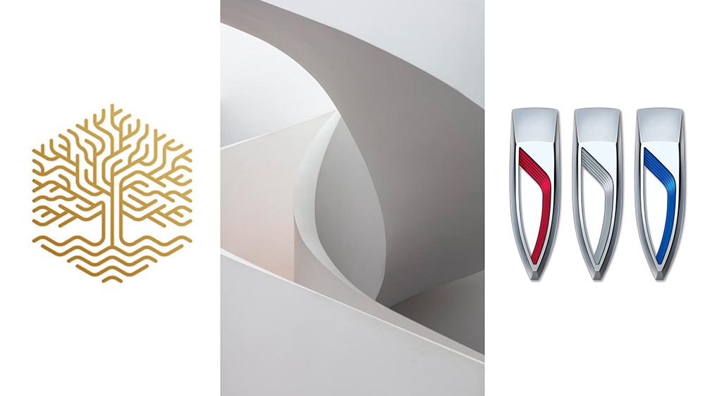
Three items for the end of June, 2022: AIA Los Angeles announces photography awards, the 2022 edition of the Logo Lounge logo trends report is out, and Buick makes its new logo official. Let’s get into the details.
AIALA Photography Awards
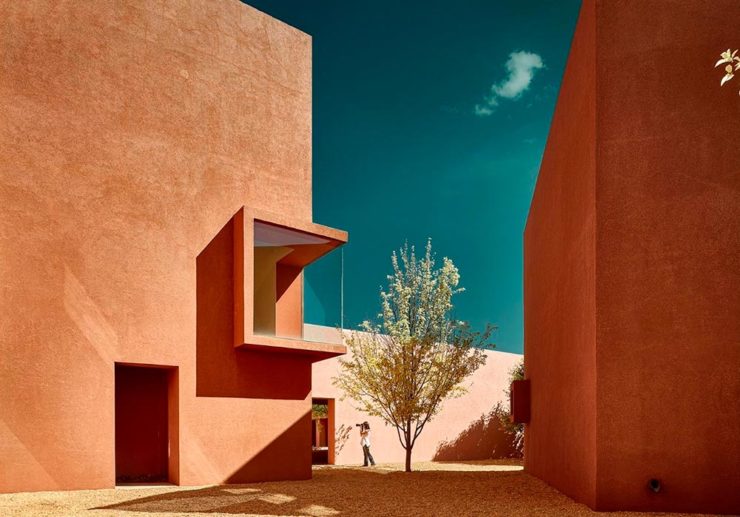
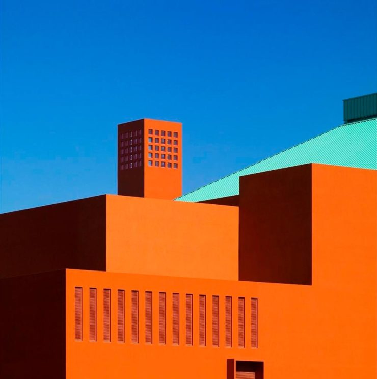
The Los Angeles chapter of the American Institute of Architects (AIA|LA) has announced this year’s winners of the annual Architectural Photography Awards, and there’s some pretty great stuff:
Ryan Gobuty: Santa Fe (Santa Fe, NM)Taiyo Watanabe: C-Glass House (Dillon Beach, CA)Tim Griffith: Mission Bay (San Francisco, CA)
[W]hile there are still corporate-looking marks being crafted there is a stronger effort to find ways to identify products that are artisanal and handcrafted.
Bill Gardner, Logo Lounge
Corporations trying to be more human. (News at 11.) But then, my use of that particular phrase perhaps betrays my lack of being in touch with the modern corporate world; I think publishing is a different animal, and prefer being part of that world despite the regular influence of corporate entities there, too.
Nonetheless, following logo trends is, from a purely graphic design perspective, worthwhile — and this report summarizes beautifully. Read on.
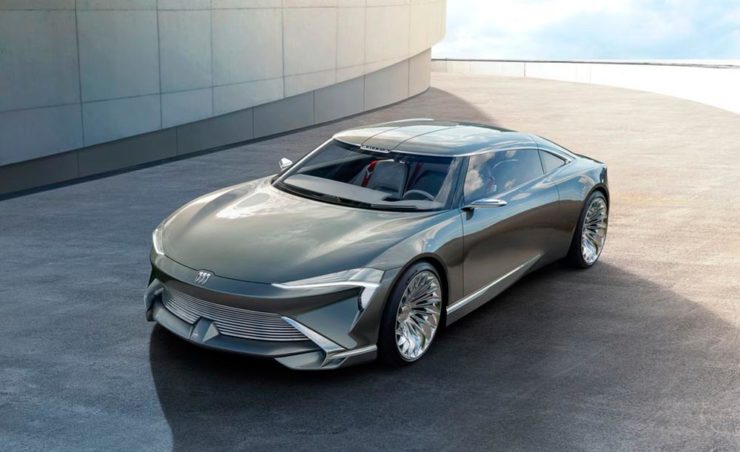
Buick’s New Logo, Officially
We’ve touched upon it before, but Buick has, with the release of the Electra Wildcat concept, officially updated its logo:
Official: Buick’s new logo
Electra is Buick’s name for electric cars, simultaneously stating the obvious while giving a big nod to past models — and the Wildcat concept is, dare I say it, borderline cool:
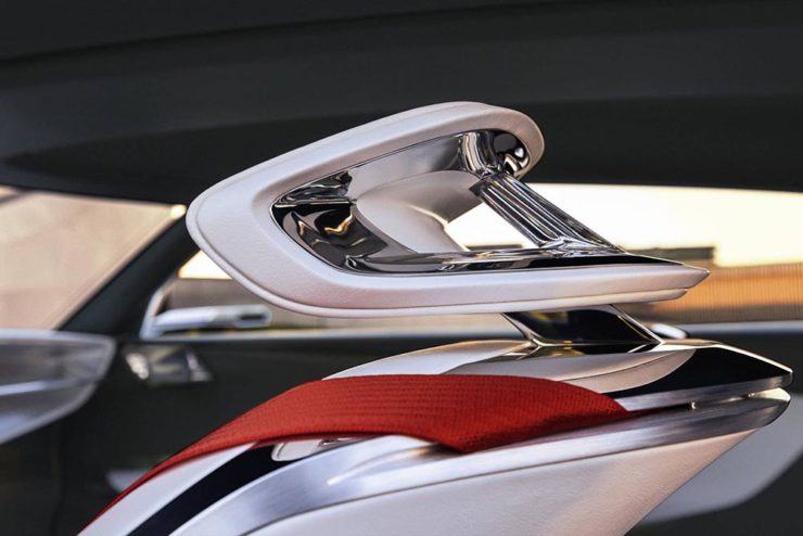
Both Buick and Cadillac have hinted at more Art Deco in their upcoming products, perhaps best illustrated on this concept’s interior:
It’s a head rest, folks.
Nice. (Not even remotely possible on a production model, but still.) Read more on Buick’s new logo and transition to an electric car brand at Car and Driver or The Drive.
Three completely unrelated items for you this time, ranging from the serious and interesting through the loony and interesting to something of a whole different stripe.
The Eames Institute of Infinite Curiosity
Update 2, 25 Apr:Brand New discusses this logo, with the usual catchy title: The Fast and the Curious: Counterspace Drift
Eames Institute’s “curious” logo variations, discussed at Brand New
Update, 8 Apr: It’s Nice That has more: The Eames Institute launches with a curious, “Eamesian” identity, and a logo that observes
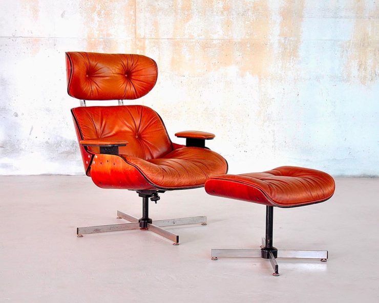
Original post: Practically everyone has heard of an Eames Chair:
A particularly awesome example of an Eames Chair (and ottoman).
What you might not realize is that the legacy Charles and Ray Eames left behind enriches our lives to this day. It’s a shame, then, that while their house is a mid-century masterpiece (and museum), much of their lives have remained behind closed doors.
For almost three decades, a barn-like building in Petaluma, California, contained remnants of one of the most iconic design legacies of the twentieth century. […] We created the Eames Institute because we want you to examine the archive of what you know—the collection of your experiences, understanding, memories, and questions—and connect to the provocations that call to you. We want you to tap into that same fount of relentless curiosity, and its power to shift your perception and open you to innovations and discoveries.
Now, however, there’s the Eames Institute of Infinite Curiosity. Awesome name aside, it introduces us to the more personal side of one of design’s strongest partnerships.
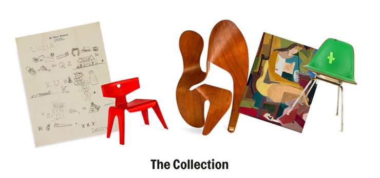
Items from the Charles and Ray Eames Institute. Drawings from the Charles and Ray Eames Institute.
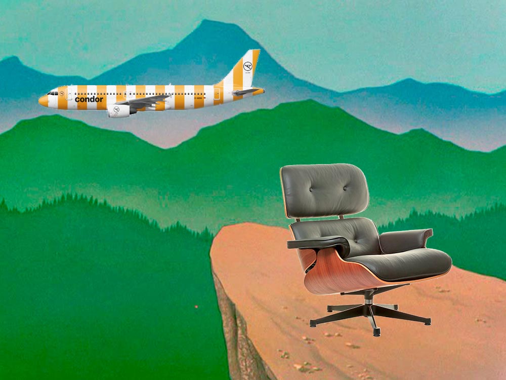
Crossed wires, anyone?Imagine who might run up to — or even get pushed off of — this cliff.A nice, innocent factory. Nothing could possibly go wrong.
Next time I treat myself to a Loony break, I’m going to make sure to spend some time looking beyond the action and appreciate the backgrounds. Nice.
Condor Airlines Rebrands
Most of you have probably never heard of Condor Airlines; they’re mainly a European thing, a “leisure” airline associated with Thomas Cook, formerly owned and run by Lufthansa. (Here’s some history.)
It doesn’t particularly matter. What does is the bravado exhibited by management. Before, a typical airline logo — dare I say, typically Germanic:
Condor’s OLD livery.
Then someone said yelled, “HEY. WE DO VACATIONS. LIKE BEACH TOWELS. LET’S DO STRIPES.” The result:
Condor’s NEW livery. Wow.
Armin Vit:
The new livery has zero fucks to give and just plasters every plane with thick vertical stripes that go against pretty much every single assumed tenet of what makes a good livery. It doesn’t look speedy, it doesn’t look nimble, it requires a lot of paint, and by all other standards it is just plain ugly and I love it.
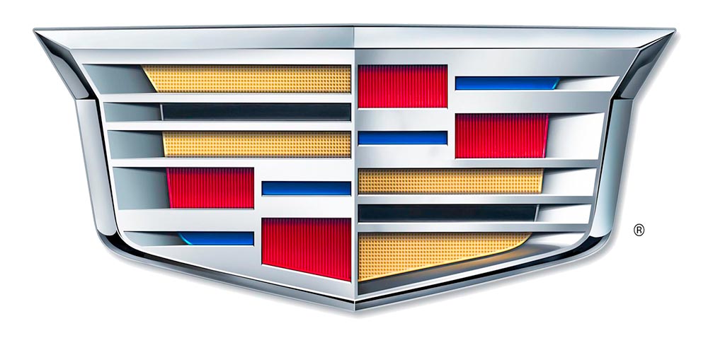
As seen in the last line above, the 2014 logo is a simplification of the 2000 logo, sans the “old-person” wreath, and I thought quite successful:
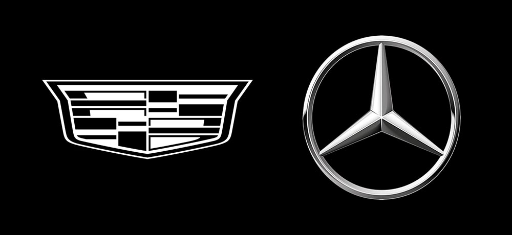
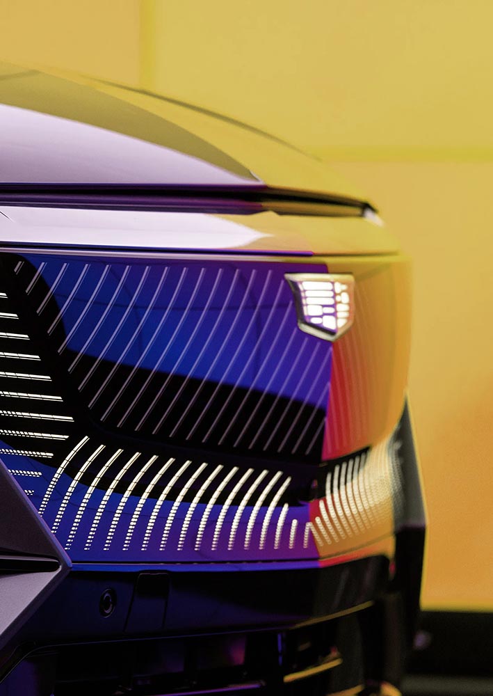
Fast-foreword (ahem) to 2021, and the monochromatic, flat-logo thing is in full swing. The latest “old-person” target is the Cadillac script, replaced with another trendy item, a custom “Cadillac Gothic” font.
Not only that, but there’s the new trend among luxury automobiles — mere cars aren’t good enough — of illuminated logos;
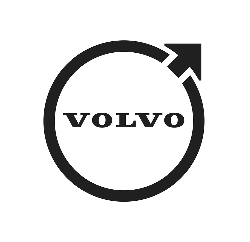
The “Iron Mark” has been given a makeover, and the result is … interesting. First, as a reminder, here’s the logo as it appeared previously — no, the one previous to that:
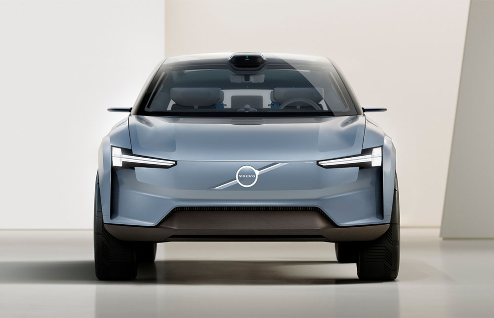
My mother’s 2010 Volvo S80
The blue has been associated with Volvo’s logo for a long while now, and it’s slowly been disappearing from the lineup (in favor of black in the same location). However, they’ve decided — they being both Volvo Cars and Volvo Group, two distinct entities (the latter including Volvo Trucks, the Volvo construction folks, Volvo Penta [marine], etc.) — to change to this new, more austere logo and word mark simultaneously. Aaaaaand:
See the previous coverage on Foreword. Can’t go, however, without a hat tip to Kristen Shaw at The Drive, who dug out this 1937 version — which, I’d argue, beats ’em all. Kudos.
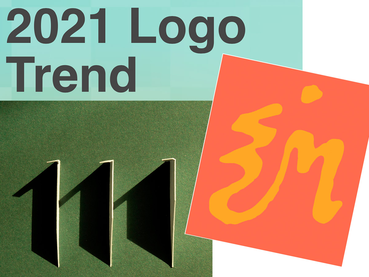
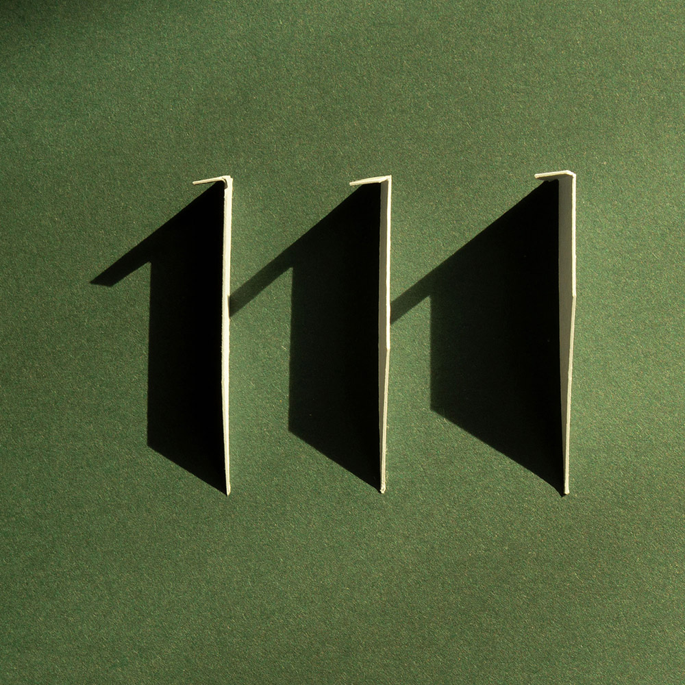
Three items for you here, starting off with the 2021 Logo Trend Report, from the Logo Lounge. From the Asterisk to Electric Tape, Quads, Chains, and more:
Bill Gardner discusses all fifteen different trends, with logos to back ’em up (naturally).
Next, “A Cabinet of Curiosities” from Hoefler & Co.
Printers once used the colorful term ‘nut fractions’ to denote vertically stacked numerators and denominators that fit into an en-space. (Compare the em-width ‘mutton fraction.’)
Now, let’s take a moment to celebrate the creator: Ken Garland. Not your typical graphic designer, he reached out, embraced the 1960’s and ’70s, and never looked back.
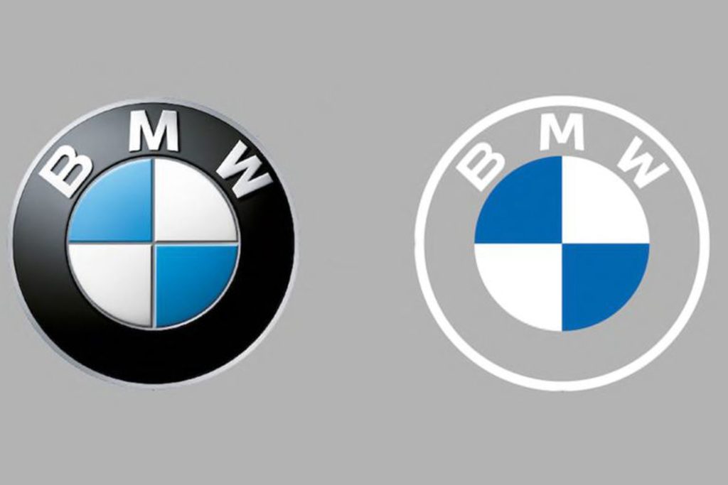
Original post, March 5th, 2020: After 23 years, BMW has updated its logo … but there’s a problem.
Let’s back up a little, as even the previous logo wasn’t perfect. Debuted in 1997, it followed the then-trendy “3D” look, complete with highlights. It was, however, clearly BMW — black background, blue-and-white roundel, chrome outline, lettering. This new one, however, loses the iconic black (for transparent) and chrome outline (for white):
BMW’s logo: 1997 (left) and 2020 (right)
It’s less representative and less clear in my opinion, but hey, I’m only a BMW owner, not any part of their marketing team.
Another problem: it debuted on the Concept i4. controversial all by itself.
Why not revert to the earlier, 1963 version? (Or update it with new type — but keep the black?) Transparency is fine in some cases, but I’m not sure that this isn’t a case of style over substance in the actual use cases (web site logo, app logo, etc. — more than just on the cars, I mean).
Update, 7/27/20: Dezeen has a roundup of the six other companies that have made their logos “flat,” proving the “3D” look mentioned above is truly out of fashion:
Audi, Citroen, VW, Nissan, Mini, and Toyota, oh boy!
Ford Almost Let a Graphic Design Legend Update Its Blue Oval Logo in 1966: Paul Rand, who designed iconic logos for IBM, Cummins, ABC and numerous other companies, designed a sleek logo for Ford that went unused.
“Opel Details All-New, Slimmer And More Modern ‘Blitz’ Logo,” at CarScoops.
Update, 12/30/20: Kia’s was previewed on a show car earlier in the year, but they’ve gone and made it official:
There were some changes along the way, if you compare what’s on the show car and what you see above — and not all for the better, as it almost gets smeared. Still, looking forward to seeing where one of the most dynamic car companies today goes with this.
Update, 1/8/21: GM. One word: GAK.
So bad I actually feel sorry for them. More here and here.
Update, 1/13/21: Brand New is actually much nicer to GM’s logo update than I expected. Diplomacy? You decide. (Brand New is a subscription now, BTW — the best $20/year available, IMHO.)
Update, 3/2/21: Peugeot has joined the fray. Not great, especially at smaller sizes, but at least not the GM train wreck — and, in many ways, better than the last couple of outline lions (this one seems to be based on the 1960 version):
Read about the lion’s history here, Peugeot’s press release “reaffirming its personality and character” here, or one of the regular site’s notes, including a potential move upmarket here or here.
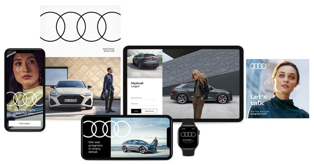
Update, 3/4/21: Audi, while not redoing their iconic “4 rings” logo, has redone the branding around that logo:
Update, 3/6/21: Speaking of Brand New, they have a good deal more information regarding Peugeot. Good stuff!
Update, 3/10/21:Dezeen has more on Peugeot, as well. And CarScoops has the first pictures of the new 308 — the new logo premieres on this model update — and discusses that, on the grille, some of the car’s sensors appear behind the logo. Interesting. (I still preferred the lion on the grille, myself. Not that we get Peugeots in the United States, anyway….) Check it out.
Update, 3/10/21: CarScoops has some more on Nizzan — uh, Freudian slip there: Nissan and their new logo.
Okay, who’s gonna be next…?
Update, 3/13/21: Uh… Renault!
Not as big a change as Peugeot, and more successful, too: single color, retains history well, still instantly recognizable, works at small sizes. Nice. Details from Motor1 or CarScoops.
Update, 3/20/21: Brand New discusses the new Renault logo:
There is nothing wrong at all with it and I do like the approach to its construction but, ultimately, it’s like it’s missing some emotion or passion or, pardon my French, a Je ne sais quoi to make it special.
I agree that the 1972 version is superior. Let’s see how this one evolves.