Foreword

  • New and Updated Middle Georgia Photography Galleries

    New and Updated Middle Georgia Photography Galleries

    There was another photostroll yesterday, which in turn leads to three updated photography galleries, from:

    Bolingbroke;

    Juliette; and

    Forsyth.

    Also, a new gallery:

    Monticello. Five of the posted photographs detail the Old Monticello United Methodist Church, which is discussed on the Georgia Trust website.

    Enjoy — and thank you for your support.

  • A History of Arab Graphic Design

    A History of Arab Graphic Design

    A History of Arab Graphic Design is easily the best introduction to the history of modern Arab visual culture on the market today. It lacks the jargon of exhibition catalogues, leans heavily on visual sources, and dismisses some previously held assumptions about Arab art[.]

    Something for those of us in the West who sometimes suffer from Western-centricity. More at the Brooklyn Rail.

  • New Gallery: Fort Valley

    New Gallery: Fort Valley

    Took a trip to Fort Valley and Massee Lane Gardens this Easter, with a stop at Wesley Chapel on the way home, resulting in a new gallery posted. Enjoy!

    Thanks to Prof. Gerald Lucas. Photography is always better with company.

  • Print Magazine: 30 of the best book covers of 2021 (so far)

    Print Magazine: 30 of the best book covers of 2021 (so far)

    Great list — I agree with almost all of them, but wanted to call a few out especially:

    Infinite Country, mentioned here;

    O, Steven Carroll, cover by John Gray;

    Speak, Okinawa, Elizabeth Miki Brina, cover by Janet Hansen; and

    Migratory Birds, Mariana Oliver, cover by Anna Morrison.

    See the rest.

  • In Stitches (of CMYK)

    In Stitches (of CMYK)

    In “XXXX Swatchbook,” Evelin Kasikov explores all of the variables of CMYK printing without a single drop of ink. She catalogs primary, secondary, and tertiary colors, two-dozen combinations showing how rotation affects the final pigment, and a full spectrum of rich gradients. In total, the printing-focused book is comprised of four base tones, 16 elements, and 400 swatches of color entirely hand-embroidered in 219,647 stitches.

    Six years. Six years.

    More @ Colossal.

  • Beautifully Briefed: Books, March 2021

    Beautifully Briefed: Books, March 2021

    Five book design items that caught my attention recently.

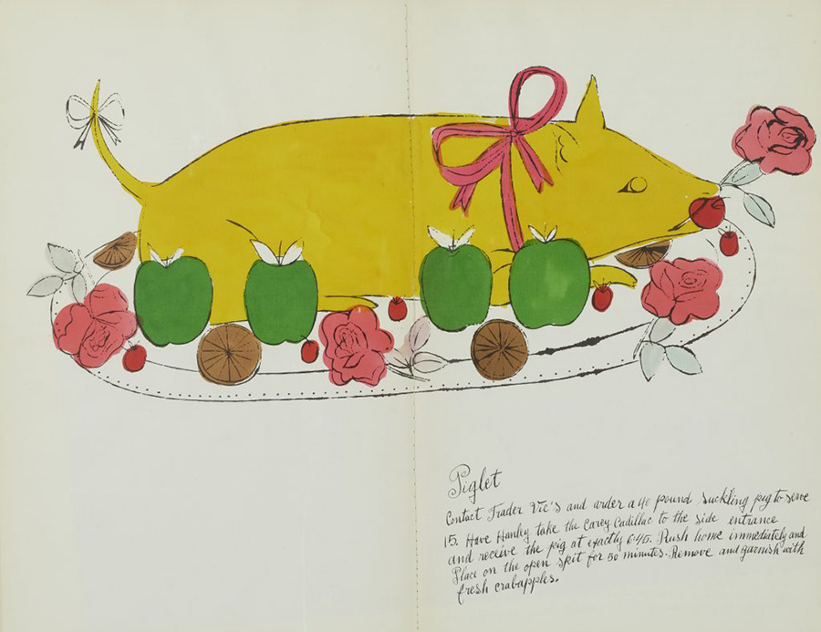
    First, from ArtNet News. Prior to basically everything, Andy Warhol did this:

    “The whimsical book was a collaboration with interior decorator Suzie Frankfurt, who wrote the ridiculous recipes, and the artist’s mother, Julia Warhola, who provided the calligraphy, replete with charming misspellings. [It] was the last of a number of books Warhol designed in the 1950s, before he shot to fame in 1962 with Pop art compositions featuring Campbell’s soup and Coca-Cola. Book design offered him a valuable creative outlet during the years he worked as a commercial illustrator.” See more.

    The rest are from the New Yorker‘s “Briefly Noted” reviews — which, I’ll admit, inspired the title of this post. They pick four titles weekly, and while I’m sure many are great, actually great book design is rare. So to have four in two weeks … well, just had to say, “noted.” (The New Yorker is, of course, subscription — but there is a free account with limited options if you’d like to read their review.)

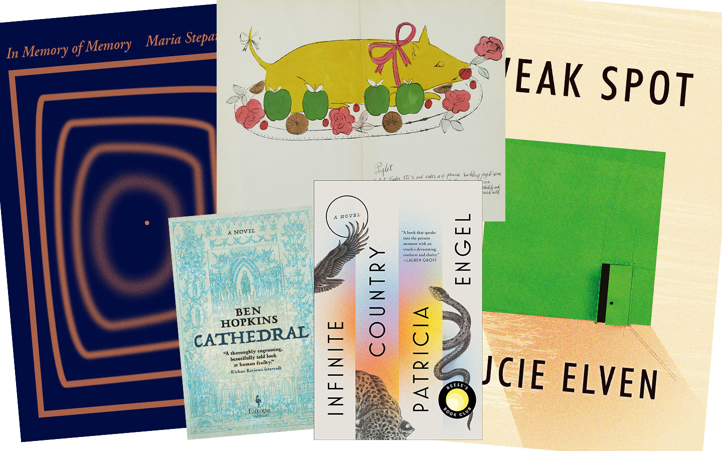
    The first three are from the March 8th, 2021, issue, starting with In Memory of Memory:

    The simplicity of the concentric rectangles — and “destination” dot — is mesmerizing.
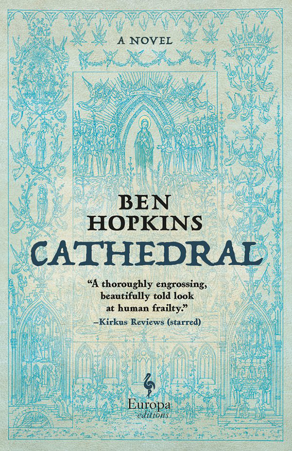
    Next, Cathedral:

    Not a simple illustration in this case, and still an attention-getter in the background. Nice.

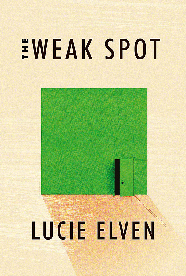
    Next, my favorite of this set, The Weak Spot:

    A very brief (176 page!) debut novel with hits-above-its-weight cover design. (Content, too, presumably…;)

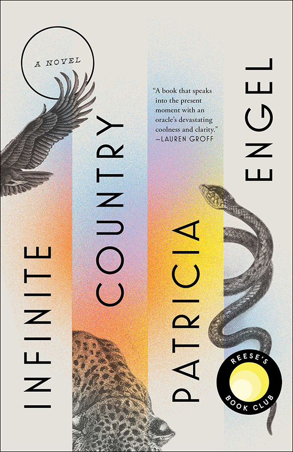
    Lastly, from the March 15th issue, Infinite Country:

    Color and composition unite into something … infinitely good.

    Enjoy.

  • Penguin UK on the semicolon

    Penguin UK on the semicolon

    “Do not use semicolons,” wrote Kurt Vonnegut; “All they do is show you’ve been to college.”

    I love a semicolon. (Perhaps a little too much, some might say.) Read more about this underutilized punctuation: Semi-colons; or, learning to love literature’s most misunderstood punctuation

  • Macon’s Miscellaneous Gallery Updated

    Macon’s Miscellaneous Gallery Updated

    The galleries for Macon on my Media site are subdivided by location, but some photography sets don’t really fit into a specific location. Today, I’ve updated the Macon – Miscellaneous gallery with photographs from Hay House, Coleman Hill and Mercer Law, and the Catholic and Baptist churches near downtown. Enjoy!

  • Gallery for Plains, Georgia updated

    Gallery for Plains, Georgia updated

    Former President Carter’s hometown of Plains, Georgia, has a gallery now up to 70 photographs. I just added more from the Carter Boyhood Farm, taken March 4th, 2021. Enjoy!

  • Latest in Regular Sport: New Orwell Covers

    Latest in Regular Sport: New Orwell Covers

    Creativeboom points out that Heath Kane, not a citizen but in fact a subject of the Crown, has designed new covers for George Orwell’s classics Animal Farm, 1984, and more.

    Two interesting things about this: they call it the “final printed edition,” without further explanation. I somehow doubt there won’t be more editions in print — high schoolers everywhere would mourn, professors cry, and surveillance societies everywhere smile. Okay, overdramatic, but still.

    And, I really preferred this one:

    More from Penguin on Orwells through the ages.