As we celebrate the Thanksgiving holiday here in the US, a reminder that there’s a ton of things to be thankful for. One of the things about which I’m grateful is that folks actually read these posts — not a ton of people, to be sure, but enough.
So, before we get to the sort of items I usually post in this series, a request: don’t forget to click through on the links. Indeed, most of what’s here are links, and the originals are interesting — great book design, typography, or photography worth the extra moment of your time. (And remember to click on the post titles if you’d prefer larger photos/illustrations.)
Thank you.
Now, back to our regularly scheduled programming.
Photography
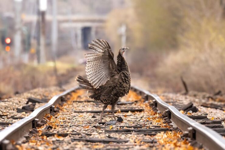
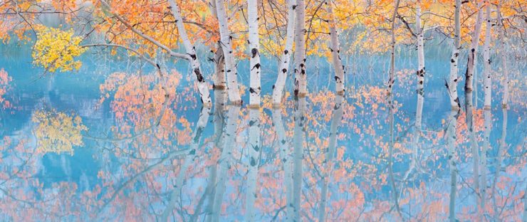
International Landscape Photographer of the Year 2024
As usual, the entries here are inspiration for professionals and aspiring photographers — folks have submitted some excellent work:
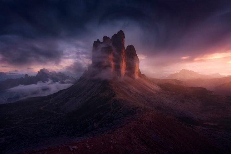
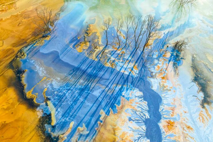
Canadian Andrew Mielzynski repeats his overall win again this year. PetaPixel highlights some of his work along with their favorites. The contest website has a gallery of the 202 top-scoring photographs, along with more information.
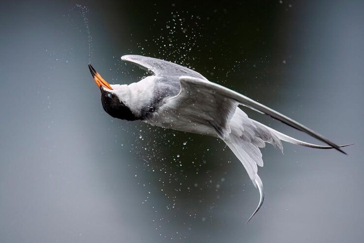
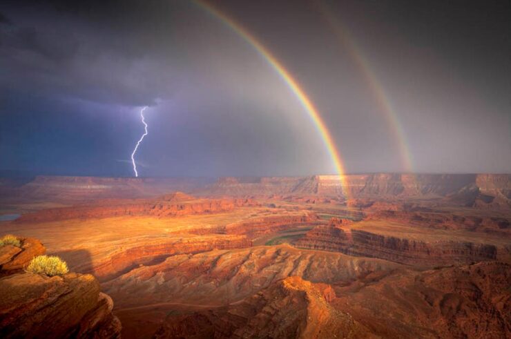
Standard Chartered Weather Photographer of the Year 2024
Meanwhile, over in the UK, the Royal Meteorological Society has attracted some talent, as well
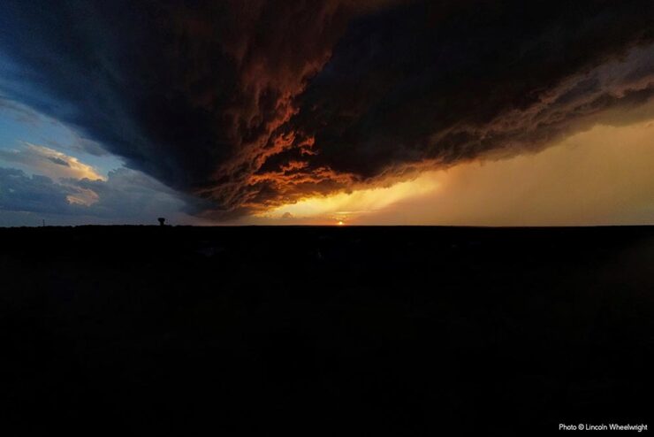
Of course, given the nature of the contest (ahem), each photograph includes an explanation of the weather phenomenon. See the contest website for a few more. (Another hat tip to PetaPixel.)
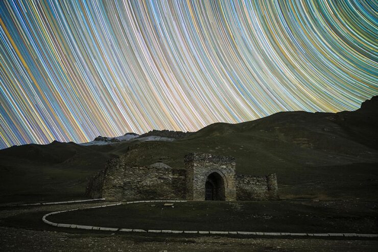
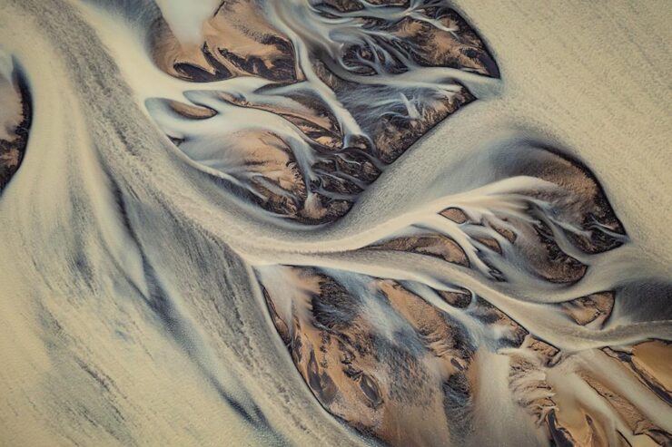
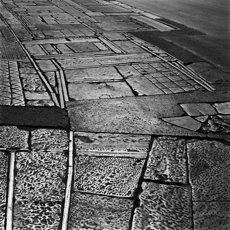
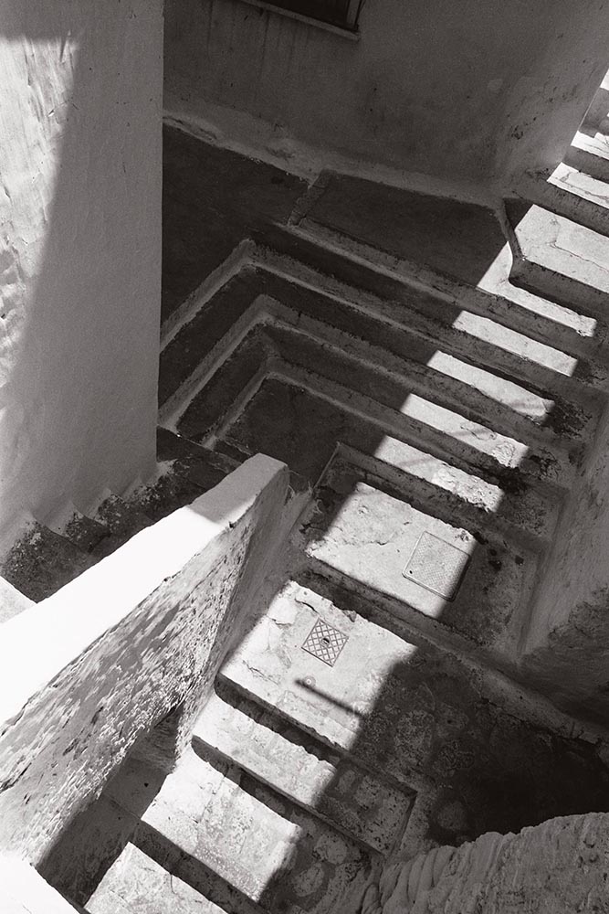
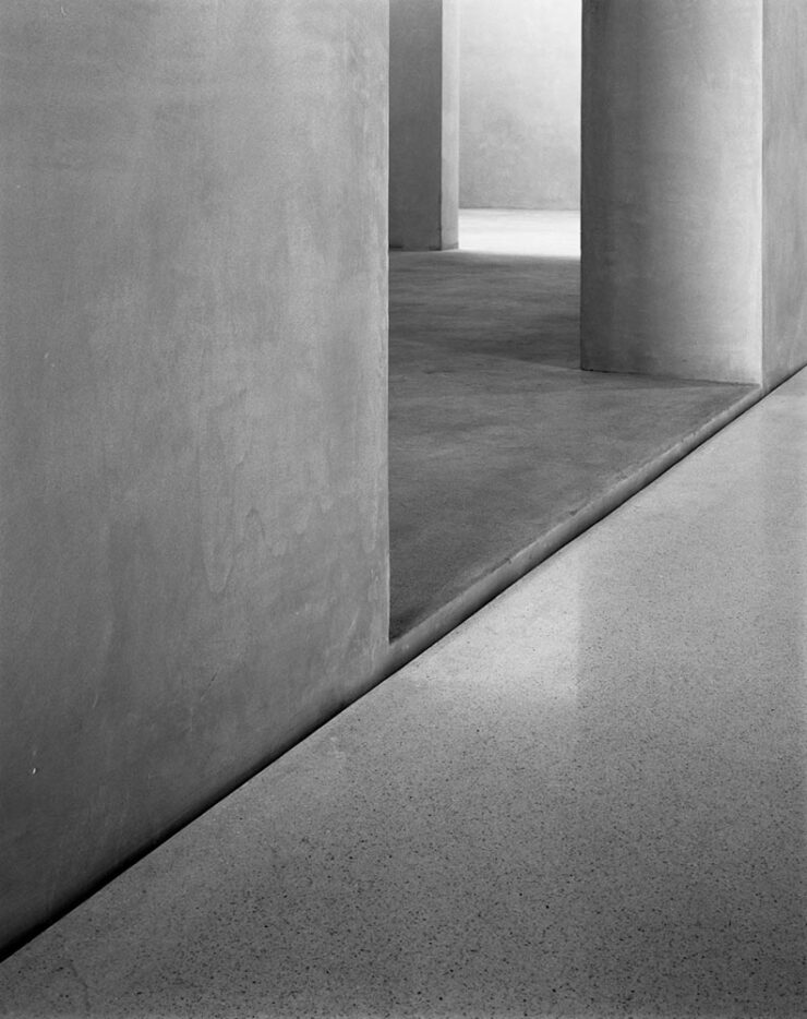
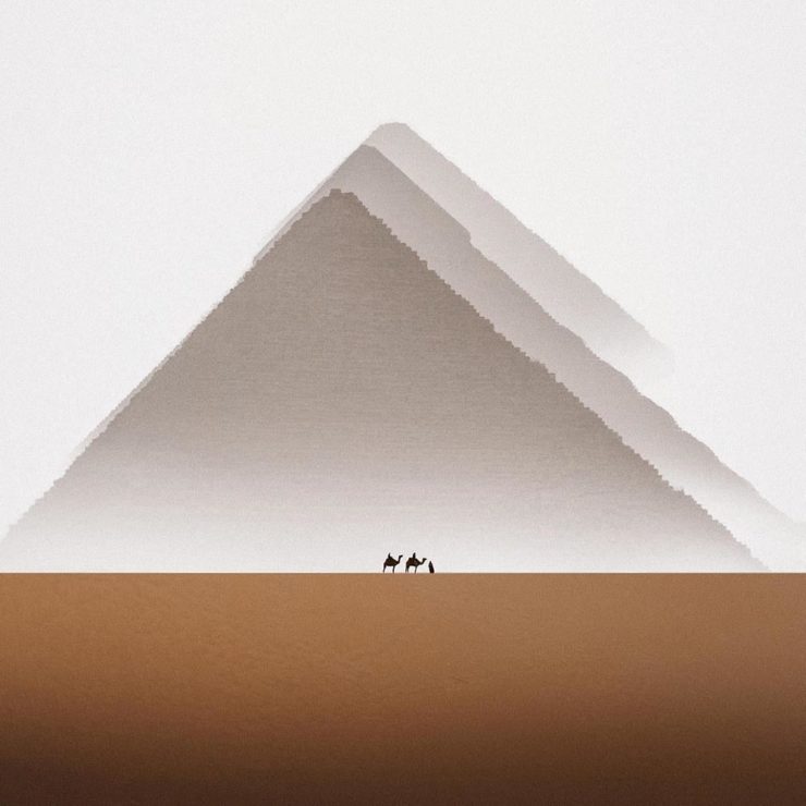
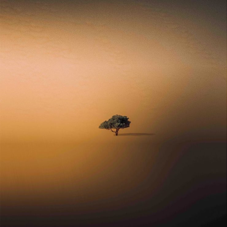
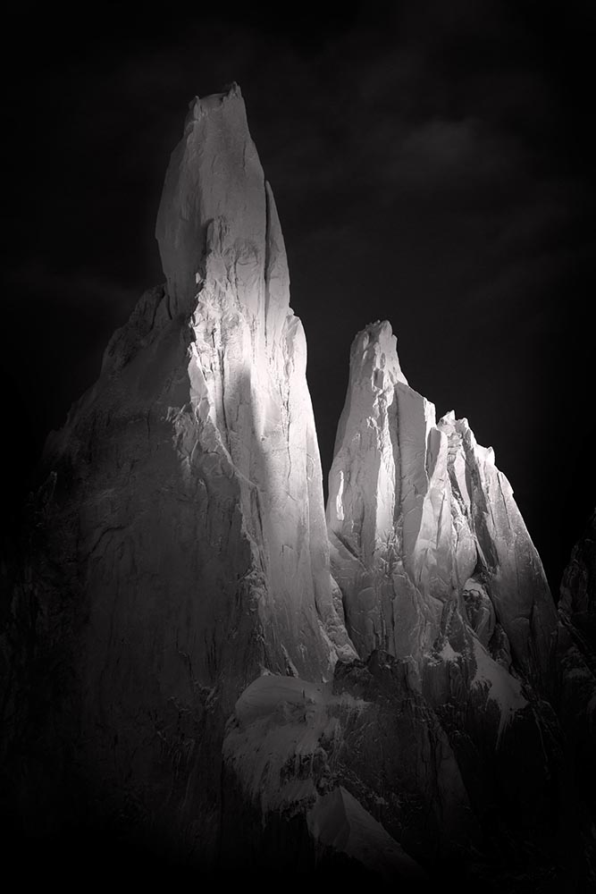
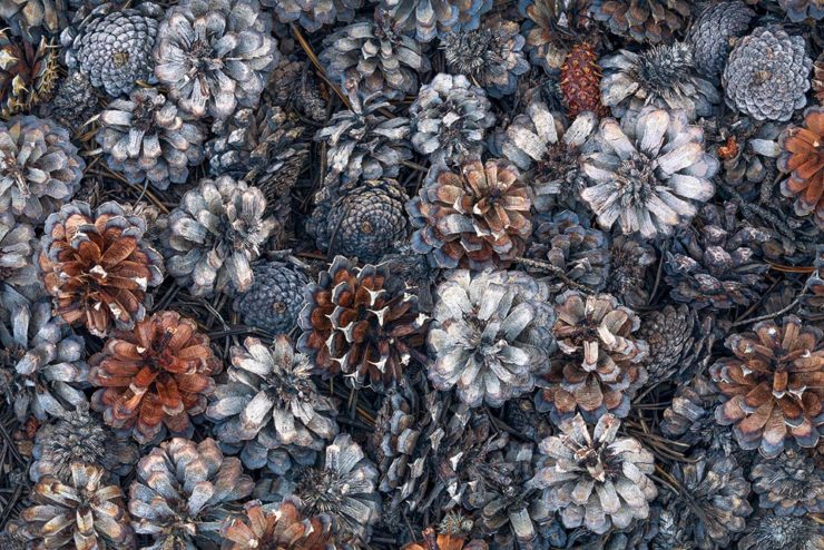
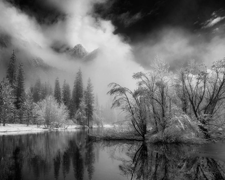
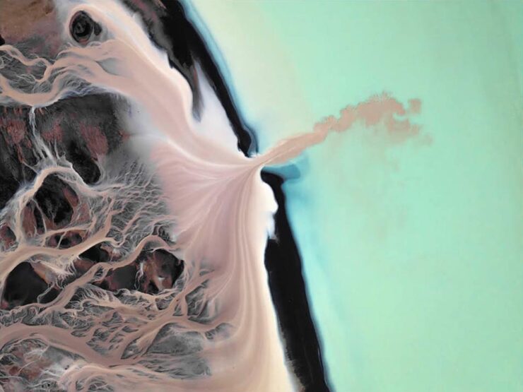
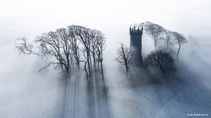
Iceland Forces of Nature
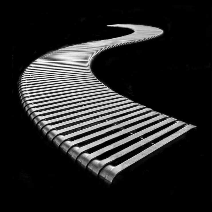
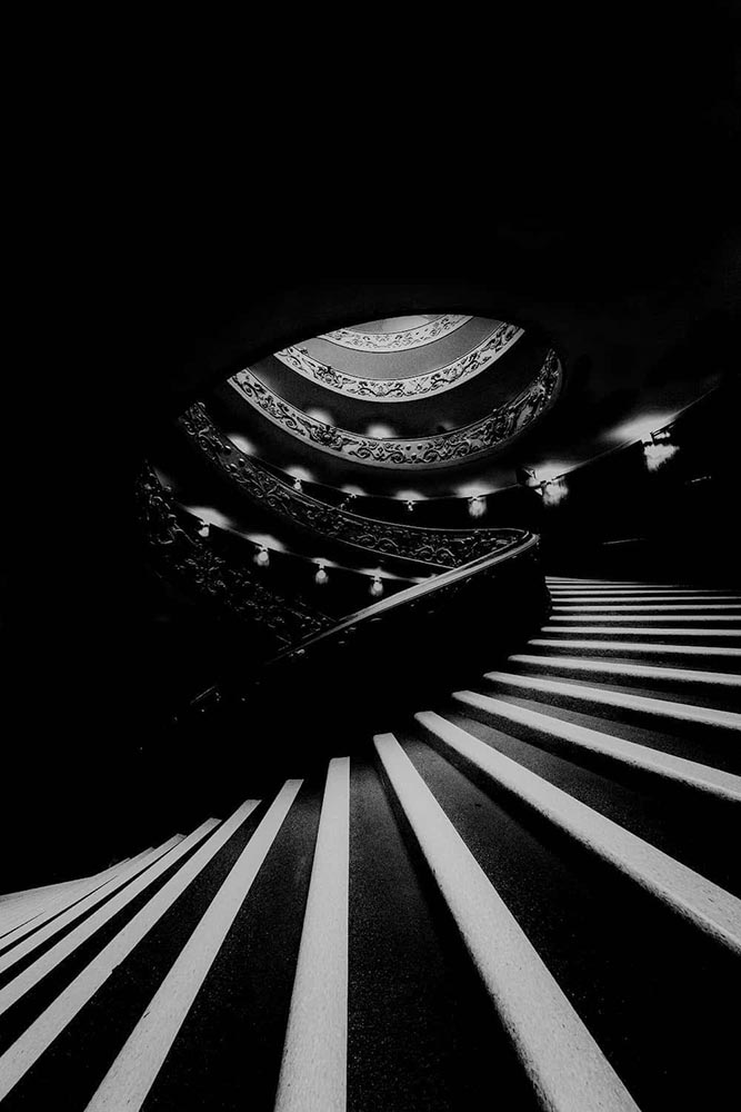
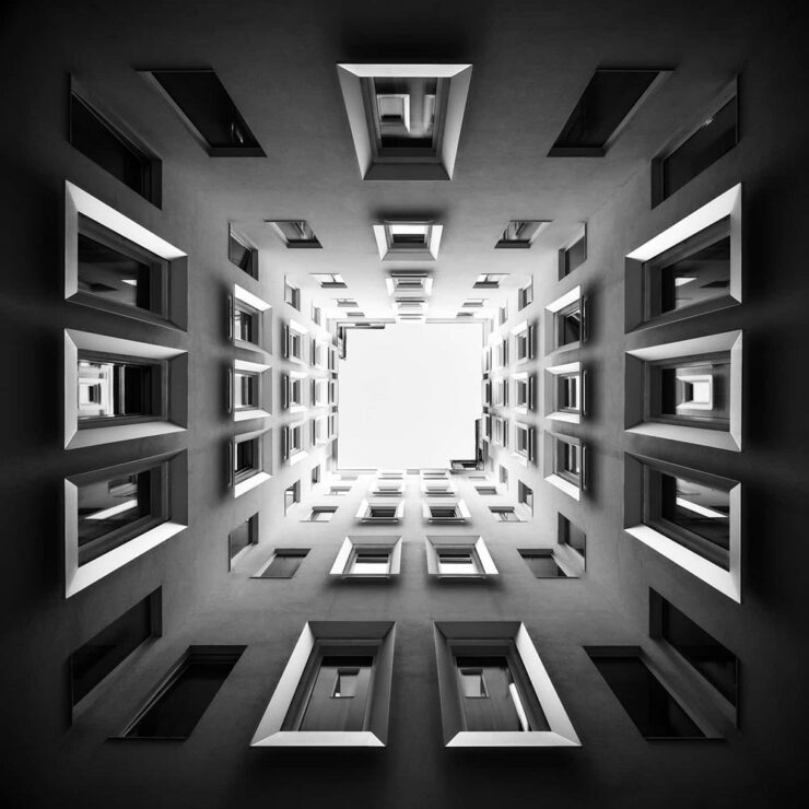
This is Colossal highlights a series by Gary Wagner, whose “striking photos pare dramatic landscapes down to their essential shapes, lines, and tones.”
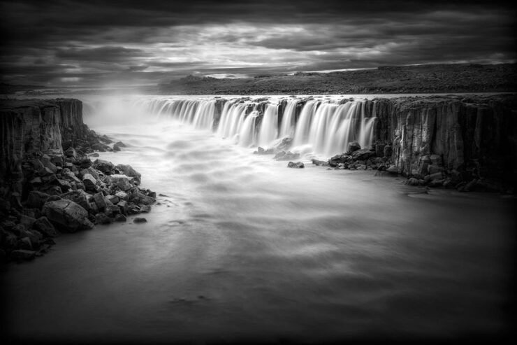
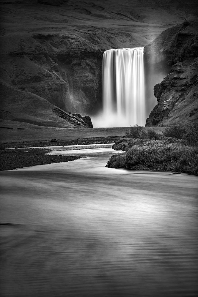
His work is all in black and white and similarly moody — dramatic, even — and absolutely worth the perusal. (Be sure to check his archives, too.)
Special Bonus #1: Coincidental Charisma
Nice. See more. (Via This is Colossal.)
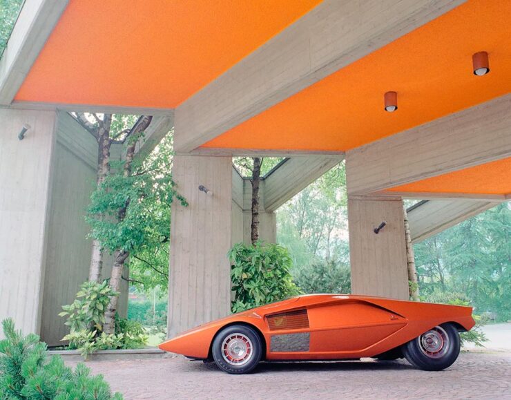
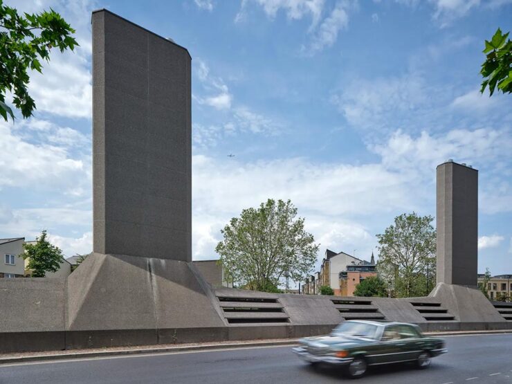
Special Bonus #2: Soviet Brutalist Architecture
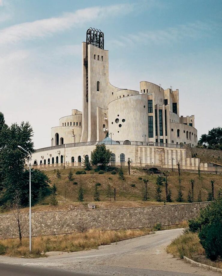
More a (very) brief history than a stack of photographs, this Wallpaper* article nonetheless highlights some strangely wonderful buildings.
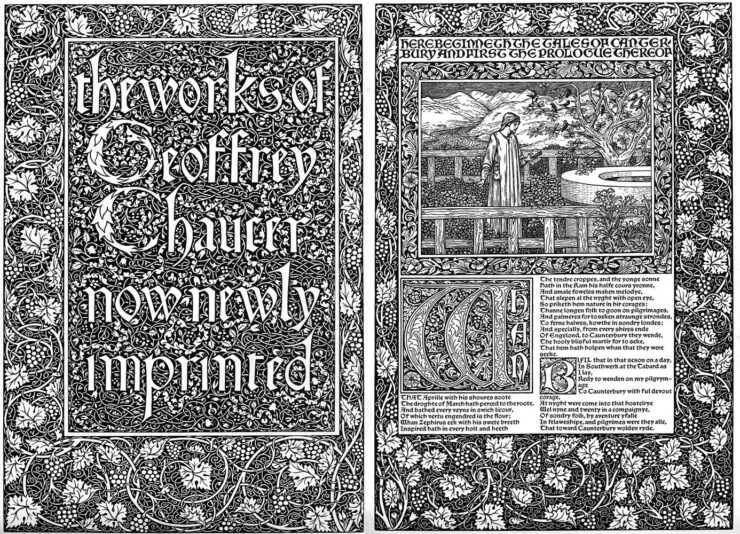
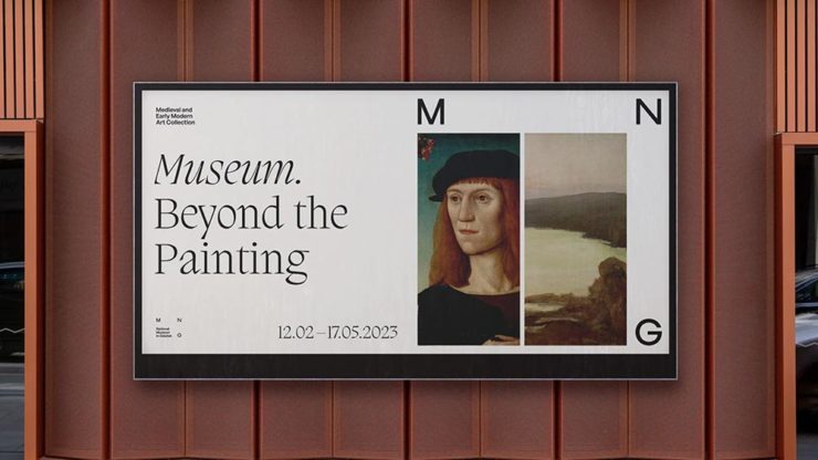
Typography and Design
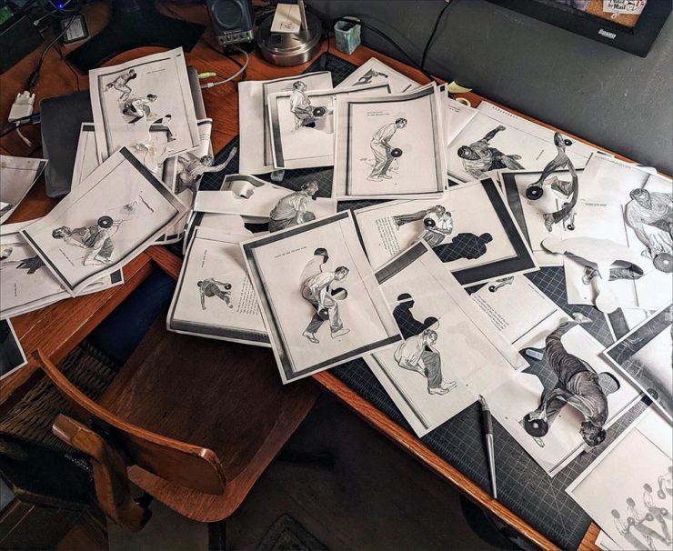
Graphic Design for Television
As a Graphic Designer for Film & TV, I work in the art department and create anything that is seen on screen with text and or imagery, such as storefront signs, food packaging, patterned wallpaper, stacks of bills, newspapers, lost cat flyers, or even children’s drawings.
— Leah Spencer
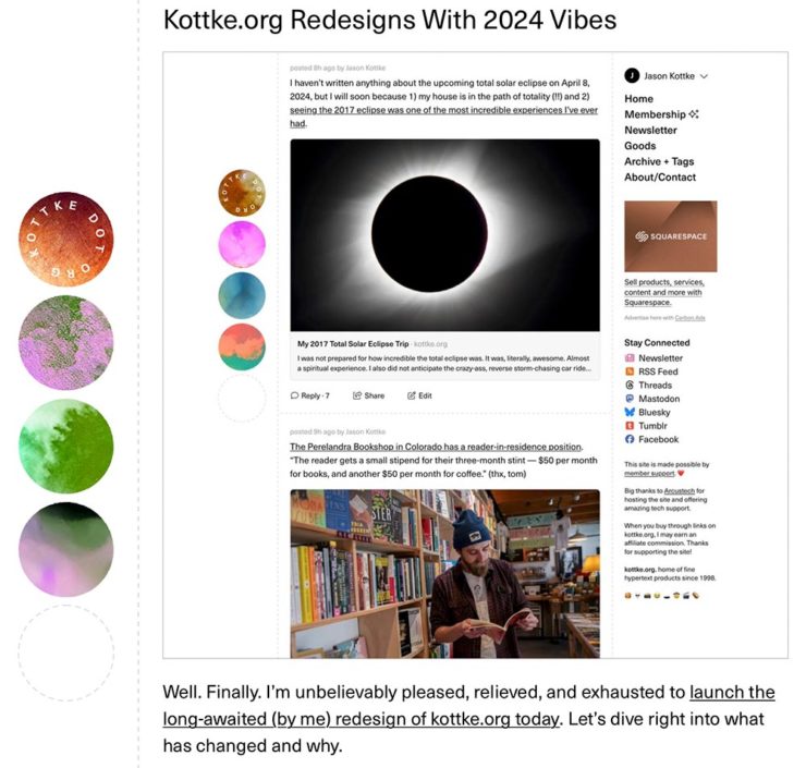
While the piece is from last year, I’d not seen it — or the Alphabettes website — and appreciated its in-depth explanations, especially with respect to typography. Great for fans of The Marvelous Mrs. Maisel, of course, but demonstrates the level of detail required for getting any show design right. (Another gem from Jason Kottke, and be sure to check Leah’s web site, too — it’s excellent.)
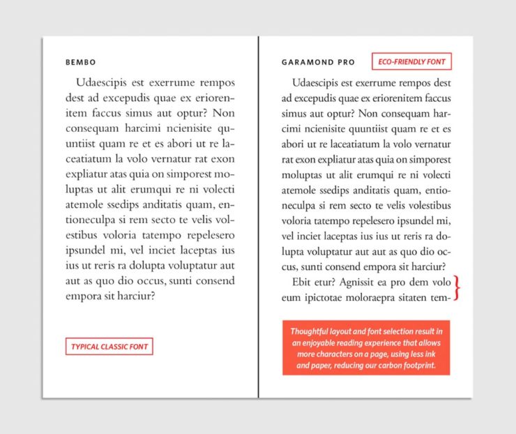
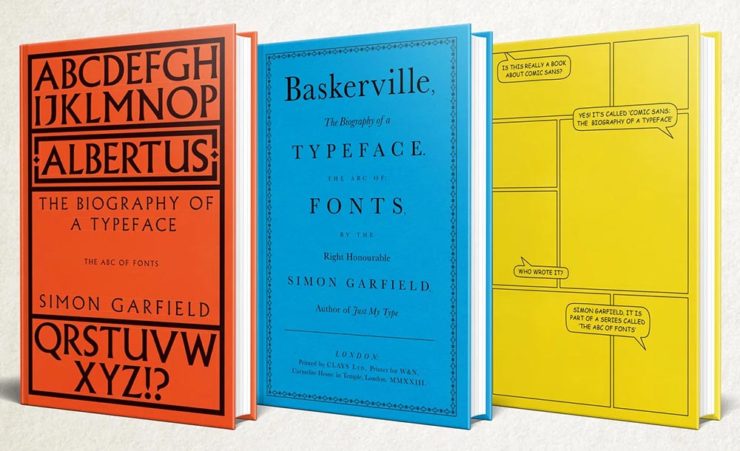
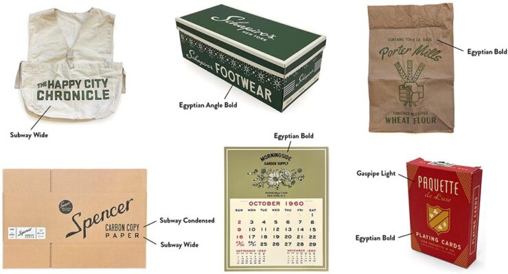
Special Bonus #3: Emigre Type Specimens, 1986–2024
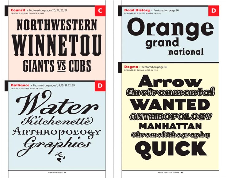
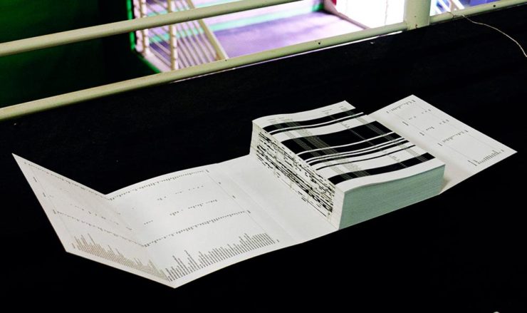
We are happy to partner with San Francisco-based Letterform Archive on a reissue of our first volume of type specimens, an ample tome first published in 2016. But this time, we nearly doubled its already impressive extent to more than 1,200 pages containing 40 type specimens and spanning 38 years. We also added new texts by Letterform Archive associate curator Stephen Coles and longtime Emigre collaborator Jeffery Keedy. In addition to specimens not included in the first volume, we also revisited our type design process files to create a special behind-the-scenes section, offering readers a look at photos, sketches, and hand-written correspondence.
This perhaps-ironically-sized book — letterhalf, natch — is awesome. Order while you can.
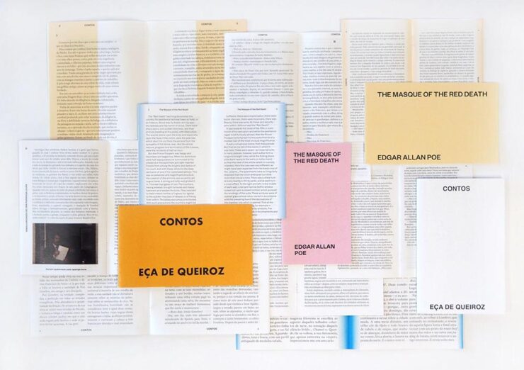
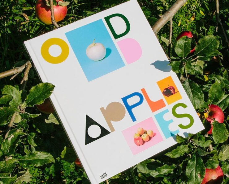
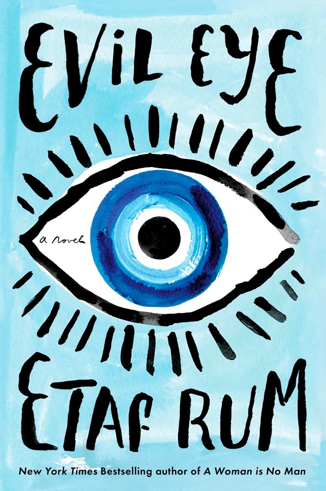
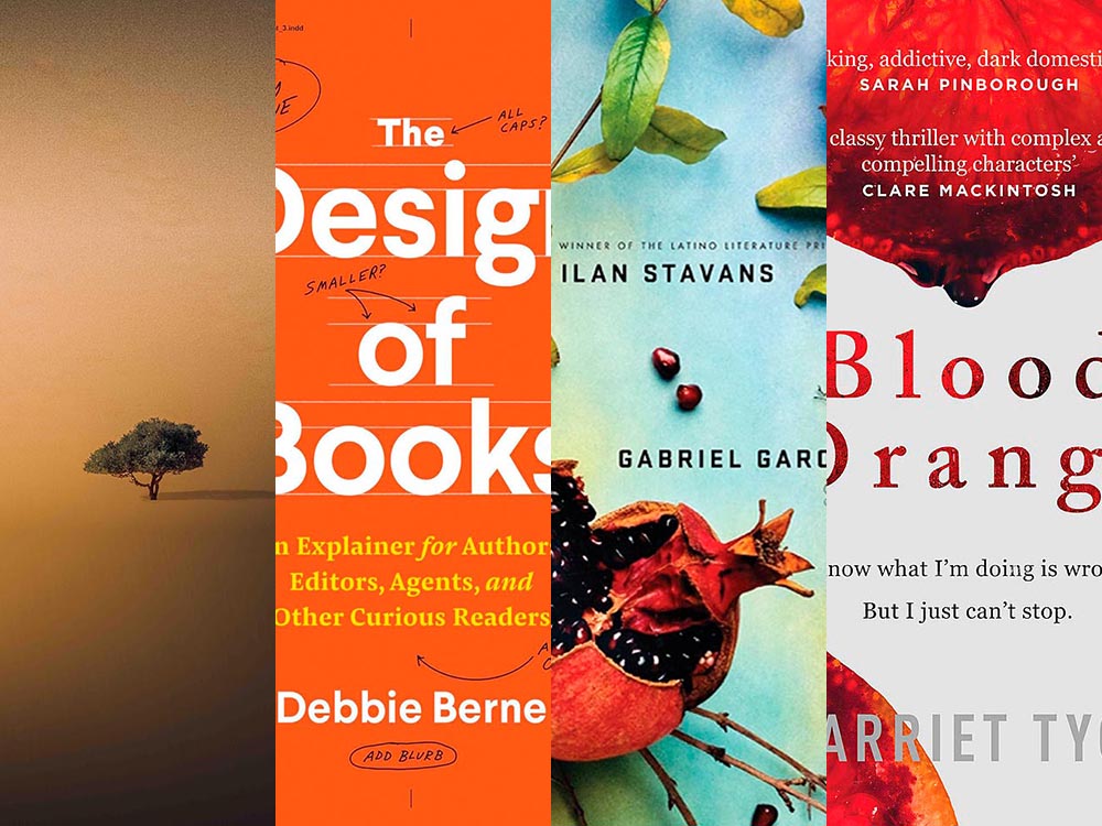
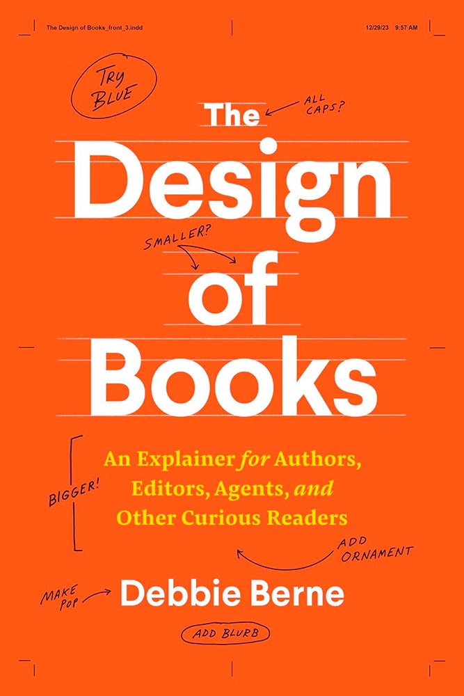
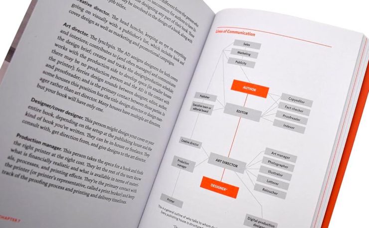
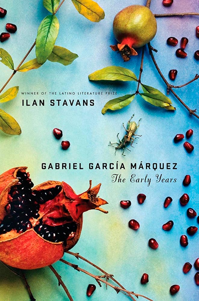
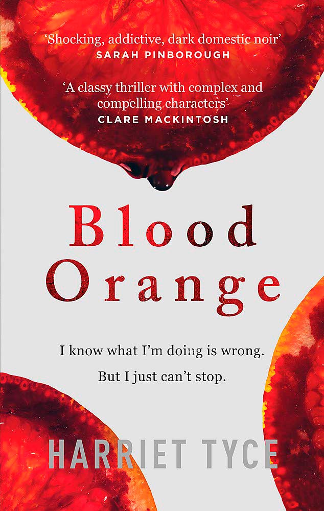
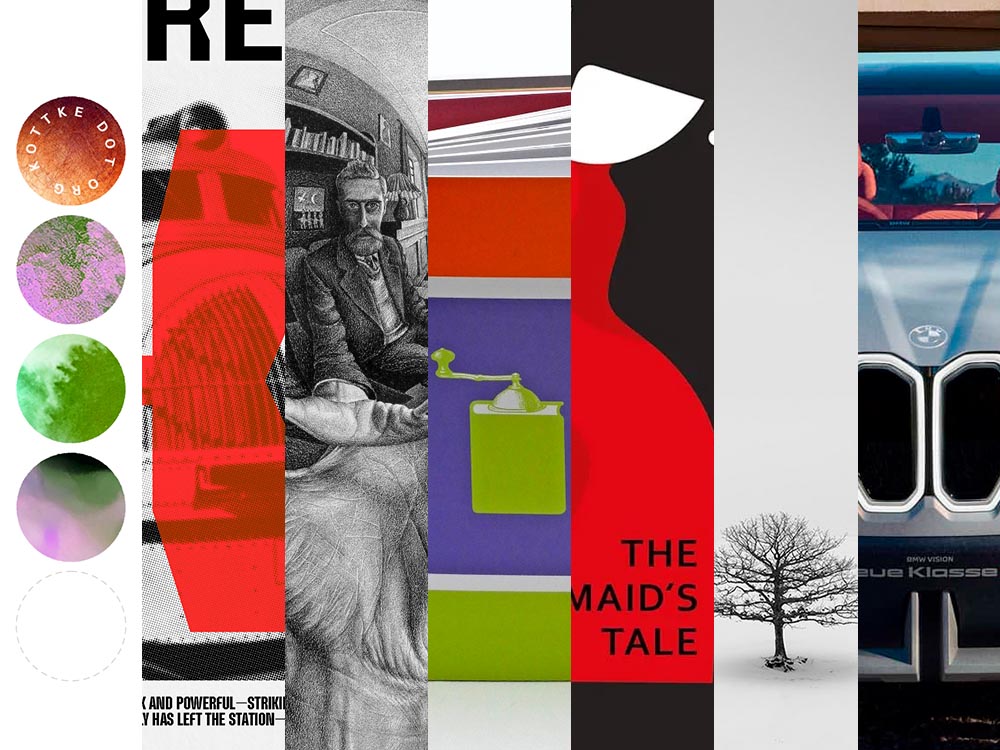
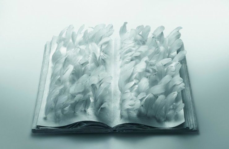
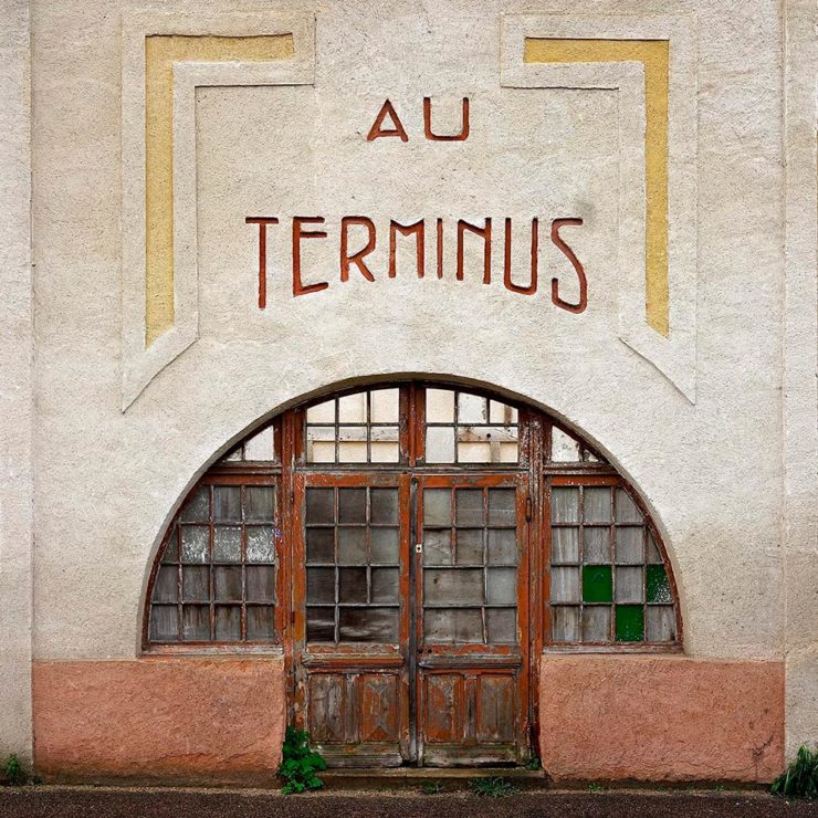
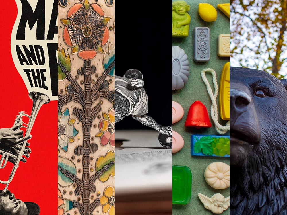
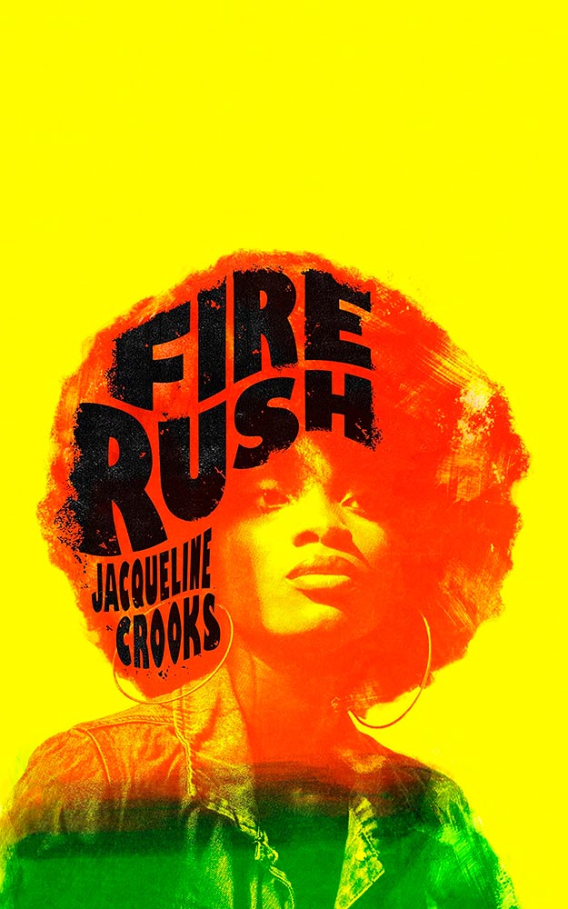
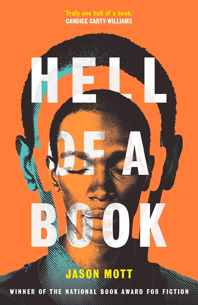
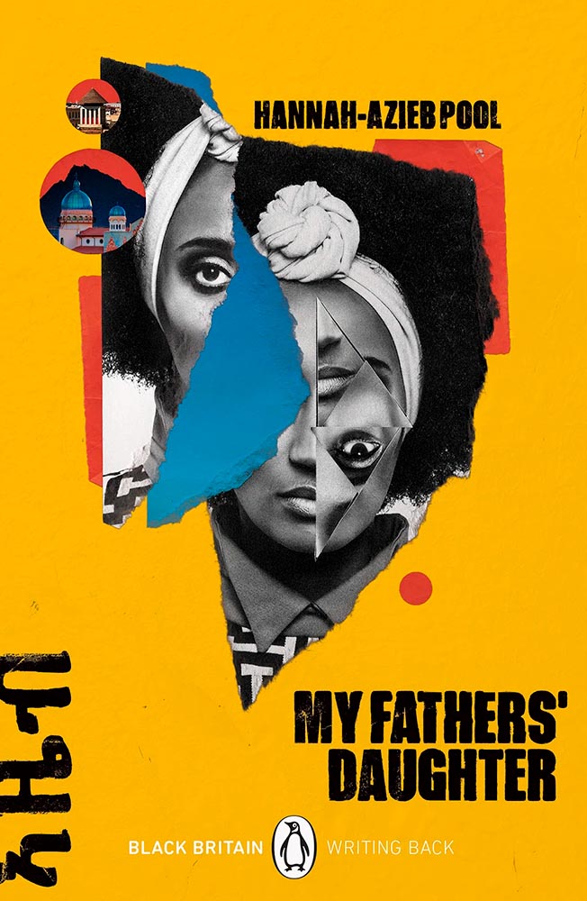
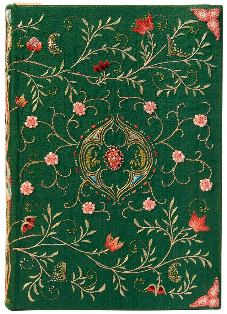
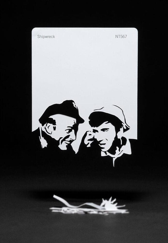
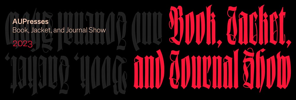
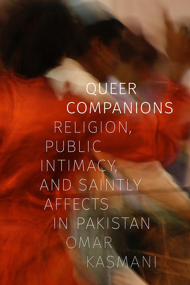
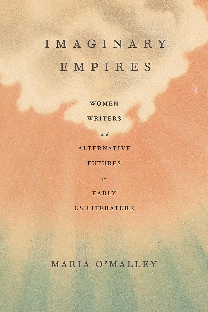
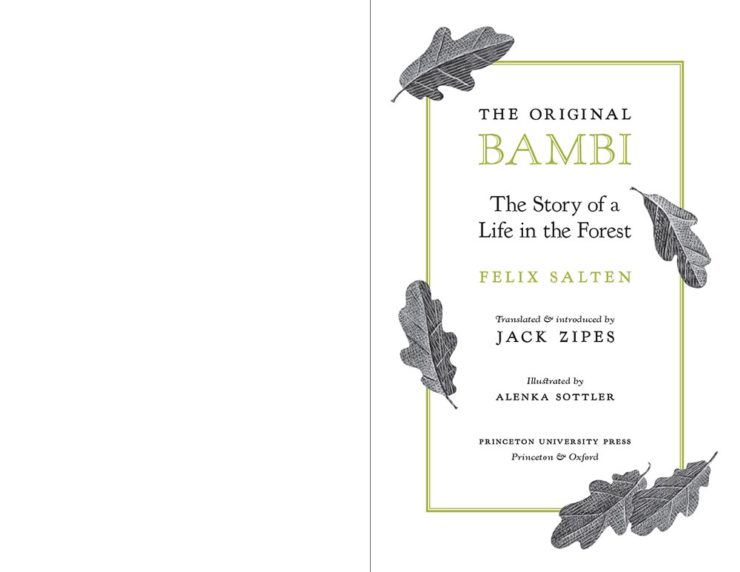
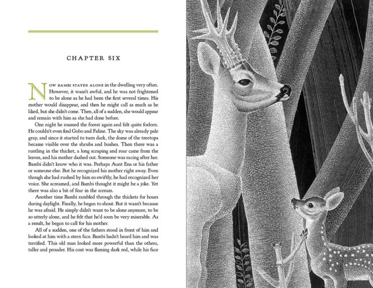
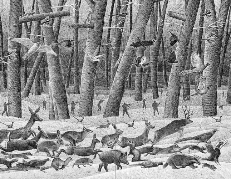
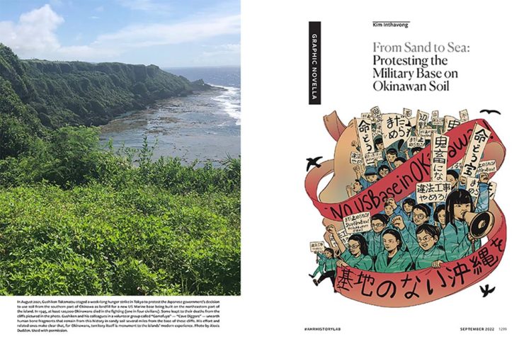
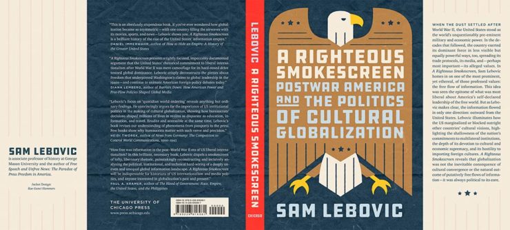
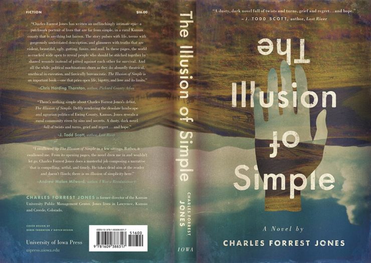
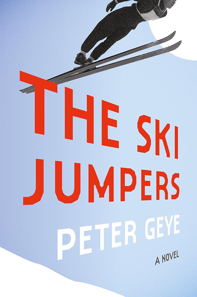
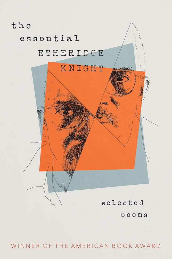
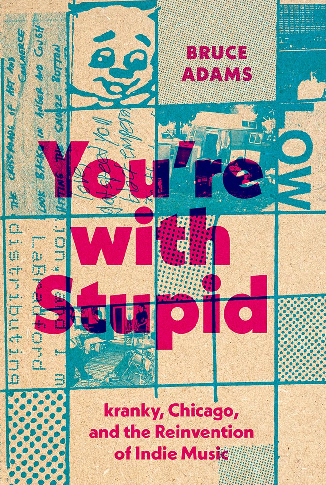
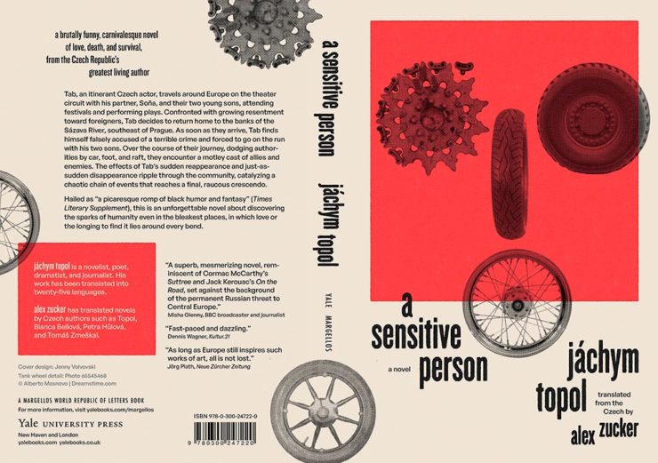
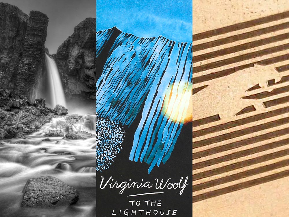
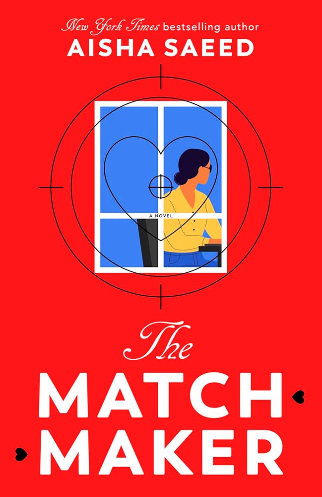
Cornucopia of Book Design
A huge variety of interesting book design items this month, starting with ShoutoutLA:
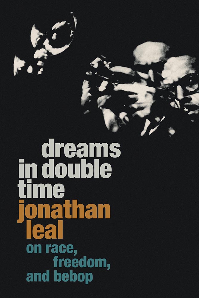
Next, from CreativeBoom, meet Aino-Maija Metsola, the artist behind the cover of this year’s Booker Prize winner:
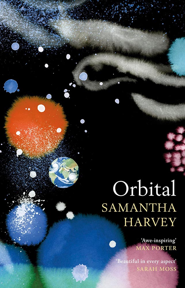
The article is interesting, highlighting her painting techniques. Even better, though, is over on the artist’s website: I found the Virginia Woolf series to be outstanding.
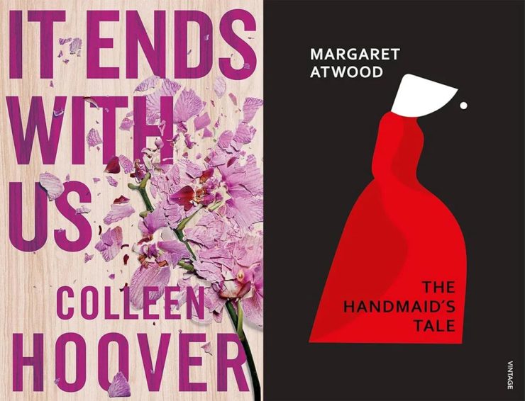
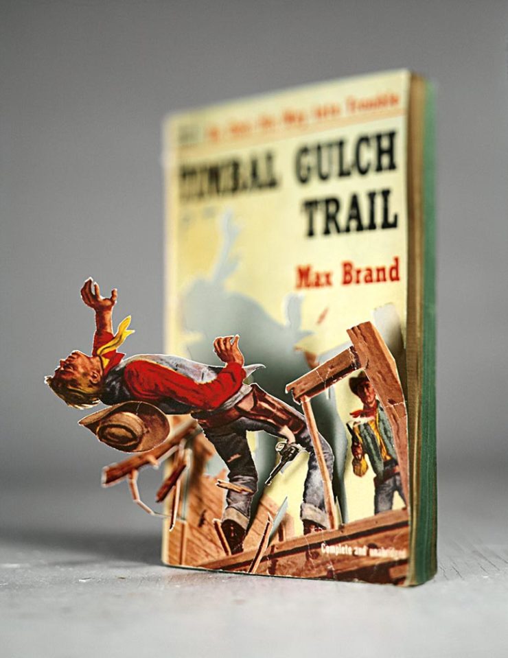
Finally, we have Debutful discussing Make Your Way Home‘s cover design:
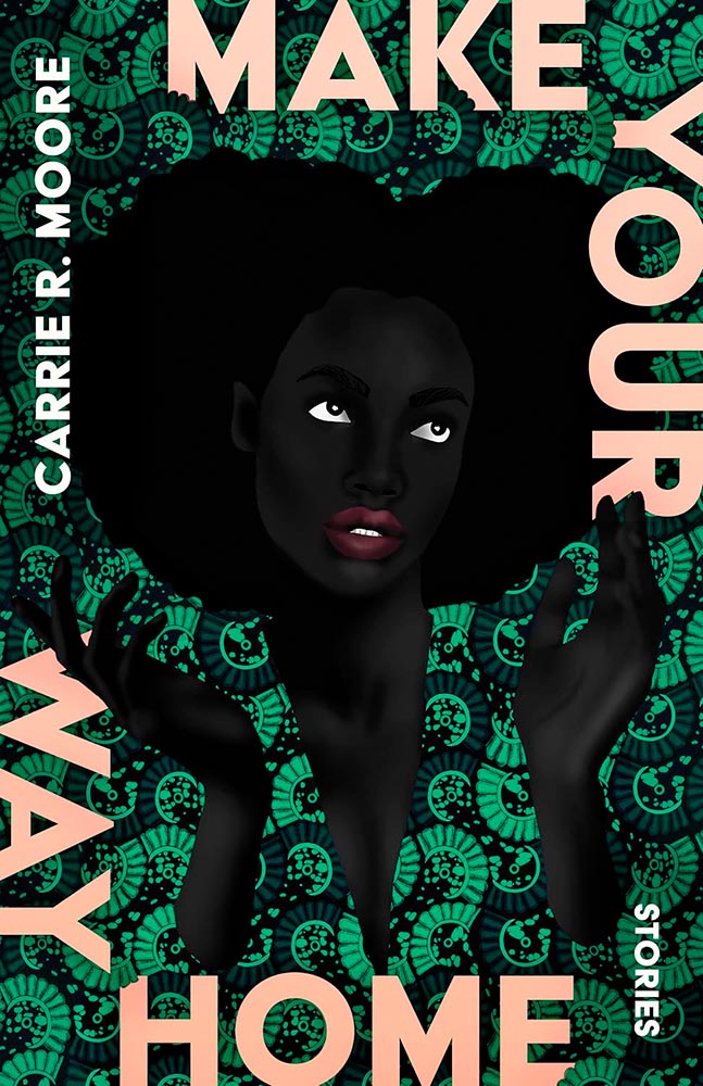
Another great cover by Beth Steidle, but it’s the art from Uzo Njoko, a piece titled “Higher Calling,” that impresses. Read more.
Special Bonus #4: It’s Nice That brings us a piece on Malou Messien, her obsession with display type, secondhand book covers and Estonian design. “This Paris-based graphic designer uses archival finds to inspire her alternative approach to typography and composition.”
Special Bonus #5: Hyperallergic highlights how the Women’s Studio Workshop, in the Hudson Valley, “Shakes up the art of bookmaking: what started as a small feminist arts collective has grown to host hundreds of residents and publish countless books under its own imprint.”
Special Bonus #6: “Read Between the Lines: Forget drop-shipping — America’s new favorite side hustle is … republishing classic literature?” Get this sad — bizarre? — item over at Slate.
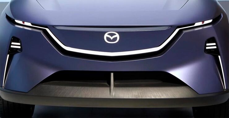
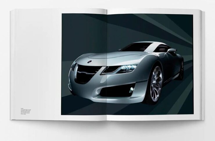
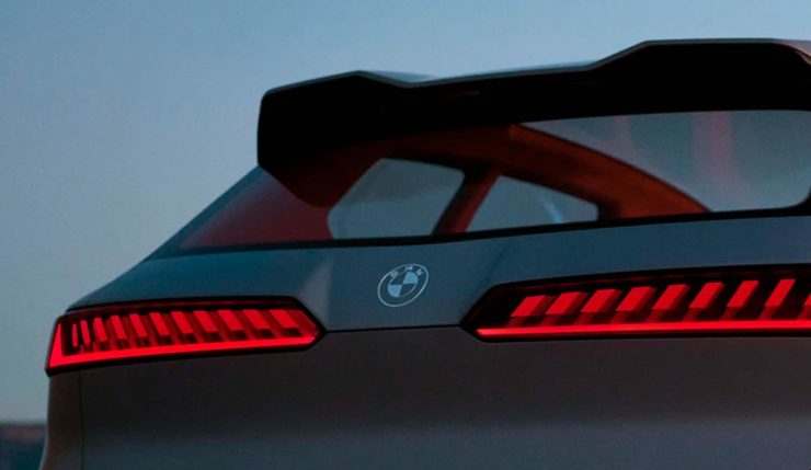
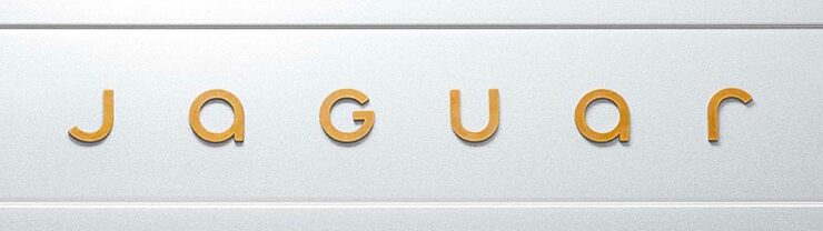
Jaguar Relaunch
“A Jaguar should be a copy of nothing,” said company founder, Sir William Lyons. The 2024 version, “copy nothing,” includes marketing lines like “delete ordinary” and “live vivid” … well, just look at this header image:
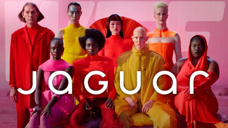
The branding — which is all we have until December 2nd or 3rd, depending on the source — is designed to provoke, and it certainly accomplishes that goal, albeit with the typically-unfortunate-for-2024 levels of internet reaction vitriol.
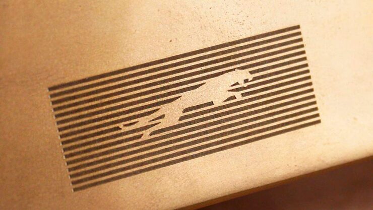
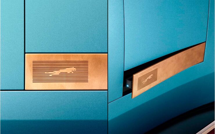
Some of the details are nice:
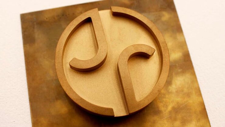
Here’s another look at the logo, against a metal background — note the matching “J” and “R”:
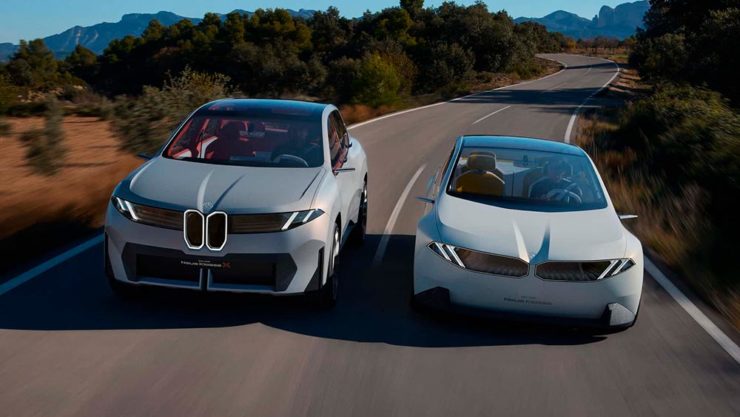
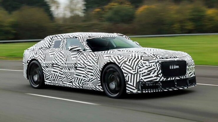
As for the new cars themselves … well, here’s their preview image of what is presumably the new sedan, designed to compete with the likes of Bentley or Maybach (as opposed to BMW, for instance):
A couple of teasers have been posted. One of the (lack of) a rear window:
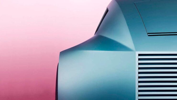
And one that’s just details:
Jaguar’s new lineup, all EVs, could be really interesting. Jaguar Land Rover’s design department does not slouch.
Debut is at Miami Art 2024. Until then, if you’d like more, Sophie Tolhurst’s design review at Dezeen is good; Wallpaper* has more from the branding campaign; and Motor1 — itself suffering from a recent redesign — has more on the actual car.
Back with more next month. In the meantime, please enjoy your holiday season.