FedEx pulled up around 8:30 this morning and dropped off a new lens. (It wasn’t due ’til Tuesday — bonus!) Given that it was an absolutely beautiful morning, I shelved my plans for the day, picked up the camera, and headed downtown.
Verdict? It’s so a keeper. See for yourself:
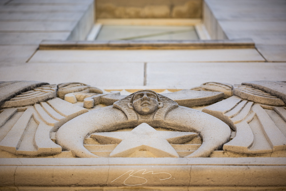
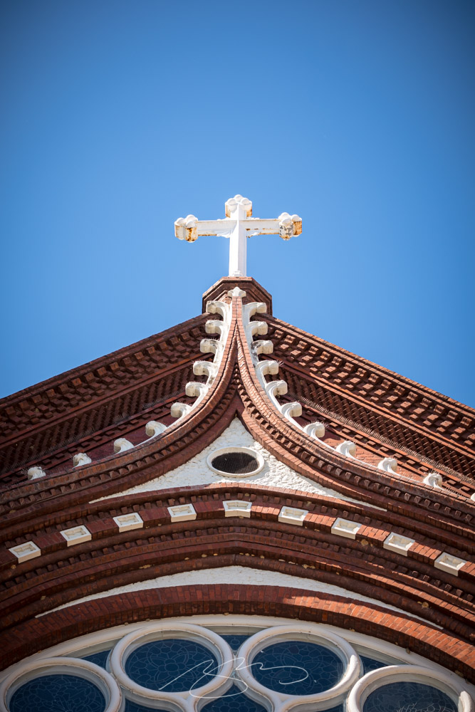
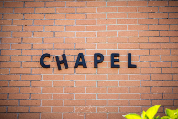
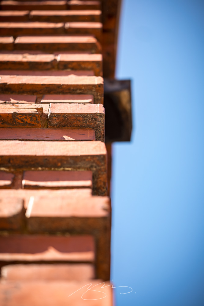
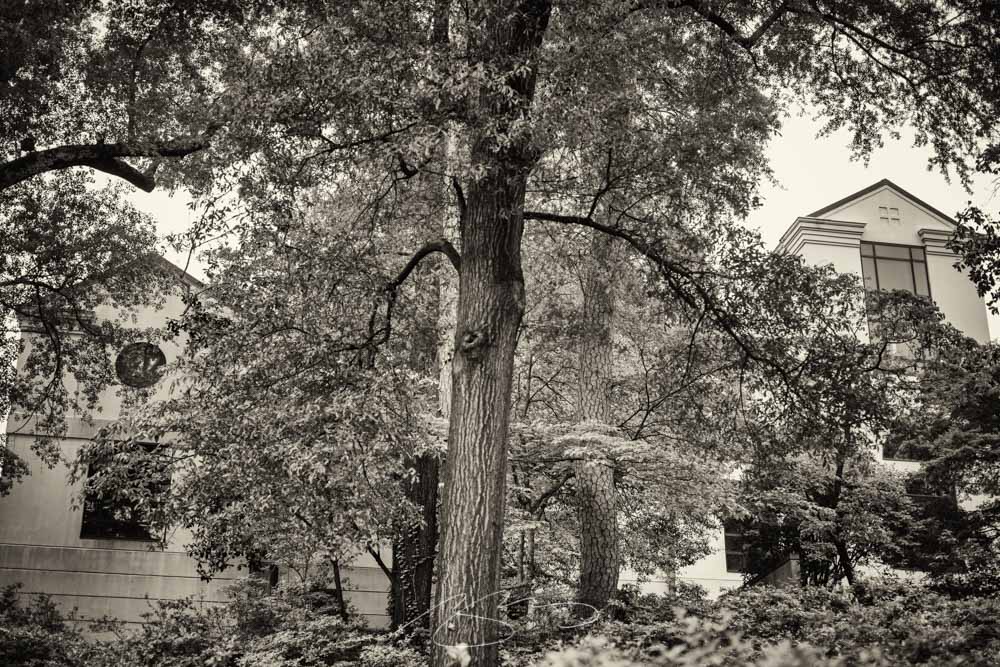
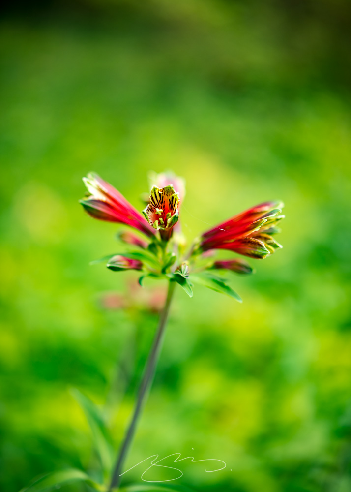
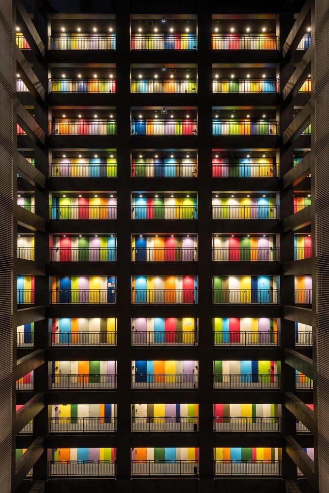
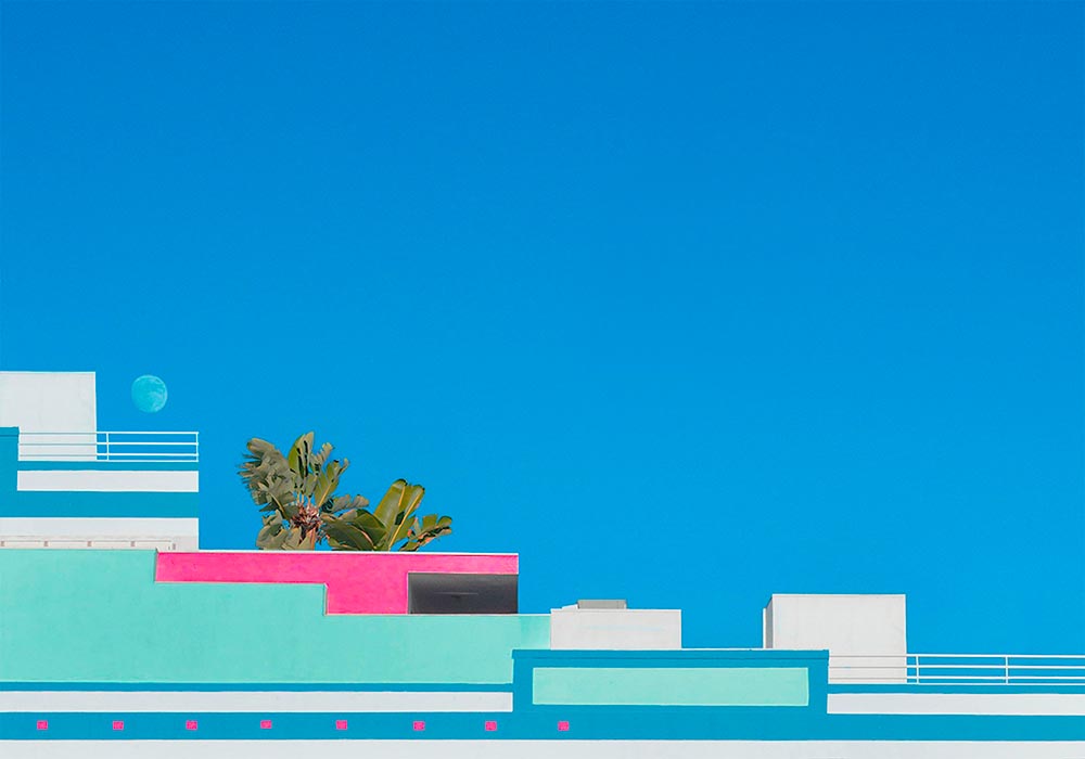
Catholic Cross, St. Joseph’s, MaconPurple Hydrangea, St. Joseph’s, Macon(Funeral) Chapel, New St., Macon552 New St. (Brick Detail), MaconPublic Art (Detail #1), D T Walton Sr Way, MaconTree and City Auditorium, Macon
Wound up with sixty new items posted. However, the downtown Macon gallery was getting almost too big — confusing, even — so has been separated into three parts:
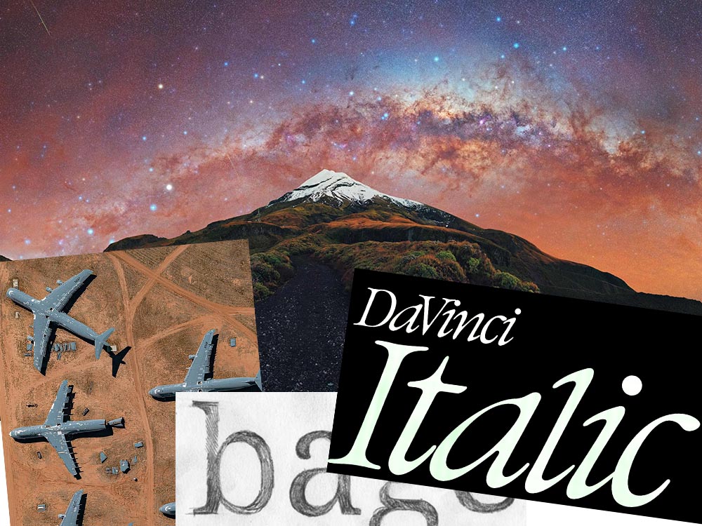
This month’s favorites cover a delightful new extension of the typeface DaVinci, Google’s updated mega-font, Noto, photographs of a desert aircraft boneyard from above, and mega-photographs of the Milky Way.
Before we get there, however, I wanted to wish Jason Kottke — whose 24 years of web sleuthing has been a source for items here on Foreword dating back to its original iteration in the ’90s — good luck on his sabbatical:
“I need some space to think and live and have generative conversations and do things, and then I’ll make something, but I can’t tell you what it is just yet.”1Alexandra Bell, NYT That’s the sort of energy I need to tap into for a few months.
Hear, hear.
The Beautiful DaVinci Italic
It’s Nice That points us to a new, extended version of the font DaVinci, done for Sydney’s Biennale:
“When you do this sort of type exercise — based on printed letters — it gives a very organic shape and form, in opposition to the very metallic sharp shape from type materials.” Furthering this organic look by pushing the fluidity curse at its maximum, Virgile ended with a design “which is very historical, yet with a contemporary twist.”
Just look at those glyphs!
Makes you want to find an excuse to use it. But that’s not all: Flores is an incredibly diverse artist whose work both challenges and inspires. See more.
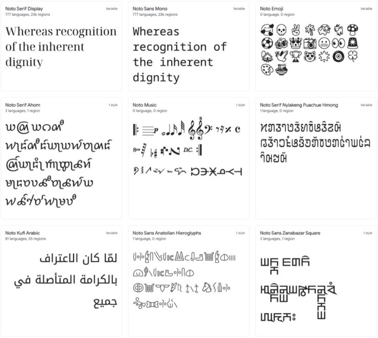
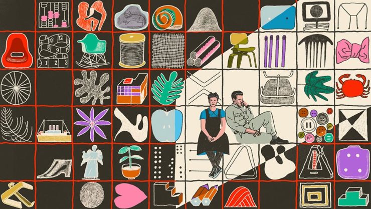
Google’s Noto
Called “A Typeface for the World,” Google’s Noto defines “megaproject.”
Noto is a collection of high-quality fonts with multiple weights and widths in sans, serif, mono, and other styles. The Noto fonts are perfect for harmonious, aesthetic, and typographically correct global communication, in more than 1,000 languages and over 150 writing systems.
Google’s Noto font collection.
According to Google,
“Noto” means “I write, I mark, I note” in Latin. The name is also short for “no tofu”, as the project aims to eliminate ‘tofu’: blank rectangles shown when no font is available for your text.
While the font itself has been around for a few years — 2013 seems like yesterday in so many ways! — it’s updated regularly, cover 150 out of the 154 scripts defined in Unicode, and deserves attention from every web designer and type nut. Read more at Google or Wikipedia. (Via Kottke.)
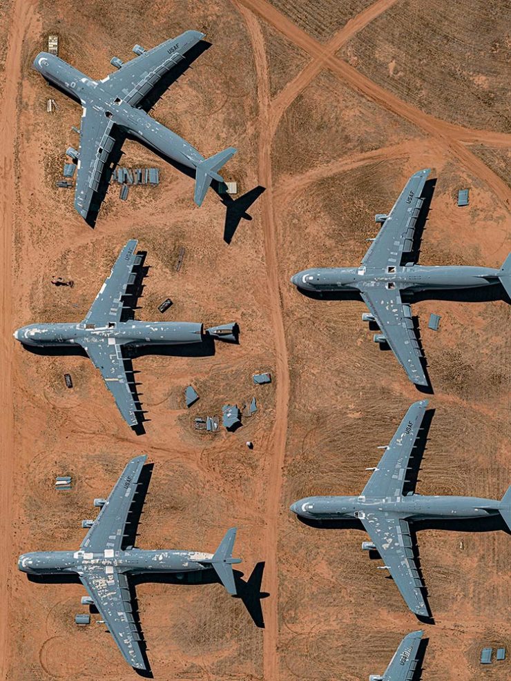
Aircraft Boneyard, From an Aircraft
This is Colossal introduces us to Davis-Monthan Air Force Base in Tucson, Arizona, whose desert conditions are ideal for storing — and scrapping — aircraft:
What happens when the military’s aircraft are end-of-lifed
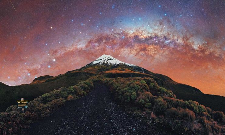
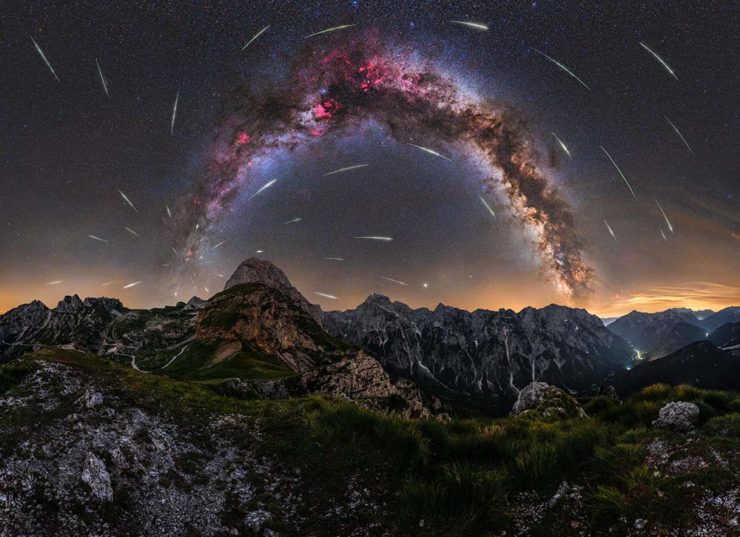
We don’t get many opportunities here in Middle Georgia, but in other, less populous (read: less light-polluted) places in the world, the Milky Way shines forth from the heavens:
As I mentioned in the last entry, Gerald and I were in Columbus, Georgia on Saturday, where our primary photographic mission was The Columbus Museum — specifically, its Olmsted Garden.
Celebrating the bicentennial of the birth of Frederick Law Olmsted, Sr., known as “the father of landscape architecture”, the Cultural Landscape Foundation has created an ever-growing digital guide of Olmsted’s most notable works.
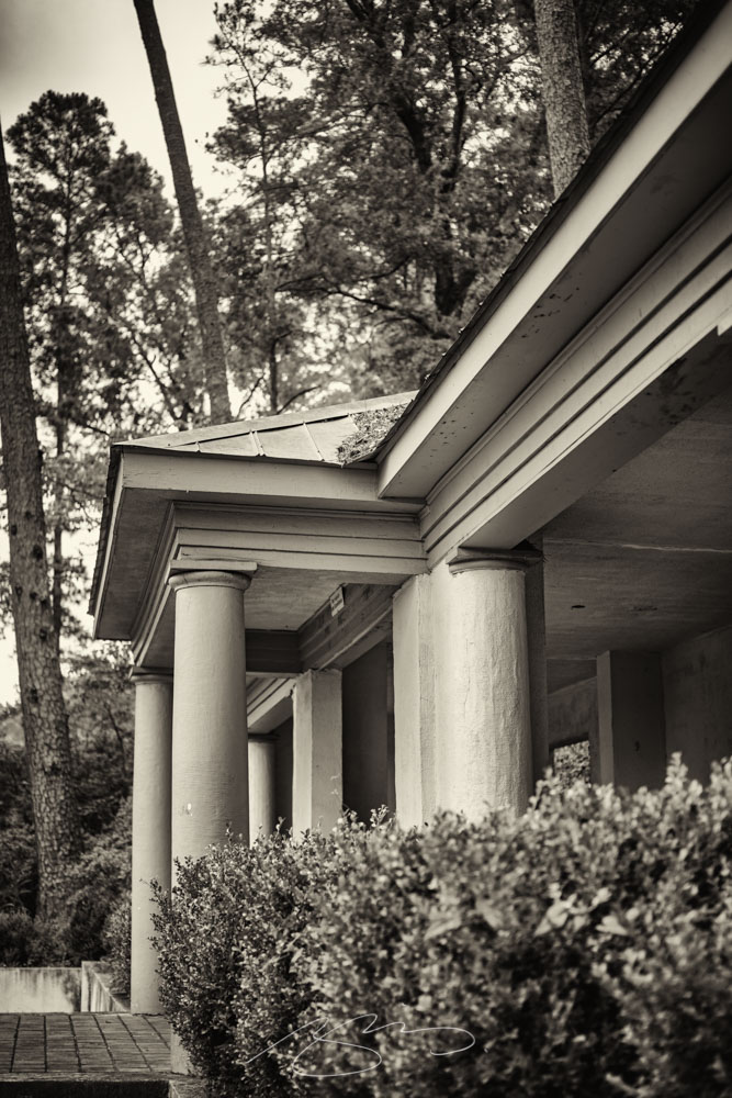
Of course, the building’s interesting, too, so there’s a good mix of architecture, gardens, architecture from the garden, and — you guessed it — garden architecture:
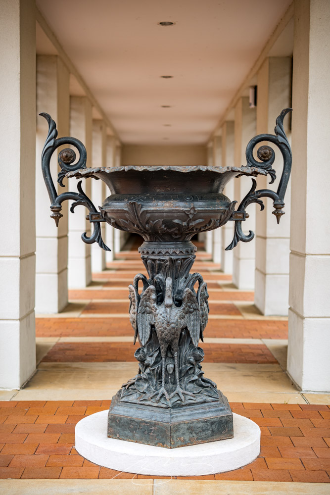
The Columbus Museum (B&W #1)Urn, Columns and Bricks, The Columbus MuseumCrawford’s Kindred (B&W detail), The Columbus MuseumOlmsted Garden (Flower #3), The Columbus MuseumOld Pool House (B&W), Olmsted Garden, The Columbus Museum
I enjoyed the visit, and as a result of that visit, added 32 new photographs to the Columbus gallery. (They’re grouped together: “Columbus Museum – Mar22.”) Peruse anytime; purchase if you’d like. Thank you!
Three completely unrelated items for you this time, ranging from the serious and interesting through the loony and interesting to something of a whole different stripe.
The Eames Institute of Infinite Curiosity
Update 2, 25 Apr:Brand New discusses this logo, with the usual catchy title: The Fast and the Curious: Counterspace Drift
Eames Institute’s “curious” logo variations, discussed at Brand New
Update, 8 Apr: It’s Nice That has more: The Eames Institute launches with a curious, “Eamesian” identity, and a logo that observes
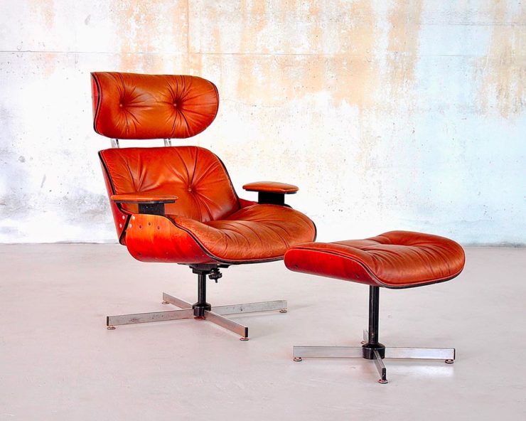
Original post: Practically everyone has heard of an Eames Chair:
A particularly awesome example of an Eames Chair (and ottoman).
What you might not realize is that the legacy Charles and Ray Eames left behind enriches our lives to this day. It’s a shame, then, that while their house is a mid-century masterpiece (and museum), much of their lives have remained behind closed doors.
For almost three decades, a barn-like building in Petaluma, California, contained remnants of one of the most iconic design legacies of the twentieth century. […] We created the Eames Institute because we want you to examine the archive of what you know—the collection of your experiences, understanding, memories, and questions—and connect to the provocations that call to you. We want you to tap into that same fount of relentless curiosity, and its power to shift your perception and open you to innovations and discoveries.
Now, however, there’s the Eames Institute of Infinite Curiosity. Awesome name aside, it introduces us to the more personal side of one of design’s strongest partnerships.
Items from the Charles and Ray Eames Institute. Drawings from the Charles and Ray Eames Institute.
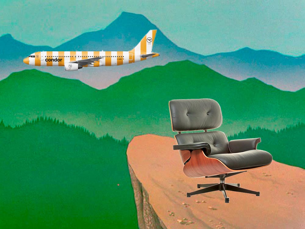
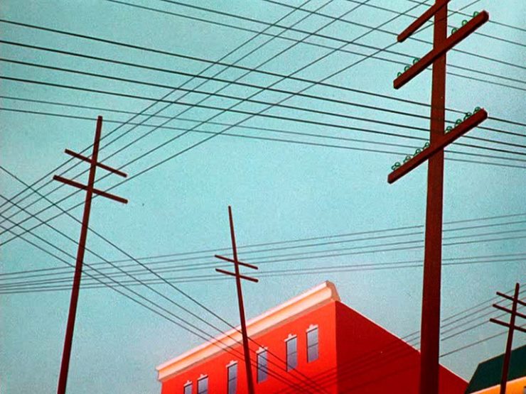
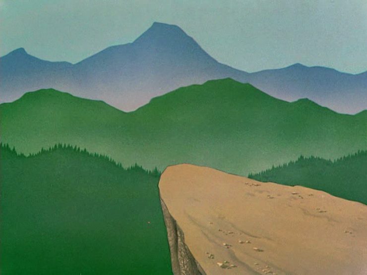
Crossed wires, anyone?Imagine who might run up to — or even get pushed off of — this cliff.A nice, innocent factory. Nothing could possibly go wrong.
Next time I treat myself to a Loony break, I’m going to make sure to spend some time looking beyond the action and appreciate the backgrounds. Nice.
Condor Airlines Rebrands
Most of you have probably never heard of Condor Airlines; they’re mainly a European thing, a “leisure” airline associated with Thomas Cook, formerly owned and run by Lufthansa. (Here’s some history.)
It doesn’t particularly matter. What does is the bravado exhibited by management. Before, a typical airline logo — dare I say, typically Germanic:
Condor’s OLD livery.
Then someone said yelled, “HEY. WE DO VACATIONS. LIKE BEACH TOWELS. LET’S DO STRIPES.” The result:
Condor’s NEW livery. Wow.
Armin Vit:
The new livery has zero fucks to give and just plasters every plane with thick vertical stripes that go against pretty much every single assumed tenet of what makes a good livery. It doesn’t look speedy, it doesn’t look nimble, it requires a lot of paint, and by all other standards it is just plain ugly and I love it.
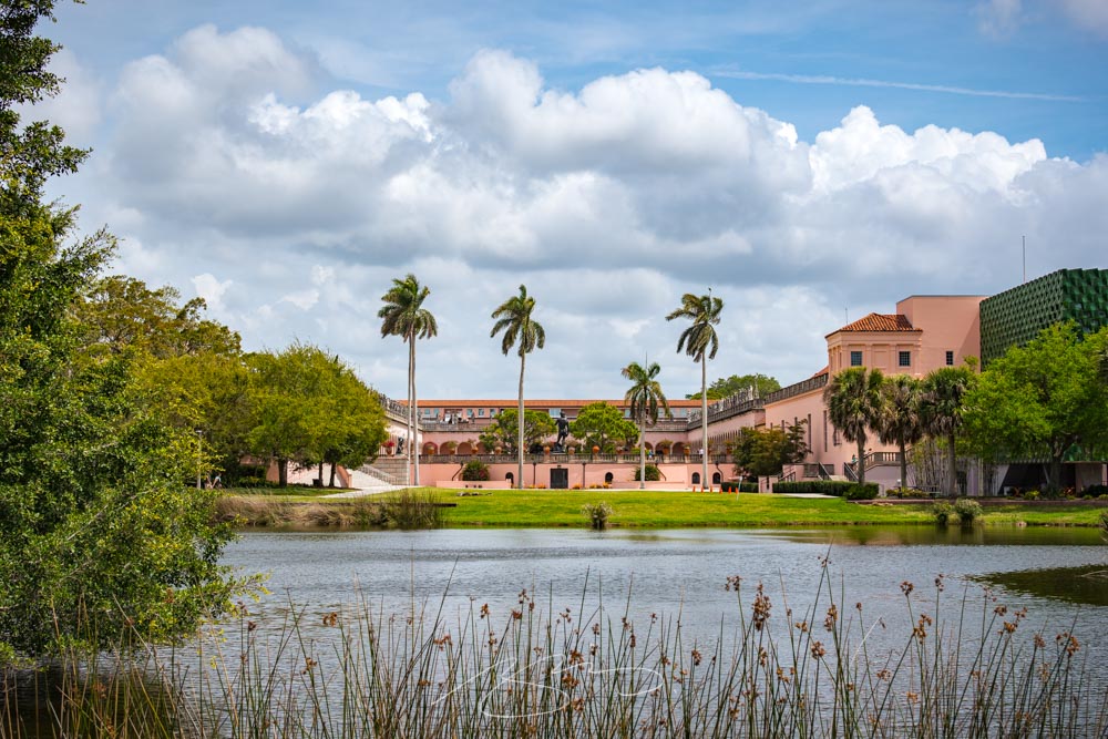
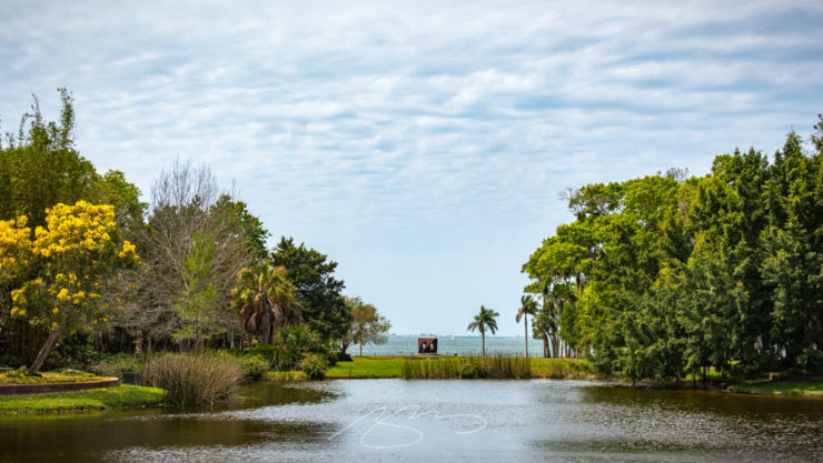
The Ringling Museum in Sarasota, Florida has been a place I’ve been taking photographs since I lived in the area, almost twenty years ago now — and a place where I continue to enjoy taking photographs whenever possible.
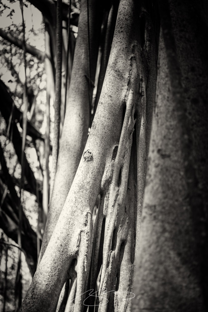
The grounds have these amazing banyan trees, with root systems larger than many houses:
Banyan (black and white, detail)
They’ve expanded over the years, adding buildings, a new entrance, and additions. This is the Chao Center for Asian Art:
Chao Center’s Asian Art Siding #3 (Detail)
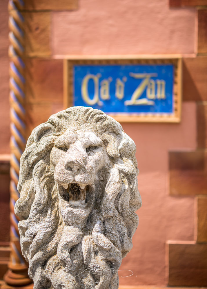
The old Ca d’Zan gate is the new main entrance:
Ca d’Zan Lion
And, of course, the whole compound is right on Sarasota Bay:
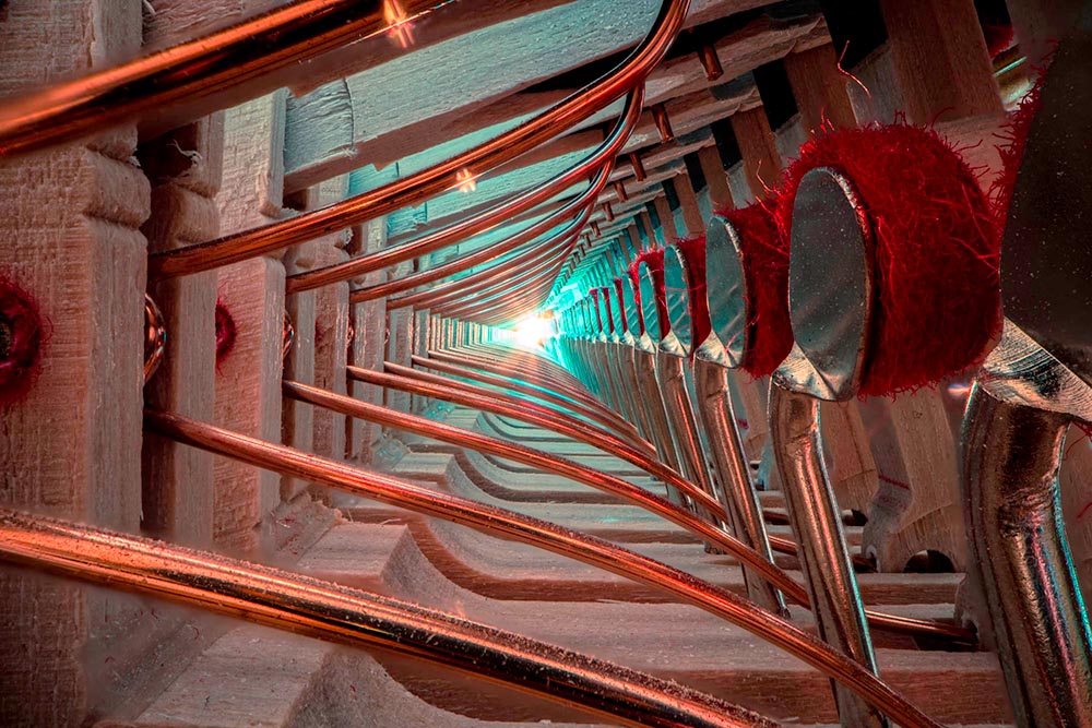
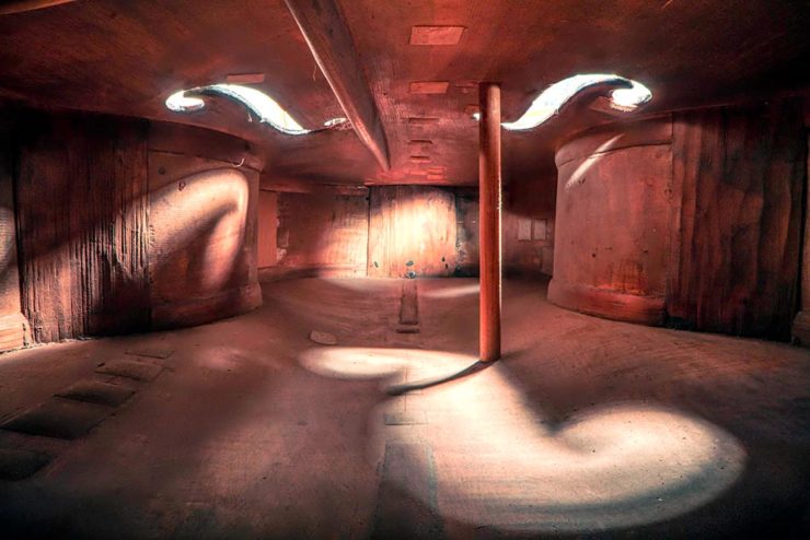
New Zealand-based photographer Charles Brooks, who happens to have spent years as a professional cellist, brings us some astonishing inside-the-instrument shots, including this one:
The Colossal post, where I ran across this, is definitely worth a read. But let me just add one thing: He’s using an L-mount (yes!) Laowa probe lens, an insightful choice driven by curiosity. Well done, sir.
It’s the yearly wrap-up and the holiday season! Recap and Rejoice!
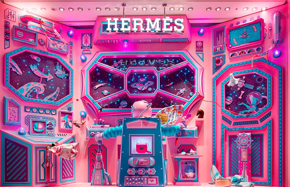
Hermès Does Windows
“Journey of a Lifetime” is this year’s window display for Hermès — yes, Hermès should have an accent, but I can’t seem to summon it today fixed! — so let’s go with a picture instead:
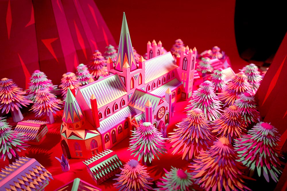
All in paper. No, let me repeat that: it’s all paper. (Well, perhaps some glue.) From artists Zim and Zou. Here’s another, one of their earlier works:
It has been, and continues to be, a rough time for a nature photographer who makes a living shooting around the world. This kind of time period sometimes makes we artists think about our life missions and convictions, and delve deeper into our beliefs and the way we view our art and what makes it worthwhile. While some people don’t see photography as art, I definitely do, and for that reason I feel that a discussion is needed about what makes photography an art form rather than technical labor.
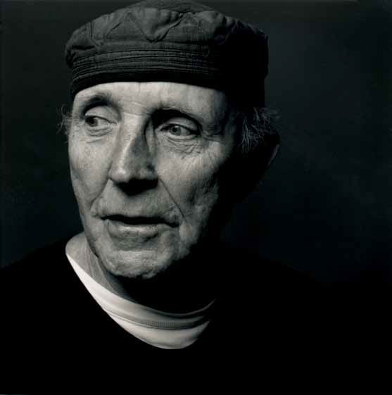
Now, let’s take a moment to celebrate the creator: Ken Garland. Not your typical graphic designer, he reached out, embraced the 1960’s and ’70s, and never looked back.
It’s been a minute since I’ve been in London — 2011, to be exact — and I’d love to go back. The food, the parks, the museums, the Thames, the short train rides to more interesting places (Hello, Cambridge?), and even the Tube. (We’ll leave the anti-Americanism aside for right now — we’re post-Trump and post-Covid, so traveling is at least an option!) Yet even the cultural masterpiece that is London is showing some cracks; from the New Statesman:
Hockney’s Piccadilly Circus has also drawn criticism for its simplistic approach. Over on the cesspit of arts criticism that is Twitter, anonymous accounts that decry all art made post-1920 as an abomination have ridiculed Hockney’s scrawl as indicative of the death of art. Other critics have rightly argued that the work feels like a red flag to a bull: fuelling culture-war debates about the legitimacy of public art, rather than encouraging the public to get onside.
I like it more every time I see it. Read more at It’s Nice That.
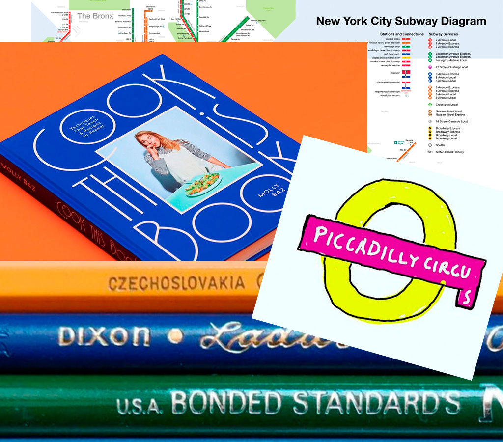
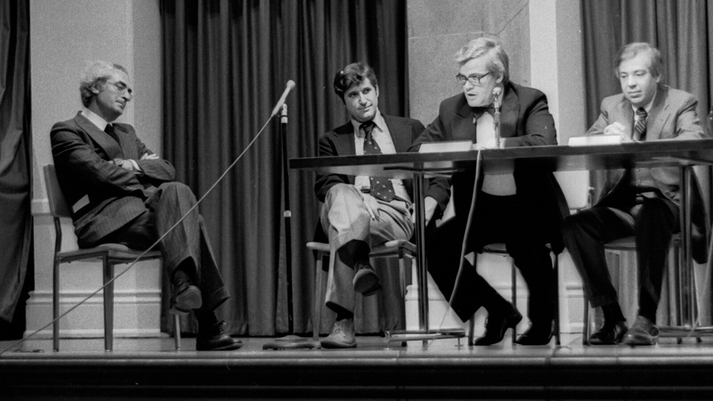
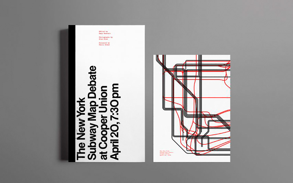
On the NYC subway map:
Speaking of It’s Nice That, an interesting new book from Gary Hustwit . . . on the debate over the New York City subway map. On the one side, the iconic Massimo Vignelli version, introduced in 1972, representing the less-is-more approach. On the other, the replacement version from John Tauranac, introduced in 1979, representing the more-accurate-is-more approach. (An updated version of the latter is still in use today.)
But back in 1978, the two got up on stage at Cooper Union’s Great Hall — home to debates of, among others, Abraham Lincoln — and pitched their case:
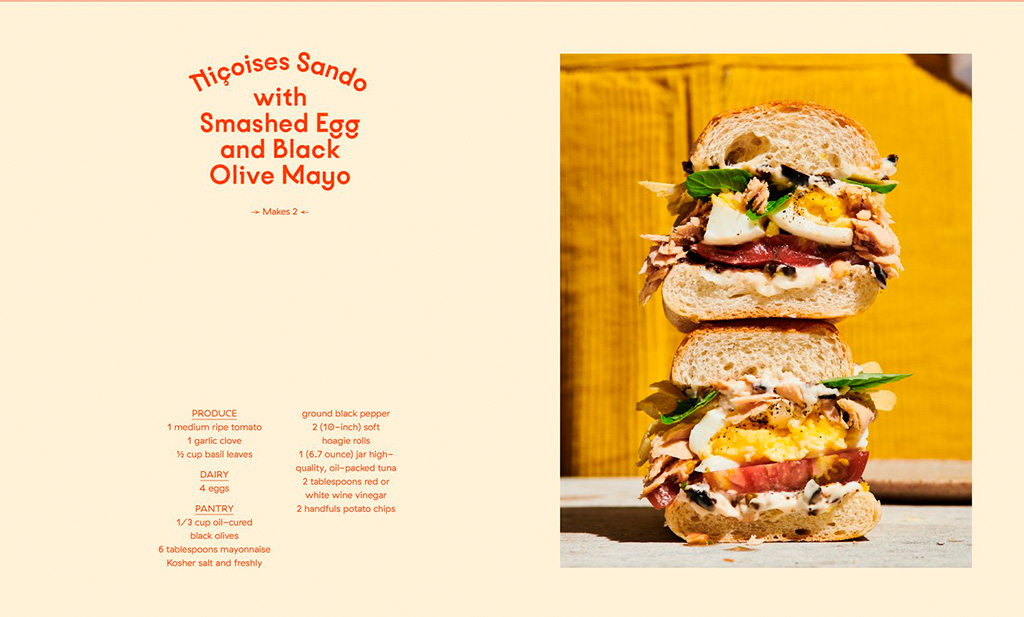
Nice new cookbook chock full o’ seventies-era design, “Violaine et Jérémy returns with a cookbook for Molly Baz, featuring three of the studio’s much-loved typefaces,” at — wait for it — It’s Nice That: